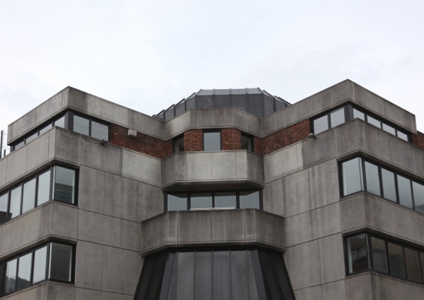
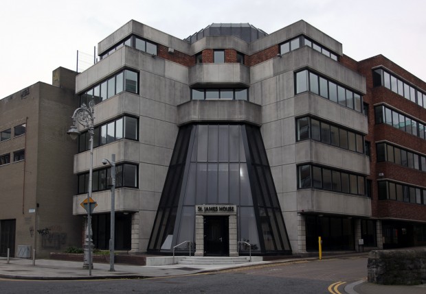
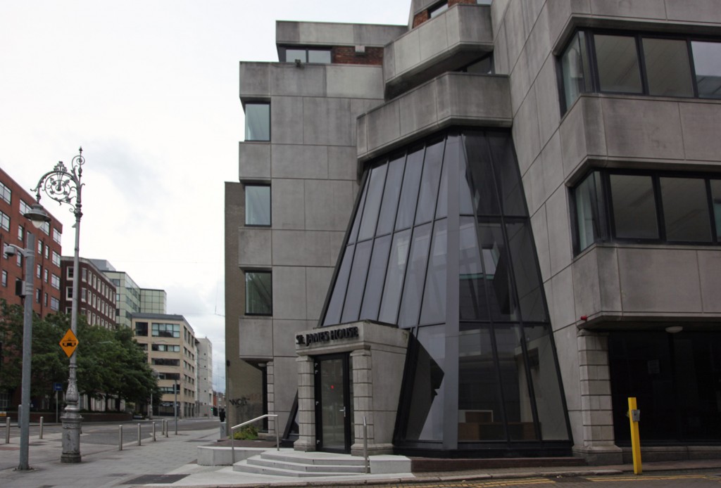
Is it ok to love a building for its geometry alone? St. James’ House is just beyond the curve of the Luas line, which forms a boundary between the busiest part of Adelaide Road (at the corner with Harcourt Street) and the quieter (but not quietest) stretch leading to the junction with Earlsfort Terrace. The building was completed in 1990, built to provide office accommodation for rental, and this entry on PADDI doesn’t confirm an architect, though ML Flynn are contractors and Tom Kelly may be another member of the project team.
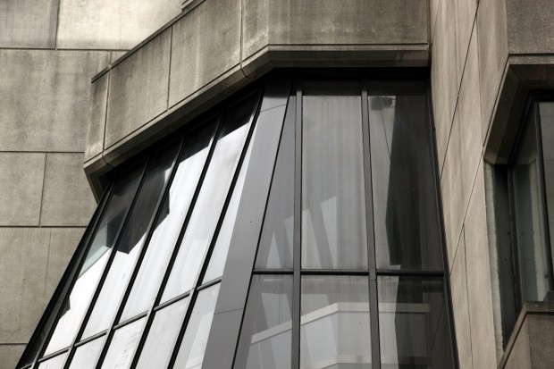
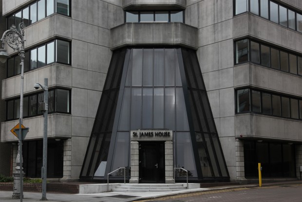
The building isn’t world-class. On the atrium, the glazing bars are heavy, the corners are extremely thick, and the angle doesn’t look to be creating a sense of lightness and air for the interior at all. The articulation of the joints (banded rustication) on the ground floor level of the facade is a motif from classical architecture – the roughness of the ground floor as a strong, tough base, with the smooth refined stone above – and combined with the entrance like a freestanding arch against the dark glass, it feels very much like a product of its time. Of course, taste is a funny thing, and I often wonder how (not if) postmodernism is going to end up becoming appealing to me, but it still feels like architecture via RapGenius, a big spelled-out translation of meaning obliterating subtler, more sensual qualities. St James’ House isn’t likely to be chosen as a brilliant example, regardless.
In spite of that, I really enjoy the geometry and how it relates to the street. Approaching from Earlsfort Terrace or Leeson Street, it’s at its most open, a corner stepping back and splaying out as a glazed entrance over the opening. If you come at it from Harcourt Street, though, it’s a surprise that’s most intense when you’re on foot, walking along the path on the same side of the road, where the flat surface of the street line ends as if it’s just ending, and the corner unfolds as you get right up to it. The Luas relationship is even more teasing once you know it’s there – you’re at too wide and too far away an arc to really see it, so there’s a strange sense of knowingly seeing an illusion pass. It’s not magic, just a tiny extra touch of complexity.
I’m admittedly a fan of buildings that are beautiful through being quite ugly, and there’s a real awkwardness I love in a lot of Dublin’s buildings with non-rectilinear angles: zig-zags and arrows and triangles and hexagons. It’s not necessarily a quality that’s always in line with the absolute peak of architecture’s potential or the production of amazing urban spaces, but it’s an endearing part of the city for me, all elbows and ankles.

