


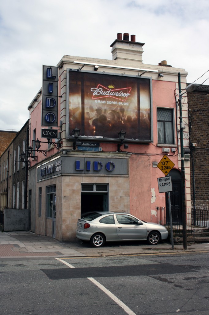
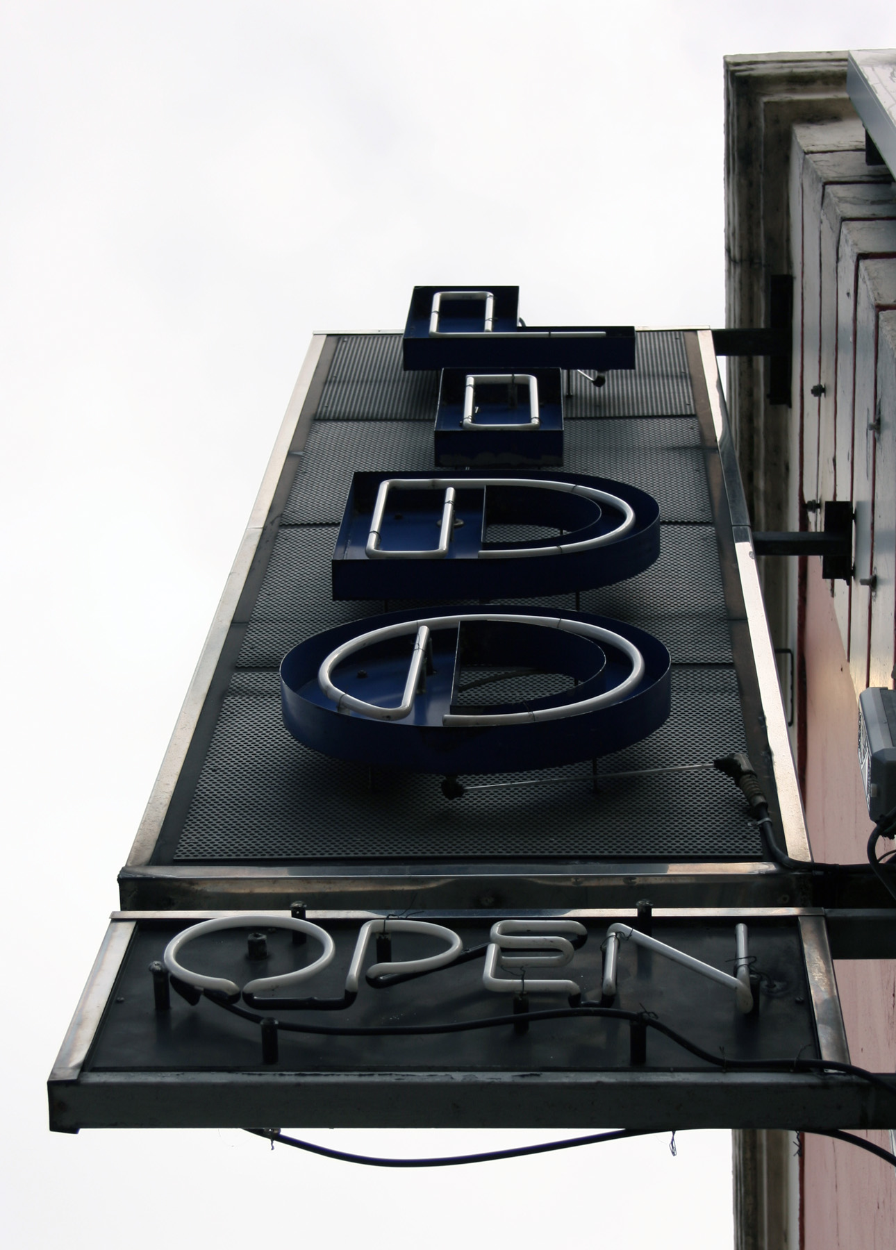
The Lido doesn’t exactly have a phenomenal shopfront. It’s nice and consistent, with the same blue lettering and heavy vertical strokes on the neon sign and the one above the windows, but the two shades of peach (the tiles and the paint) are jarring.
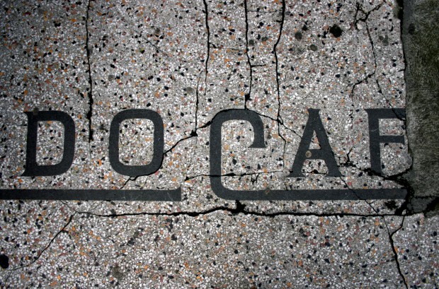
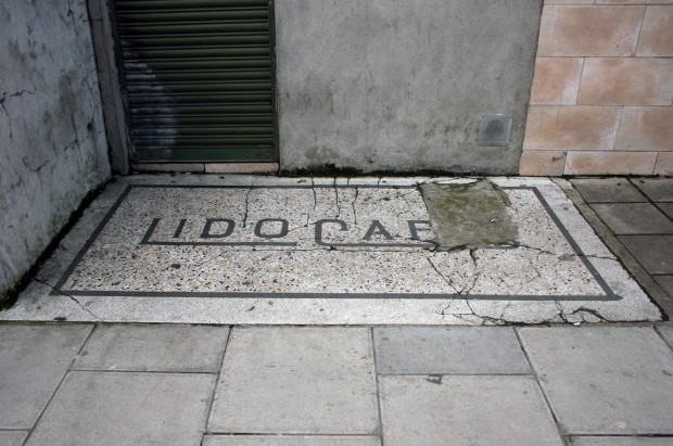
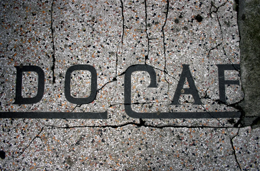
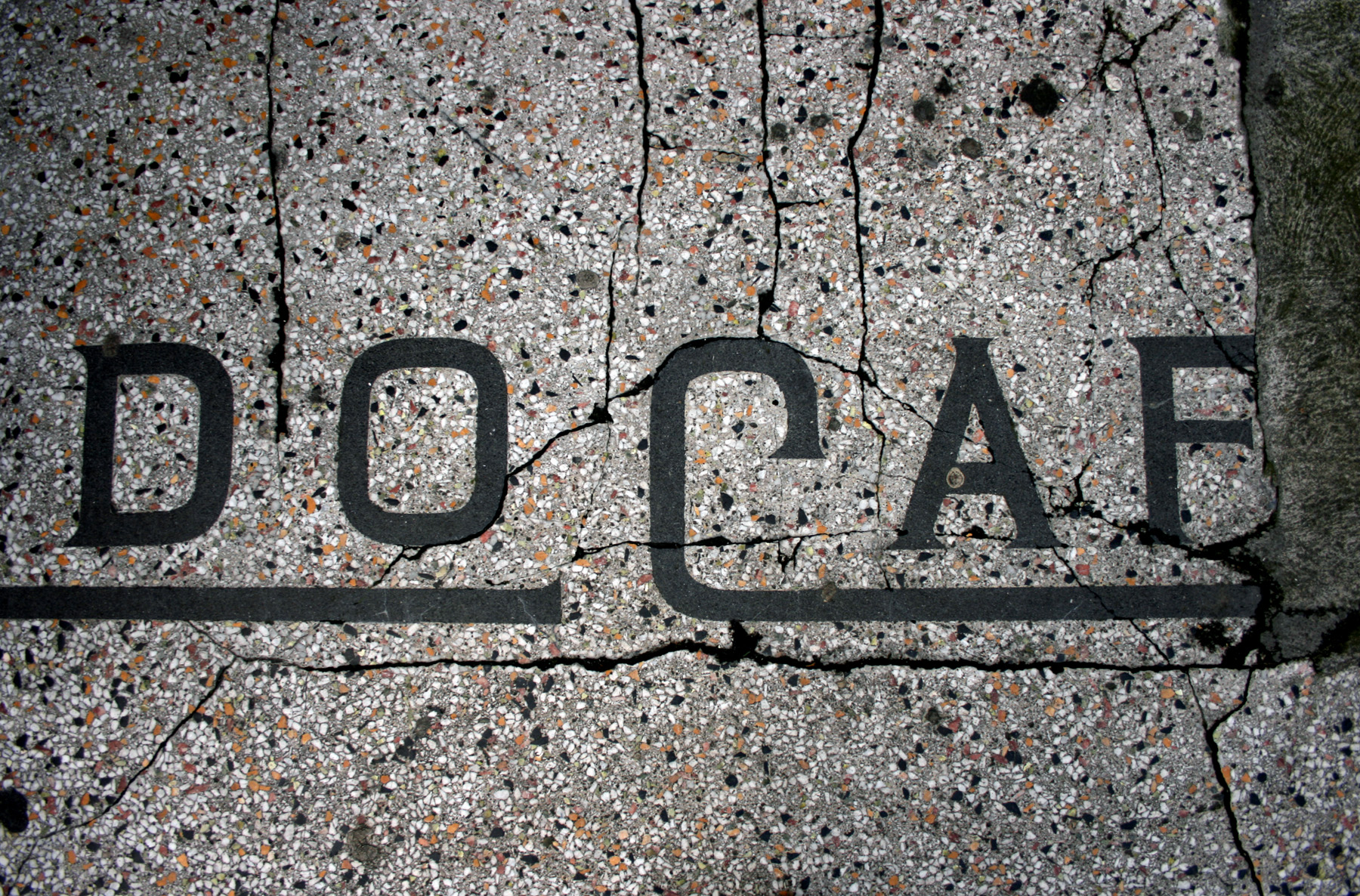
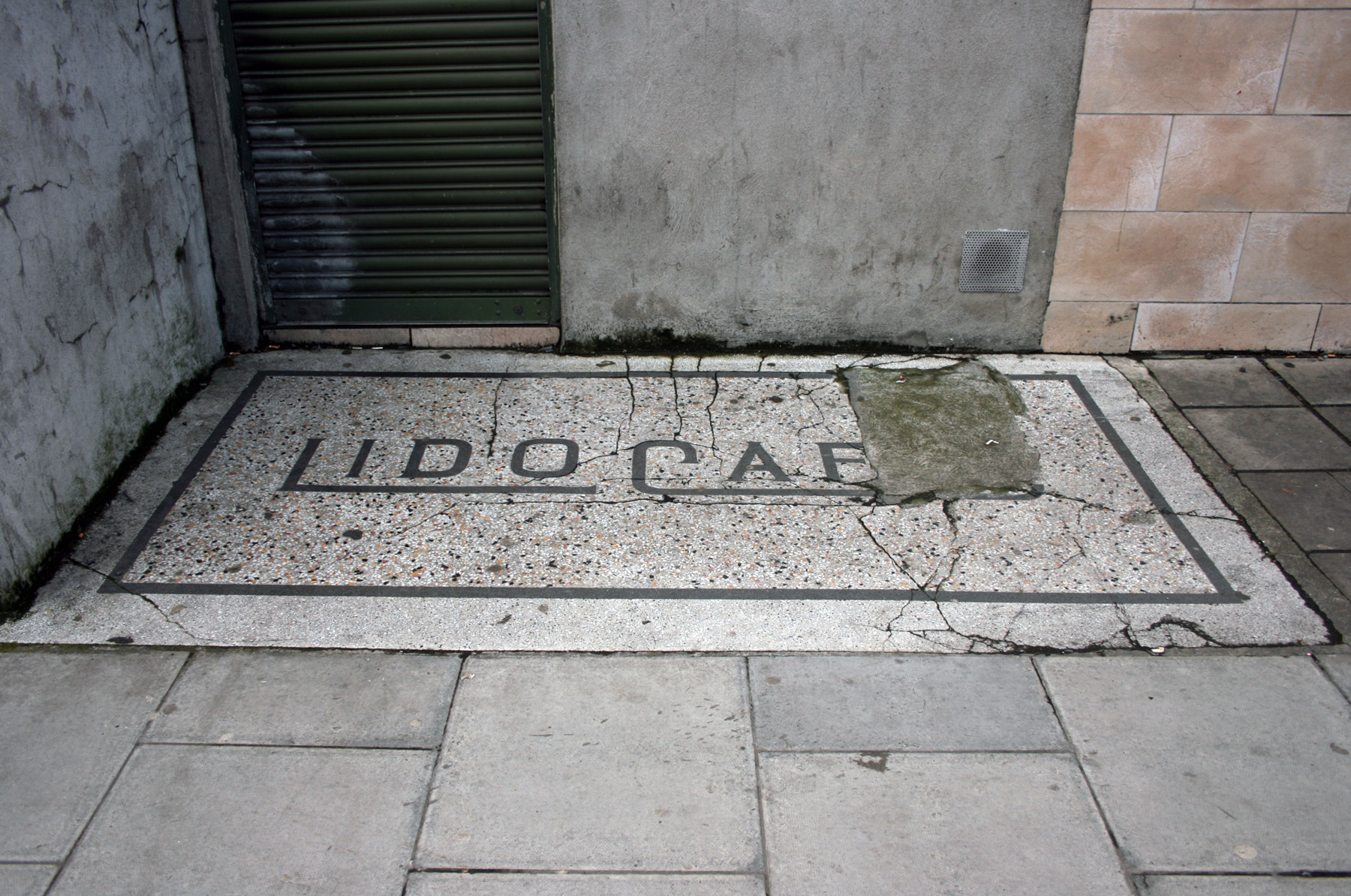
On the Pearse Street side, though, there’s a magnificent piece of what looks like terrazzo set into the paving, sitting like a welcome mat in front of a door that’s no longer in use. It’s cracked, missing in parts, and filthy, but it still looks great.
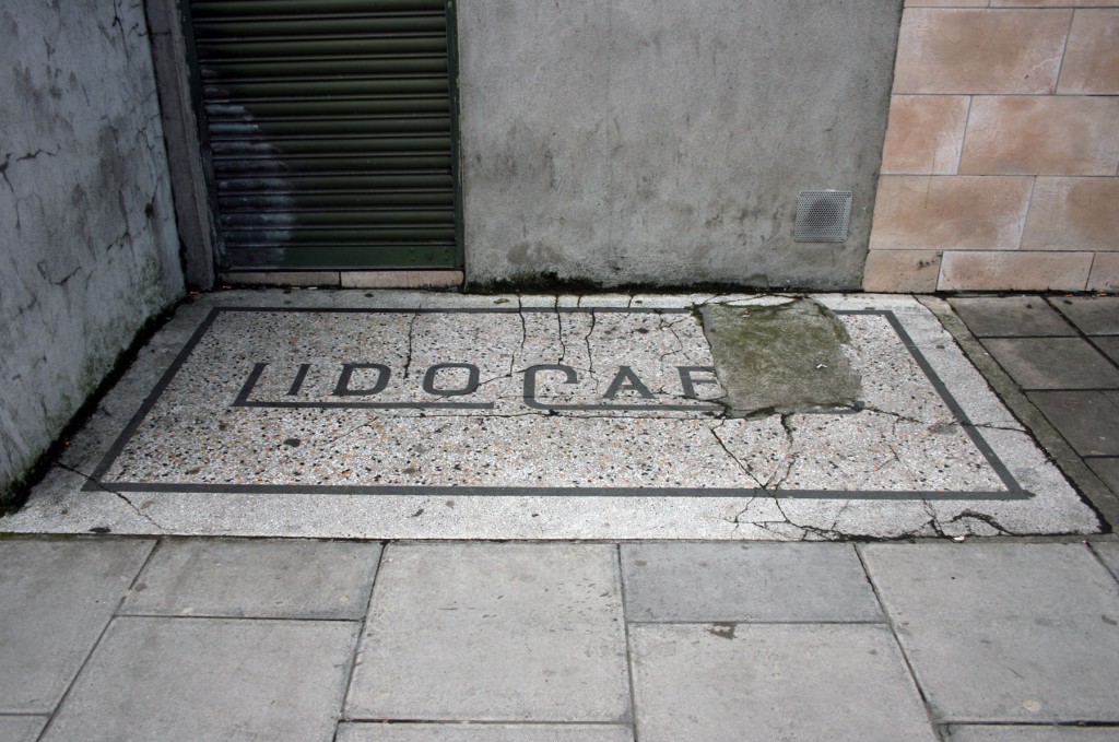
I think it’s the combination of the evocative name (nothing says Venice seafront like a 3-in-1) and the grandeur of the long horizontal flourish and sharp serifs, with the multicoloured background hiding the dirt.