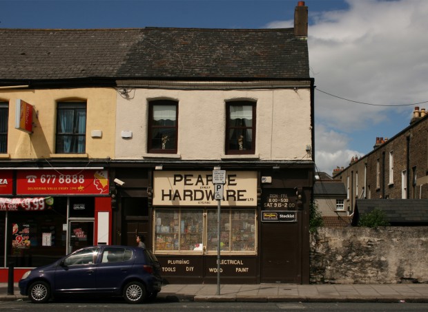
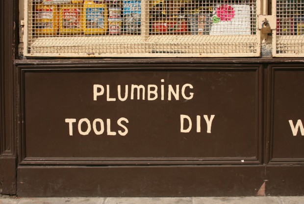
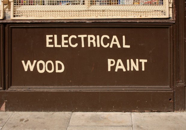
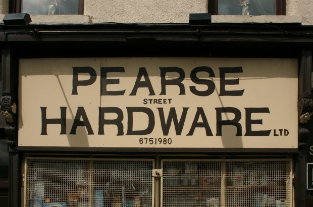
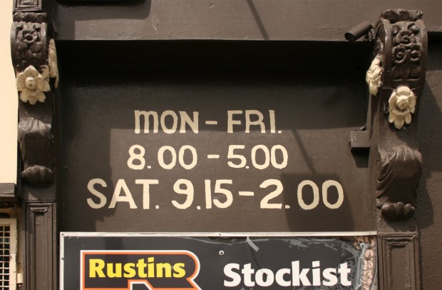
Pearse Street Hardware’s signage is handpainted in brown and cream, inverting them so that the primary sign stands out in brown on a pale cream background, while supplementary information is lettered in cream on the brown shopfront. The mesh gates covering the windows pick up the cream colour again.
It’s clearly not done by a professional signwriter and there are hints of shaky hands, but it’s been done carefully and set out with thought. There’s an endearing DIY quality to it too, and the highlight is the little dot on the ‘i’ of ‘PLUMBING’.
One interesting thing I only noticed in the photographs: the brackets on the outer sides of the doors (to the extreme left and extreme right of the shopfront) are bigger and taller than their counterparts on the other sides of the doors. Maybe this is common and I’ve just never spotted it?

