Adding a building to Trinity’s campus is a daunting prospect. Not only is it a prominent institution in the city, but the addition’s neighbours will include Thomas Burgh, Deane & Woodward, Richard Cassels and – in the decades since today’s subject – De Blacam & Meagher, McCullough Mulvin and Grafton Architects for neighbours. There’s a few misses, but remarkably few.
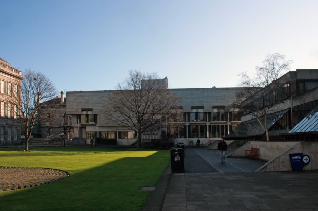
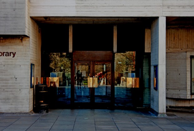
Paul Koralek‘s design for the Berkeley Library (completed in 1967) is one of the most beautiful buildings in Dublin and it’s a node for campus activity, mediating much of the traffic between Fellows’ Square and College Park, as well as now providing the main entrance for the library complex. Koralek won an international competition for the project, which was held in 1960 and attracted 200 entries.
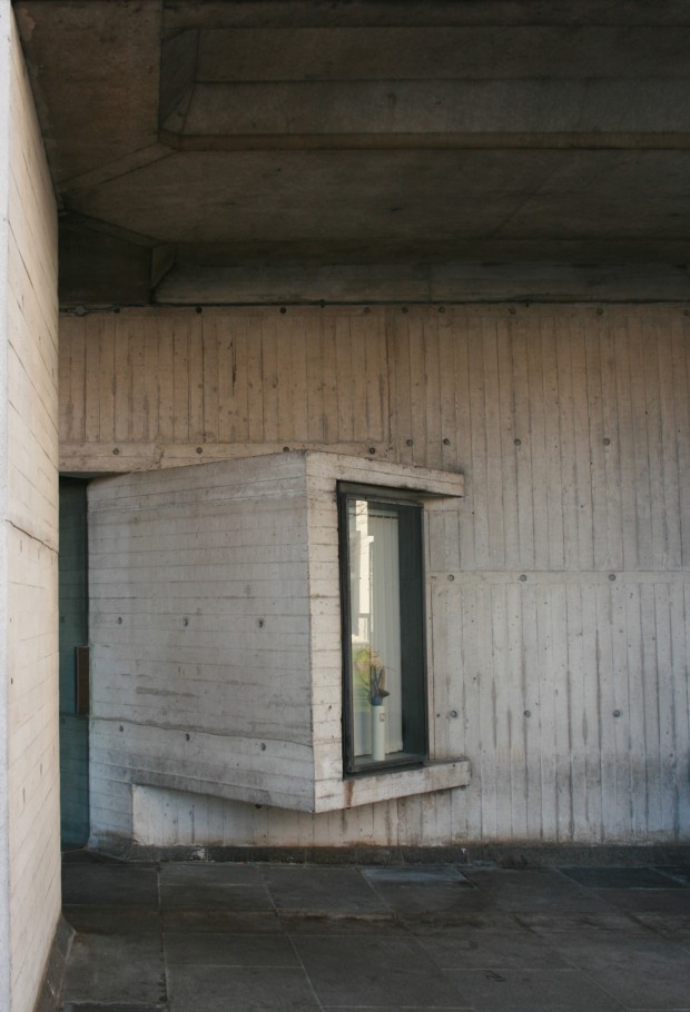
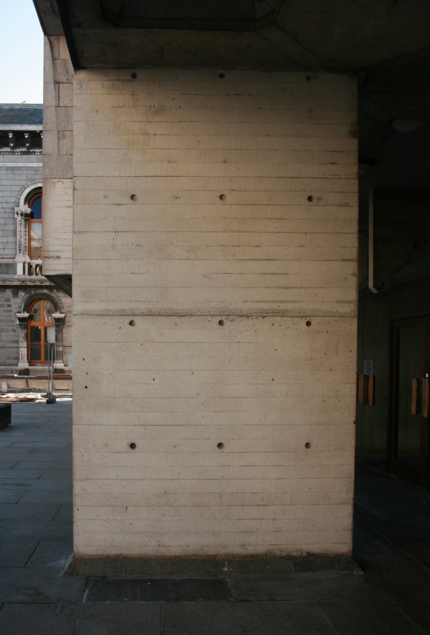
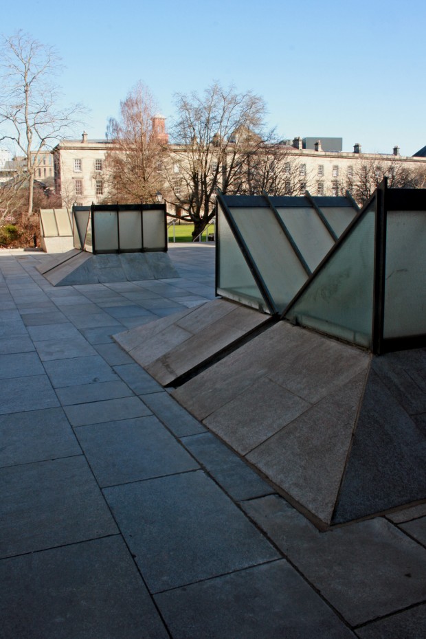
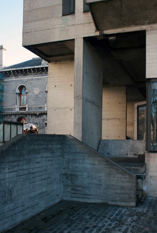
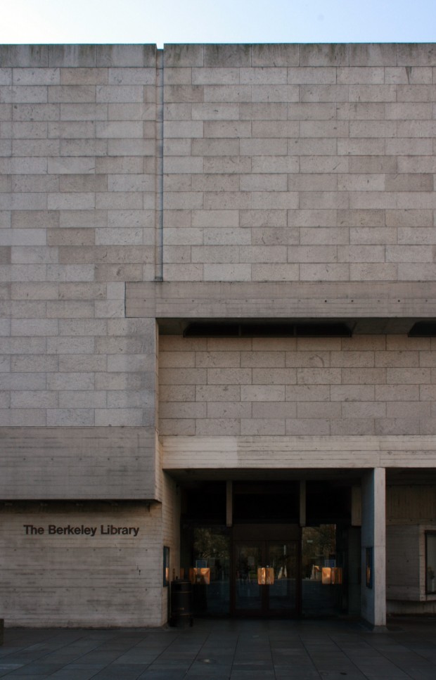
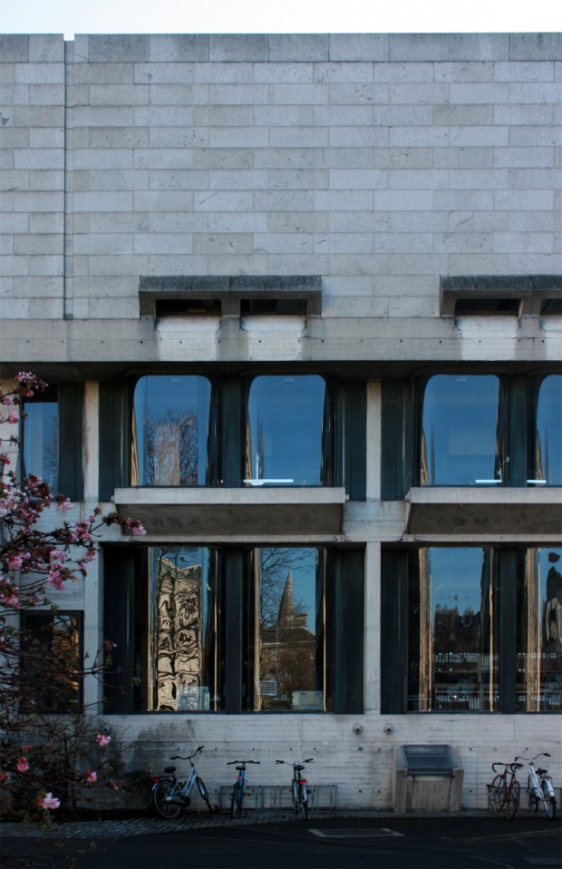
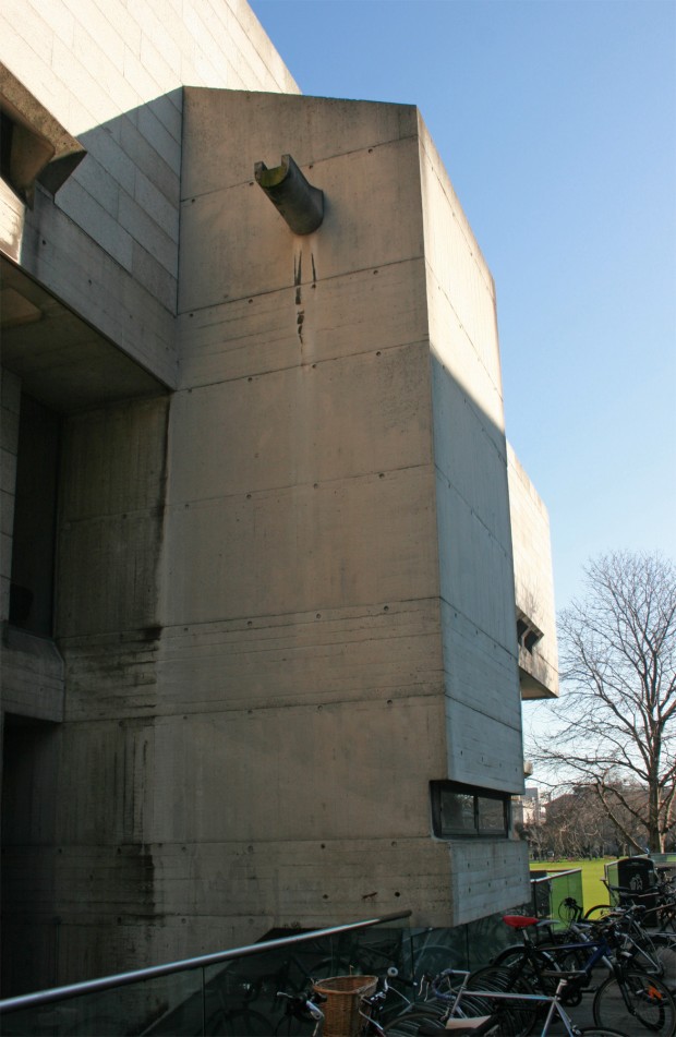
The building is Brutalist, clad in pale Wicklow granite with board-marked concrete at the lower level and in bands indicating the floor slabs within. For me, the quality of the materials, construction and detailing is a huge part of the building’s success, matching the richness of the Museum to the east and the imposing Old Library to the west. The best place to get a quick understanding of this is at the entrance from the raised podium on New Square, where you can see the deliberate and careful board-making up close.
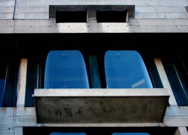
Each facade is markedly different, though the solid upper storey projects out further than the base on all sides. The oriel windows made in curved glass are a repeating element, sitting under the projection and capped at the bottom by a thick concrete wedge.
The library’s interior is also significant and beautiful, to be revisited (like many featured buildings) if we can gain access to photograph.

