In more cynical moments, one might start to notice how often the blank gable end crops up in our built environment, almost enough to be a motif. Some of the finer points in architecture crop up in how things meet and how things end, and presenting a big blank wall to a major axis is an interesting choice in establishing the hierarchy of a building’s facades. At worst, it doesn’t even seem like a choice, with rows just ending and no special type for the end condition – I used to work for an architect (a fantastic person I won’t name in case he’d rather be spared the attribution) who was so fed up with housing estates ending terraces thoughtlessly in mean blank walls with tiny bathroom windows that he had a bit of a daydream about an art installation where apparitions of the Virgin Mary would be projected on the gables. Like she was appearing on toast or in a shell.
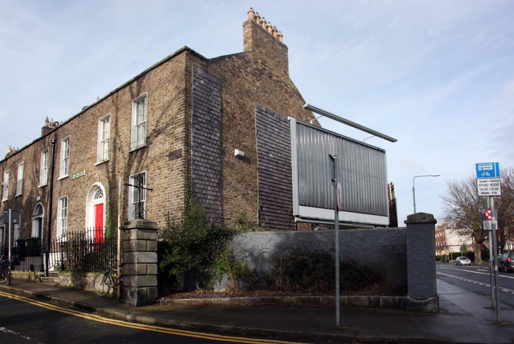
1 Mount Pleasant Square isn’t mean, and the blank gable end to the main road makes some sense: the house presents its front to Mount Pleasant Square, and the silhouette of the horizontal parapet, roof pitch, and chimney centrepiece is a nice composition anyway. There’s also a huge billboard passing in front of it, which isn’t exactly an amenity but would be impossibly grim if there were windows behind.
The house appears to have been completed in 1831, with the square completed in 1834…and as a square, it’s interesting for being curved on the north and south sides. Mount Pleasant Square doesn’t really read as a set piece, thanks to most of the square being taken up by a private tennis club, though the north and south sides have a genteel atmosphere. The houses seem to have been originally occupied by professionals, and an ad in 1873 indicates that furnished rooms were being let in number 1.
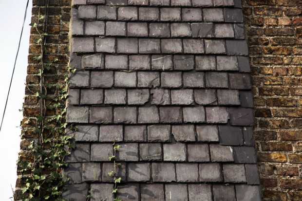
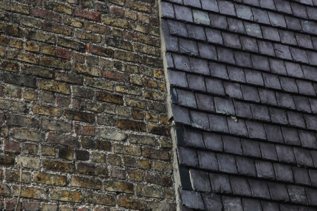
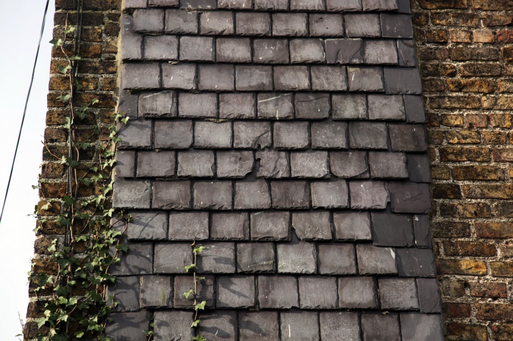
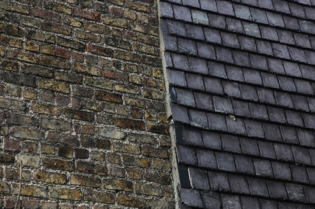
On the gable end, there are two strips of slates that appear to be sitting on mortar. I’m fascinated to imagine how and why they ended up there – they can’t be original, but are they covering or repairing something? It’s a strange thing to see them applied like a sample strip of material and texture, but they feel like that. They’re like scales, though the unlapped top row is a reminder that they’re part of a system with a capping component, a way of ending things that’s different to the middle sections. Whatever the purpose, they add an unexpected tactile moment to the junction.

