Credit unions are part of the building-block shops in towns and villages, the basic kit of parts that’s enough to support daily life and business. It’s interesting to compare them to post offices: the credit unions don’t have a strong or united visual identity, and that makes sense because each one’s an autonomous organisation. The downside is that many of them look a bit crap.
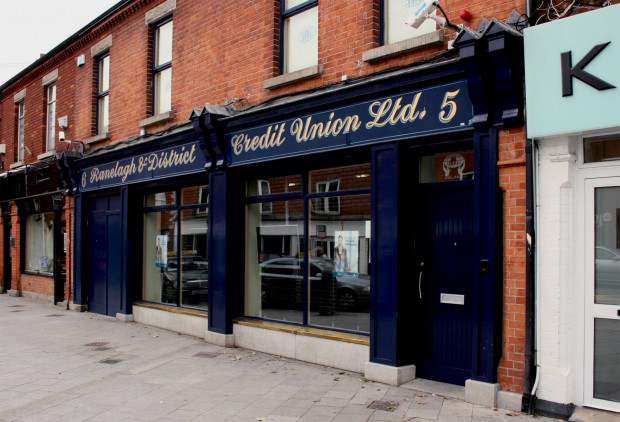
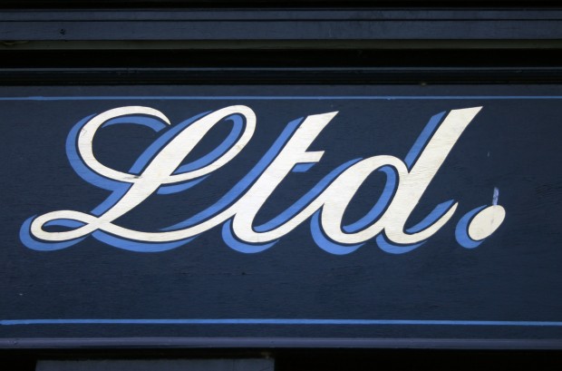
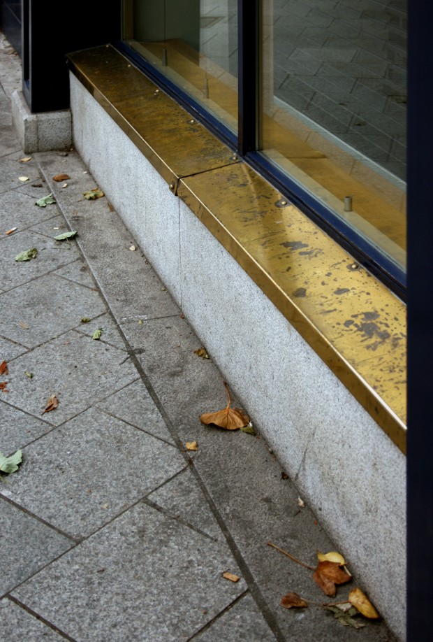
The Ranelagh & District Credit Union is beautiful, though. Its interior is pretty unremarkable but the shopfront is a deep, rich blue that’s glossy and well-maintained. The sills are capped in brass, picking up the gold-tone paint on the sign and setting off the blue. On the sign, the flourished lettering is handpainted, with a drop shadow in a different tone of blue. It does seem like the letters are a bit high up on the sign but the painting is so good that I presume it’s intentional.


