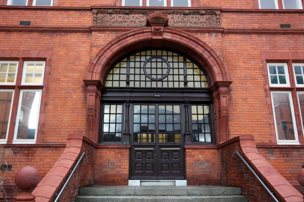
Back when I wrote about the former Richmond Surgical Hospital, I mentioned how much I would love to see the interior. This is true about a lot of buildings in Dublin (if you’re an architect, an owner, or good pals with security, please get in touch!), but the Richmond is so striking and beautiful that I was dying to see how the modernised interior looked. I got my wish.
The building was renovated by the courts service and in use as the Dublin District Court, and as you’ll see, most of the architectural interest is on the outside. Arriving up at the door instead of peering through the gates was very, very exciting, and it all started to feel a little bit Scouting NY.
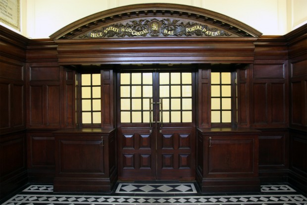
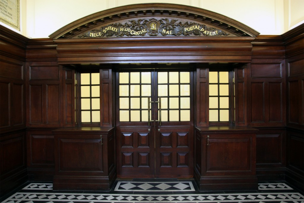
Right inside, there’s the building’s interior showpiece – a timber panelled entrance hall, with the doors to the interior framed by this carved, gilded piece.
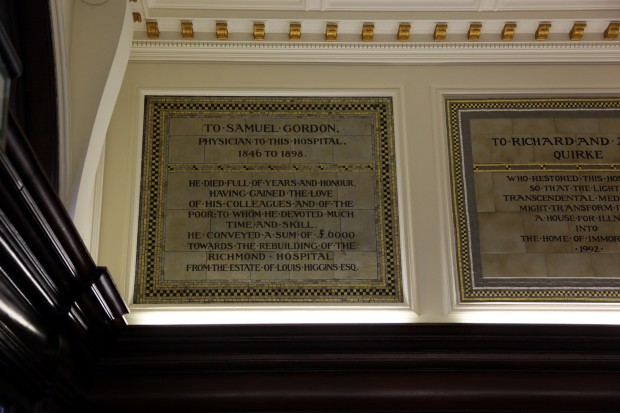
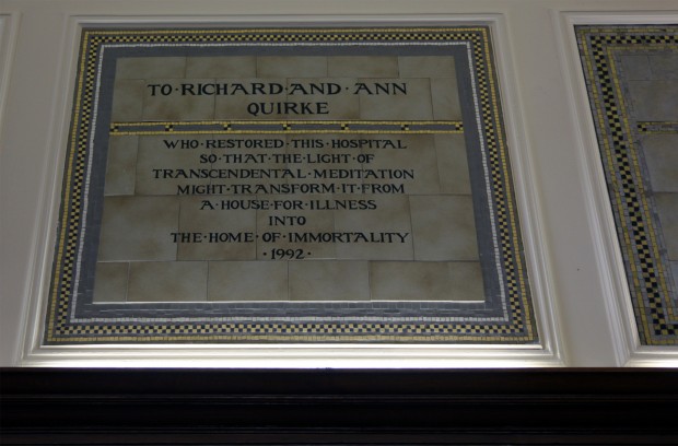
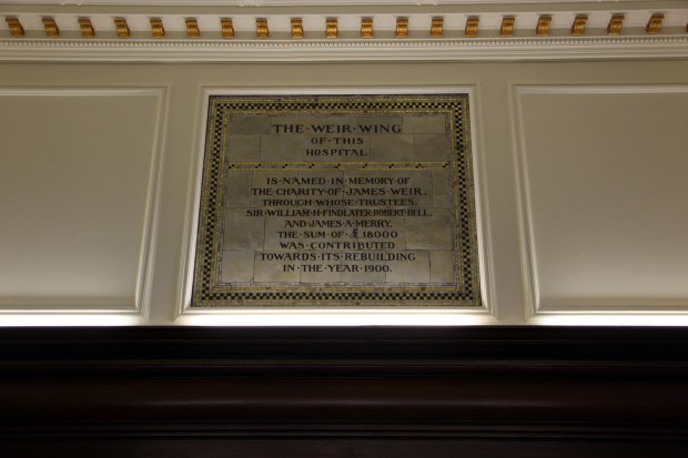
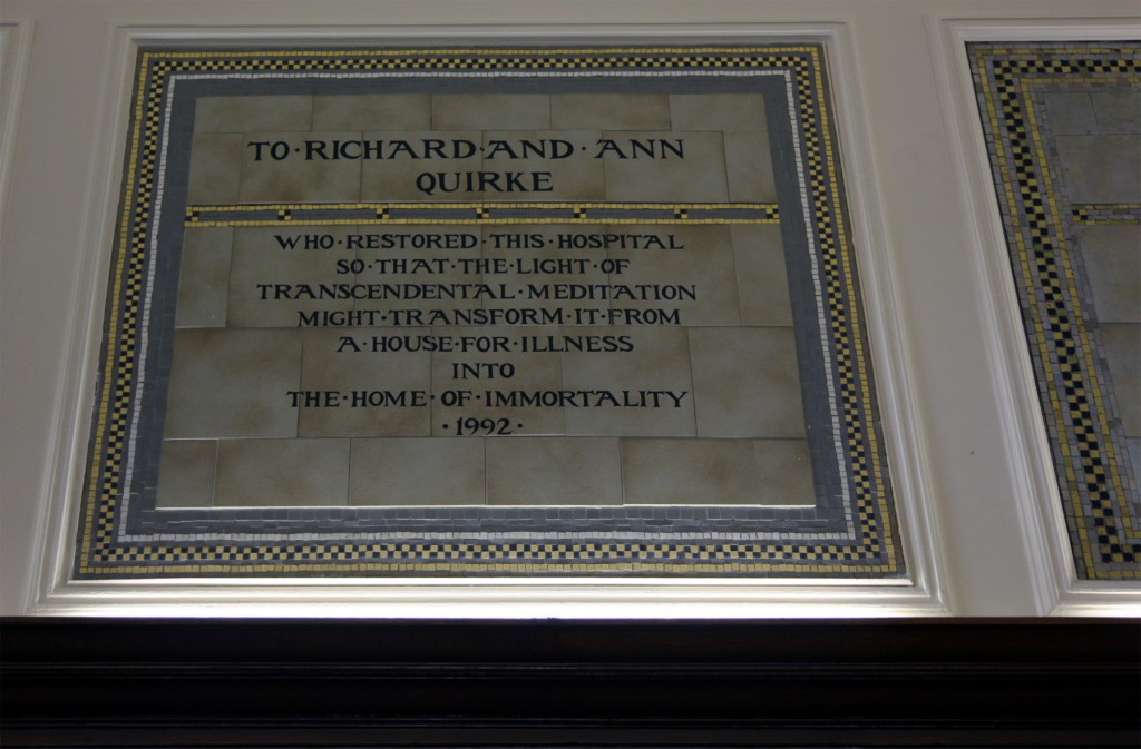
The side walls here hold plaques dedicated to the donors who funded the building. Each one is a rather lovely mix of tiling and mosaic, but it’s hard to beat the transformative power of transcendental meditation. (Can David Lynch make a house a home?)
Full of years and honour sounds pretty good.
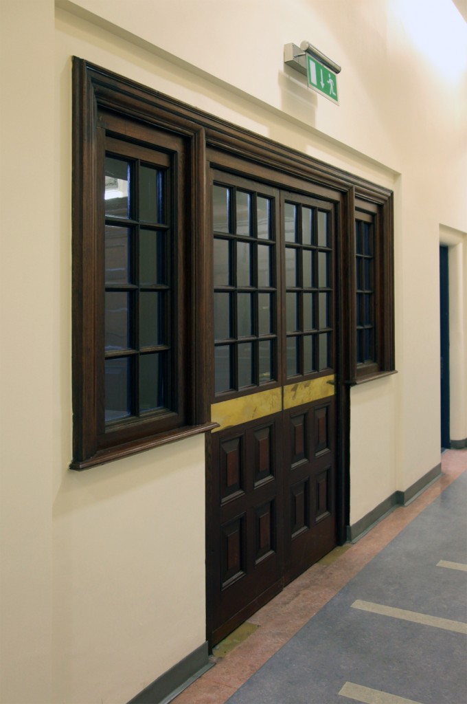
From the corridor inside, the entrance looks like this gorgeous cabinet.
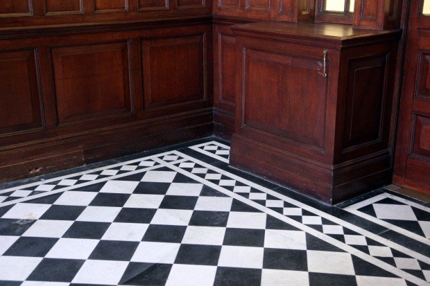
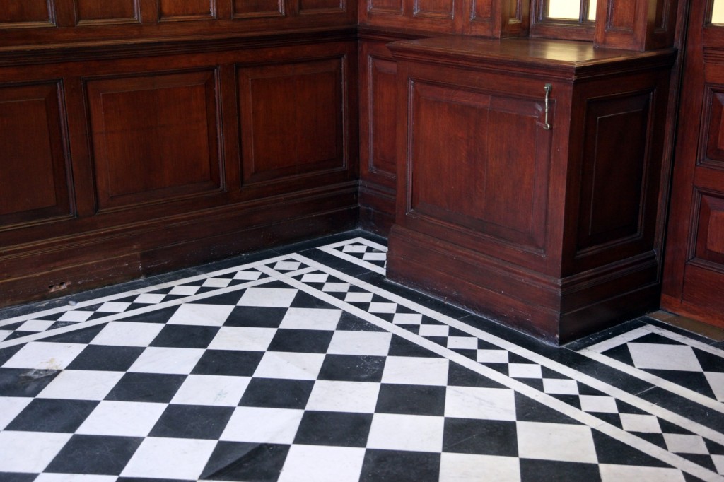
The black and white tiling, this graphically strong floor against the dark timber, ends up almost second fiddle because of the rest of the room.
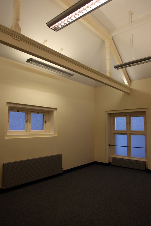
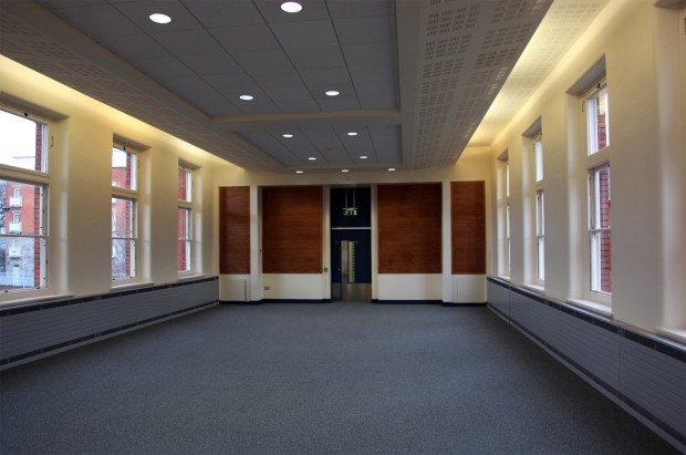
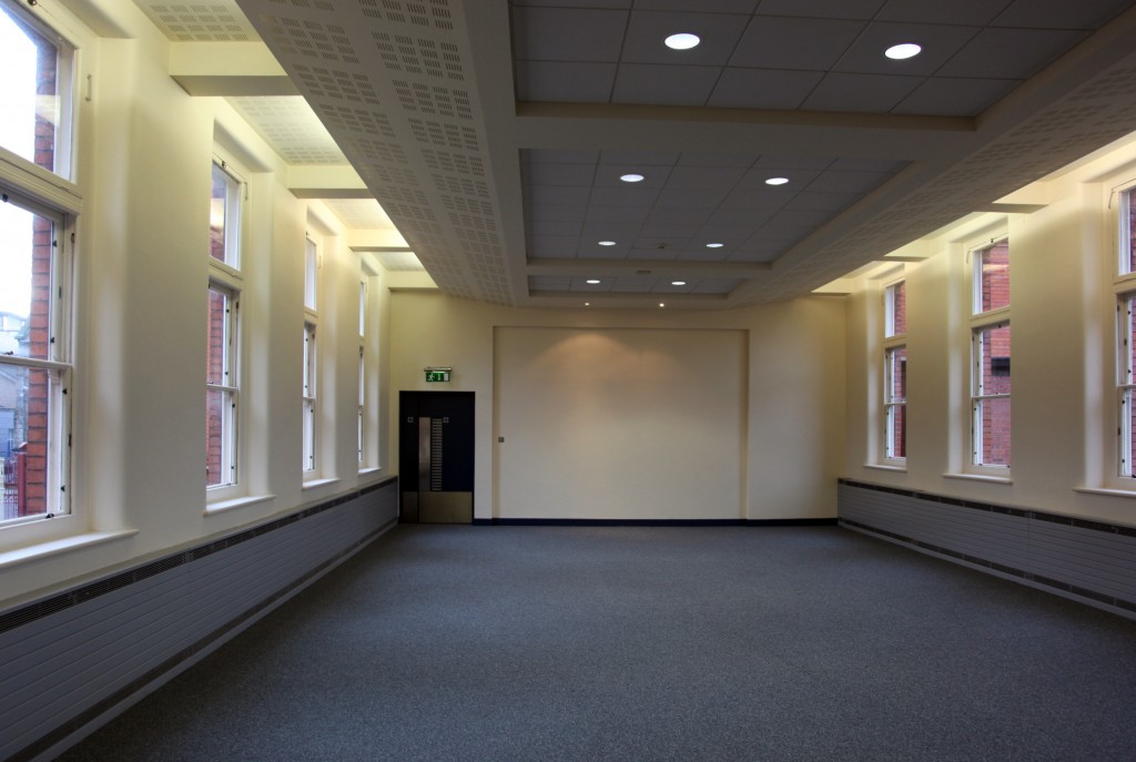
So, inside. The two wings are nearly identical and divided into dozens of small rooms – very plain, with neutral walls and floors. A few have fireplaces, and the ones on the inside of the U-shaped plan have a view onto the rest of the building, and several are hexagonal, but it would be fair to say that they feel more like ordinary offices for the most part, pristine and newly carpeted. Above is one of the courtrooms, formerly one of the wards. These were the rooms I was most curious about, and it requires a bit of imagination to picture them ever containing patients, even remembering the windows corresponding to beds.
This room was unusual in having a timber truss within the ceiling.
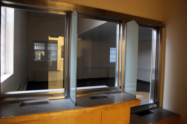
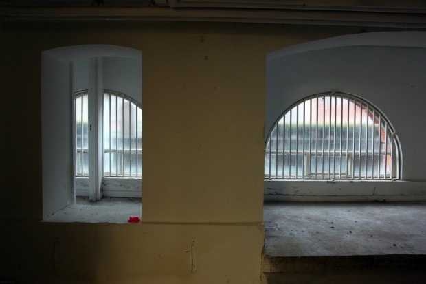
There are interesting moments in the court features, which had me trying to imagine the building’s use and who went where. Towards (I think!) the rear of the building on the ground floor, there are these reception windows, with one dropped for accessibility.
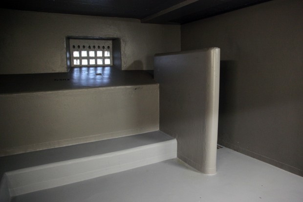
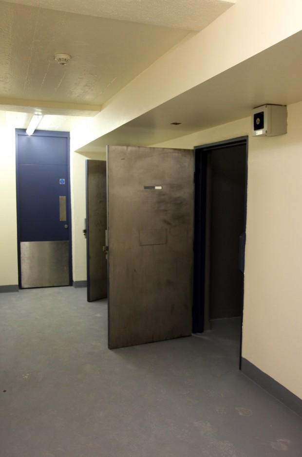
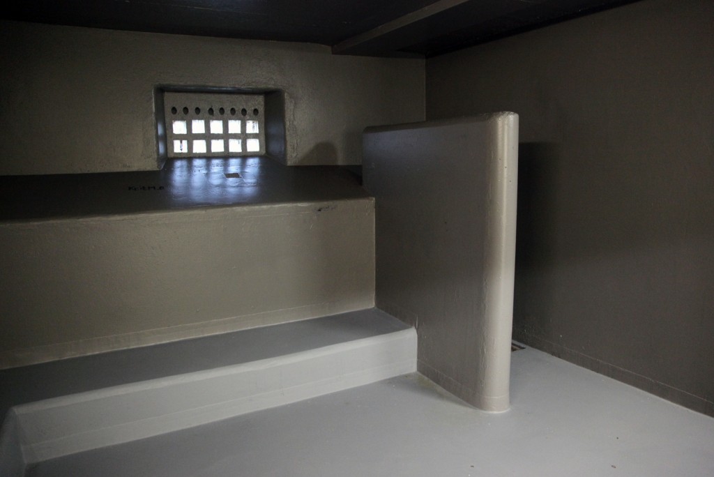
In the basement, there was the building’s biggest surprise: a series of cells. One larger one suggested it might be a holding cell for multiple people, and the smaller ones suggested pairs. I have a serious interest in institutional architecture, including confinement, and I couldn’t stop thinking about the weirdness of seeing this space freshly painted, as if nobody had ever been held inside. If you were very wealthy and very insane, this might be a good spot in your home for your H.H. Holmes moods.
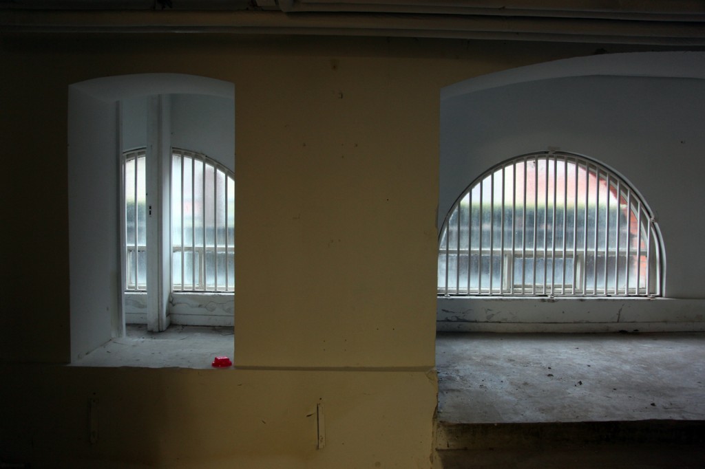
Or, more practically, the basement contains an enormous amount of space for storage – like, rooms upon rooms upon rooms – and presumably you might adapt them for that. At the front of the basement, there’s a platformed area inside the arches beneath the building, those features praised for keeping the healthy hospital being raised above the ground.
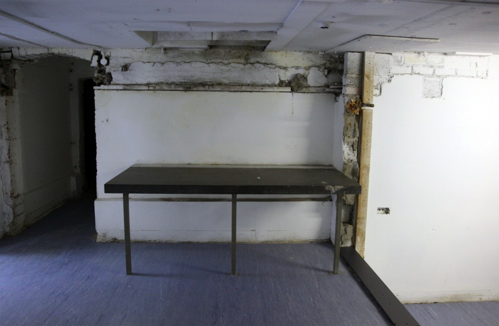
My kind guide suggested this table was used for surgery, and it’s certainly a marble table suggesting some hygiene factor in its design, though the surgical spaces in the original hospital were to the rear.
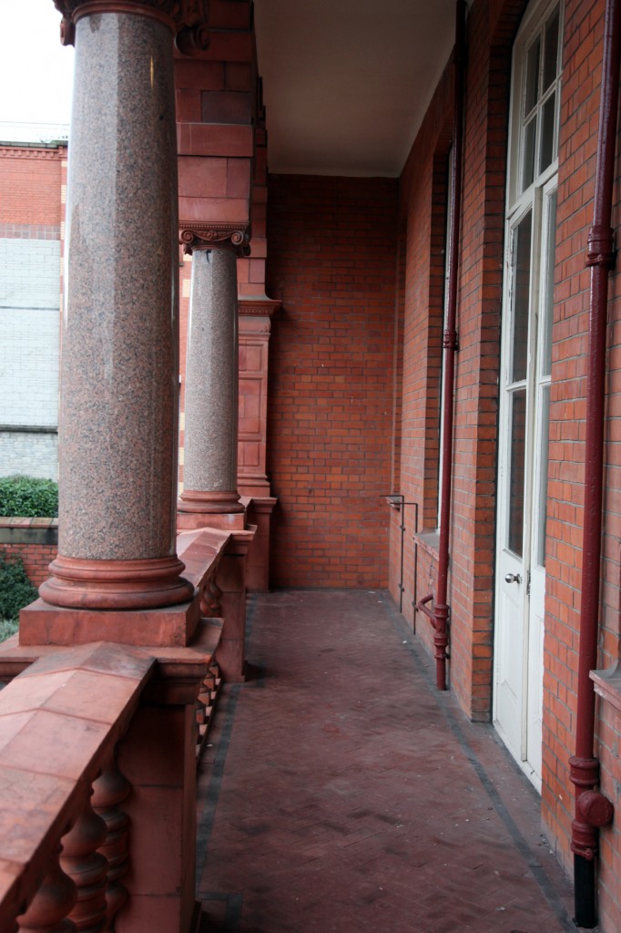
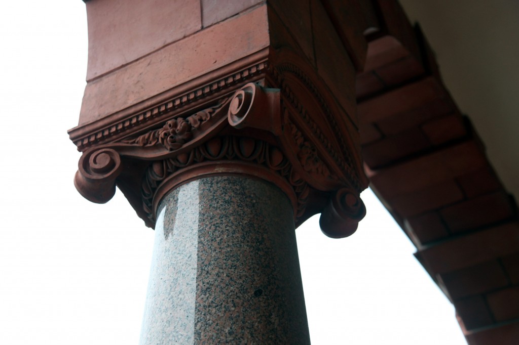
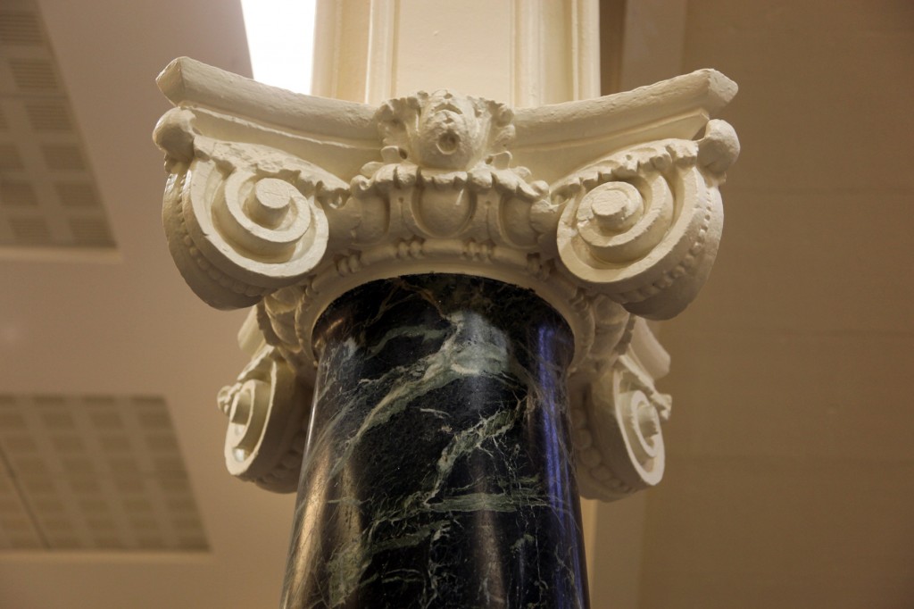
More healthy and architectural, here’s one of the open-air loggias at the ends of the ward. This was quite exciting to see and they must be extremely pleasant on a good day – it’s the moment where it most feels like you’re in the facade, and I also found it easiest to imagine the hospital function as I stood here. Seeing the capitals and brackets up close was impressive.
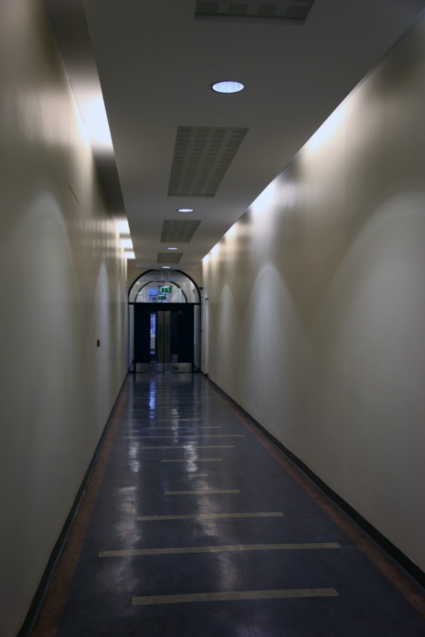
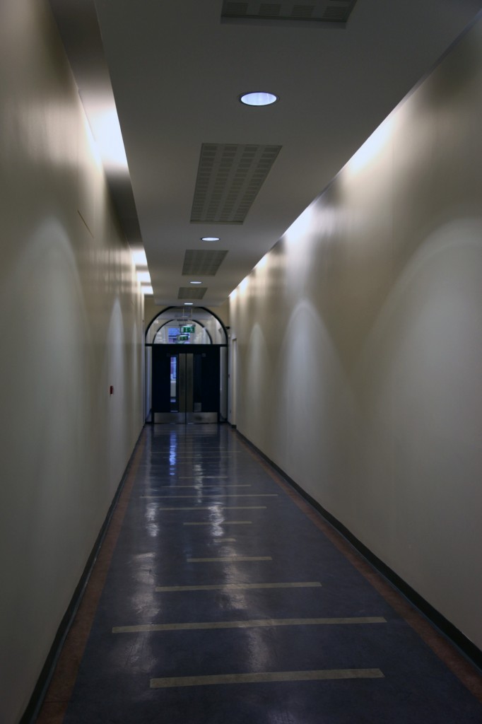
The corridors were perhaps the most anonymous part of the building, especially with the near-mirrored plan of the building’s wings emphasising a feeling of repetition.
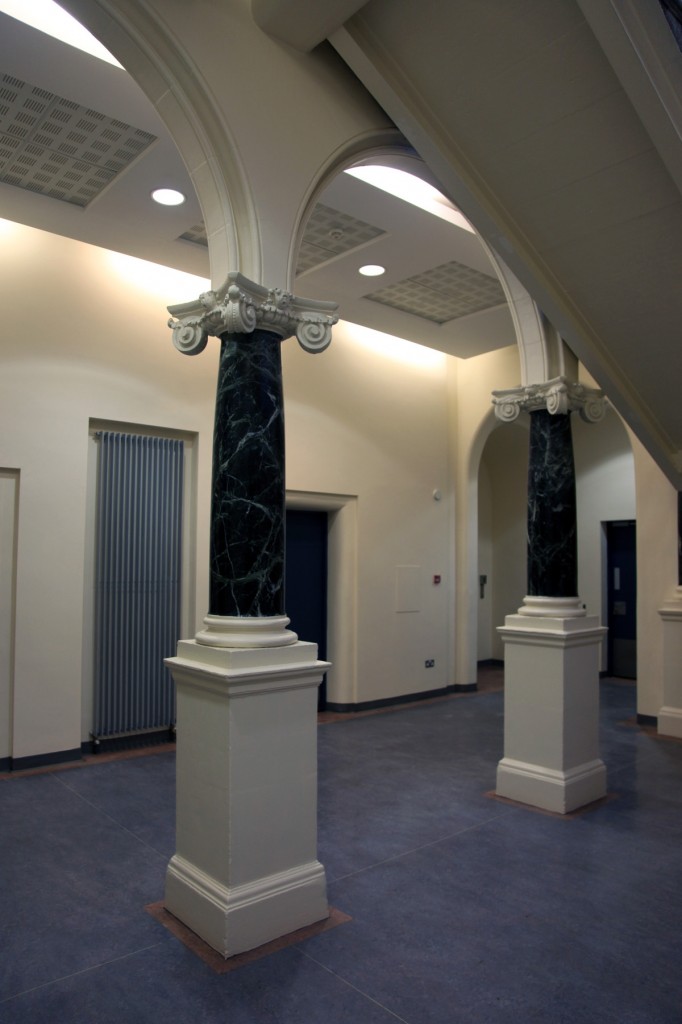
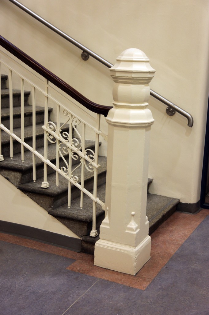
But, like the room with the truss above, something distinctive appeared every time I expected total repetition. On the ground floor at the west side, the stair hall (there’s one in each wing, plus fire stairs, as far as I could see) has this arcade supported on polished marble columns, with rakish, jaunty volutes at the base of each arch. I visited expecting a neutrally modernised courts service building rather than a turn-of-the-century hospital, as exciting as that would have been, and so it was a lovely surprise every time one of these features turned up. With the building up for sale again, it will be interesting to see how it’s changed by the next occupier – I hope they’ve got plenty of visitors to enjoy the entrance, at least.
Many thanks to Adam at Space Property Group for facilitating my visit and allowing me to photograph the interior. I really enjoyed it. The property listing is here if anyone’s looking for an investment with an incredible roofline.

