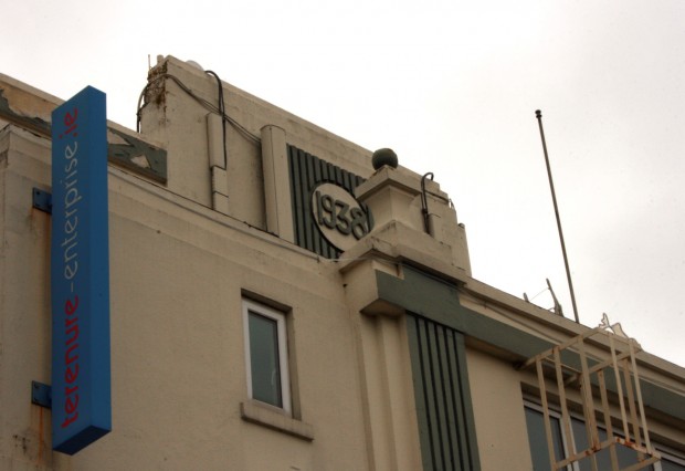
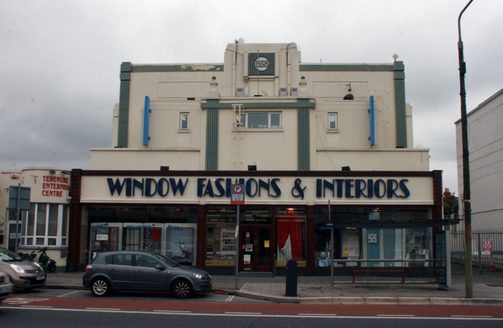
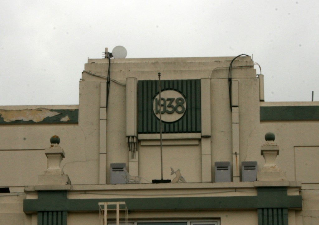
The (first) former Classic Cinema in Terenure isn’t terribly attractive when you take it as a whole, but it’s memorable for the small art deco elements. As a building, it’s still strongly evocative of a cinema.
The Classic opened on 1st July 1938, with Thomas J. Kennedy as the main contractor, though there’s curiously little mention of the architect (architecture trivia: the City Architect, Horace O’Rourke, was there on opening night). It was designed to seat 750 and was noted for its up-to-date projection technology, lighting and heating, as well as having a waiting room for patrons and supplying car parking.
The Classic, along with the Kenilworth on the other side of Terenure, closed in 1976. The Classic’s former manager, Albert Kelly, bought the Kenilworth and renamed it the Classic. The cinema remained open until 2003, best known for its Friday night Rocky Horror Picture Show screenings. Meanwhile, the classic Classic was reconstructed as a tv show room, and sold again in 1983 (apparently having gone into receivership) – local volunteers formed the Community Enterprise Society Limited, and though it officially opened in 1987, the Enterprise Centre began in 1984.
The largest unit is occupied by Window Fashions. It’s great to see a former cinema in use with a long-term tenant occupying the large space fully, especially thinking of examples like the Rialto. Unfortunately, the shopfront is out of scale with the building, especially the huge lettering. Rather than working with the original facade, the shopfront looks like it’s wearing a messy hat and the upper storeys sit in a jumble.
That said, the avocado colour on the trabeated (post and lintel) motif is a nice shade but amplifying the drabness and the strange proportions of the projecting elements: too thick to read as a line, too thin to feel like a frame. The colour gives a great depth of shadow to the fluting, though.
Judging by a photograph in The Irish Press (1 July 1938), the original facade was either entirely in white or in shades very close together, and losing the second colour might allow for a less jarring pairing between the cinema and the shop. The same piece mentions that cardinal red and grey were the ‘predominant colours,’ though this was presumably in reference to the interior.


