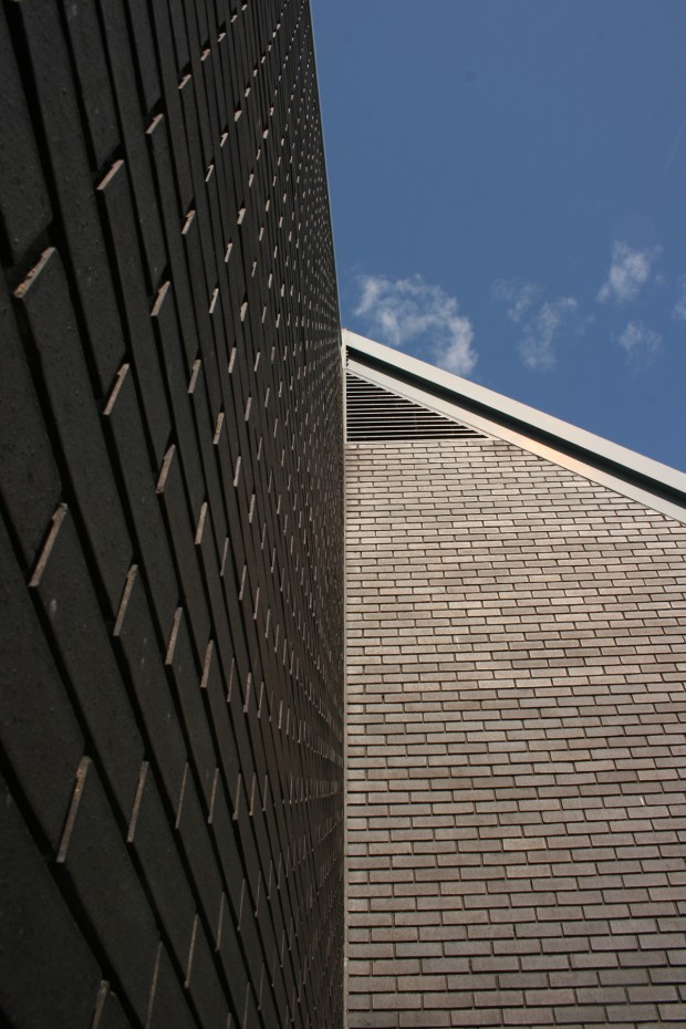
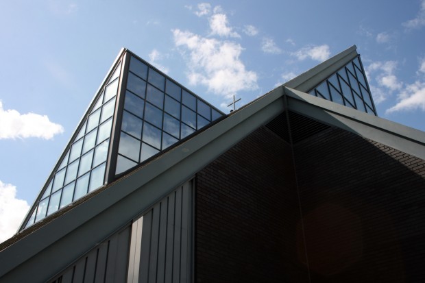
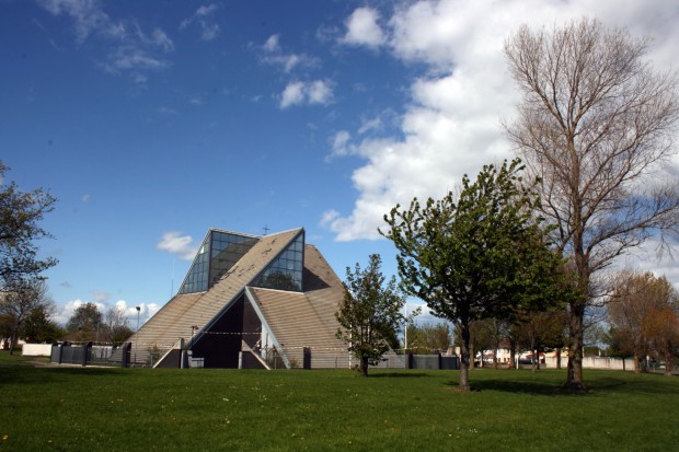
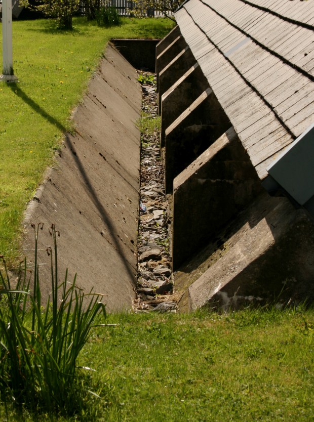
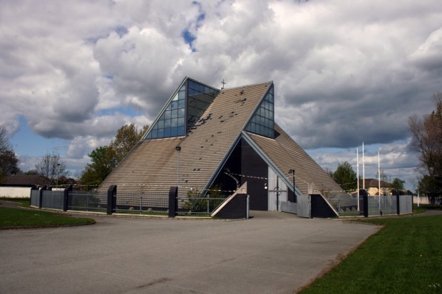
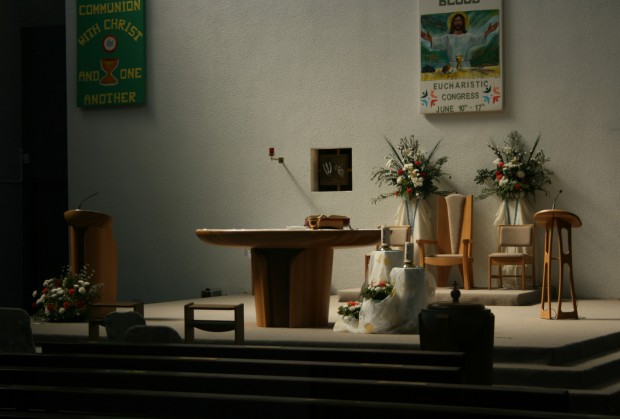
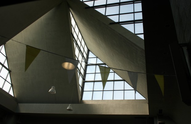
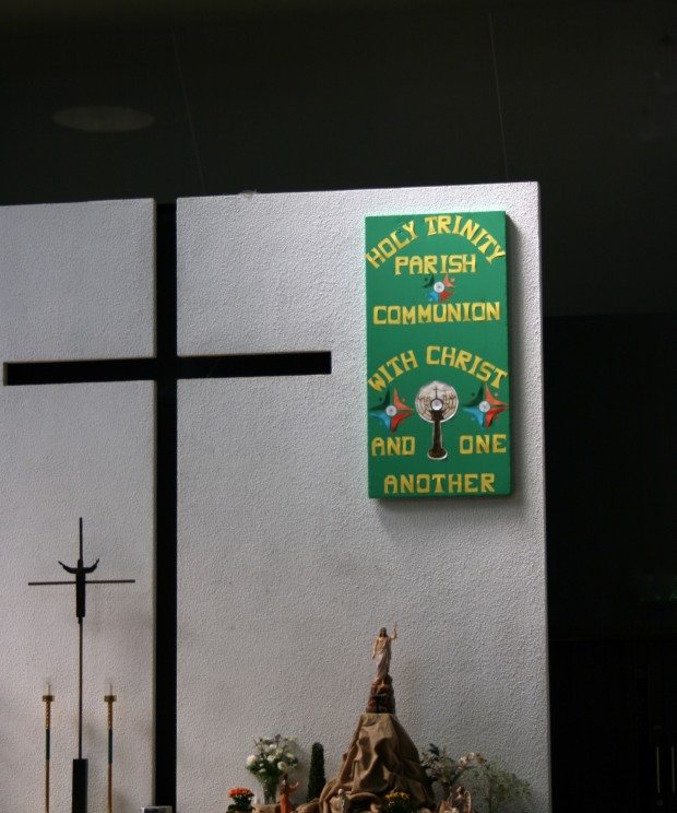
Holy Trinity has a cruciform plan, rising as four angled plates that intersect to create the church’s distinctive sculptural form. It was designed by A&D Wejchert, completed in 1978. Three arms of the cruciform shape are occupied by the congregation, facing the altar at the centre. The screen behind the altar (with the striking cut-out cross) partitions off the fourth arm, which was designed to accommodate the sacristy, a Weekday Chapel, and (on the first floor) parish offices. In terms of organisation, it’s very simple, allowing the dominance of the form to create a dramatic interior atmosphere. It feels bright, airy and focused on the altar.
The church is sited on an open green space, though it’s surrounded by railing and gates. I’d only seen it in photographs from the time of completion and in these, it opens directly onto the small park, but the gates are quite unobtrusive and incorporate the church’s geometry.
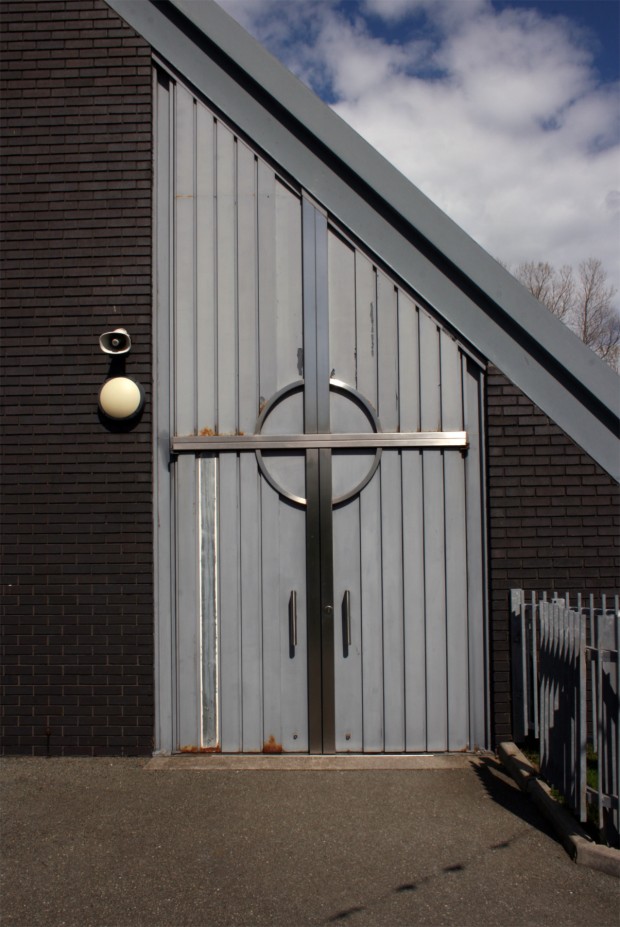
A local resident (thank you!) pointed out a few additional changes, including the addition of timber partitions and the realignment of doors at the rear of the church to provide direct access to the main aisle for processions, and covering the (originally exposed) roof structure on the interior. The modifications seem to be quite sensitive and considered, though – the structure’s impact on the interior is diminished, but it’s still a very beautiful, striking, modern church. By contrast, it made me think of Our Lady of Mount Carmel in Firhouse, where it felt like the changes were made in direct conflict with the architecture, and that’s certainly not the case here.

