In response to excess demand for school places in the area, Rutland Street was chosen as a site for the new Pro-Cathedral schools, designed to accommodate 2000 pupils. A report on a meeting preceding the project (The Irish Times, October 12, 1909, p.5) noted that there were many children in the area for whom the existing schools were not providing, and that the schools at Lower Tyrone Street (now Railway Street) had been condemned by the school inspectors.
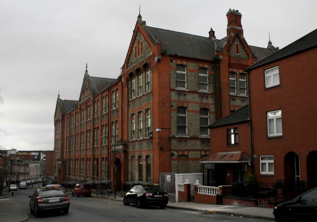
The new building was designed by Ashlin and Coleman, constructed between 1910 and 1912. Christine Casey (p.162) notes that the building is “remarkable in having four formally treated facades,” and the photograph above shows the continuity from the Rutland Street facade to the side elevation.
Rutland National School is still in operation, relocating to a new building in Gloucester Street in 2008. Its former home appears to have been empty since – if there is an agreed purpose for the building or site, I haven’t come across it.
Though the building has seen better days, it remains striking. The symmetry and order is quite charming, even as the building steps down the gradient of the street, like it’s unflappably walking with books balanced on its head in spite of any slope or obstacle. In a sense, it has continued that while the context has been transformed. From 1982, this image from Dublin City Libraries (from a great collection on the area) shows the street looking quite different, after the demolition of the 27 Steps and the tenements in the area in 1981. I hadn’t realised the 27 Steps had been around so recently – my grandmother lived on Rutland Street and attended this school, and I had associated her stories about the houses on Summerhill and the 27 Steps with the same period.
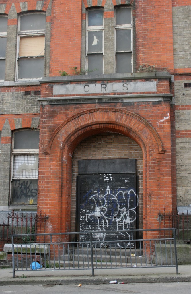
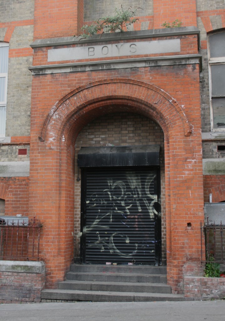
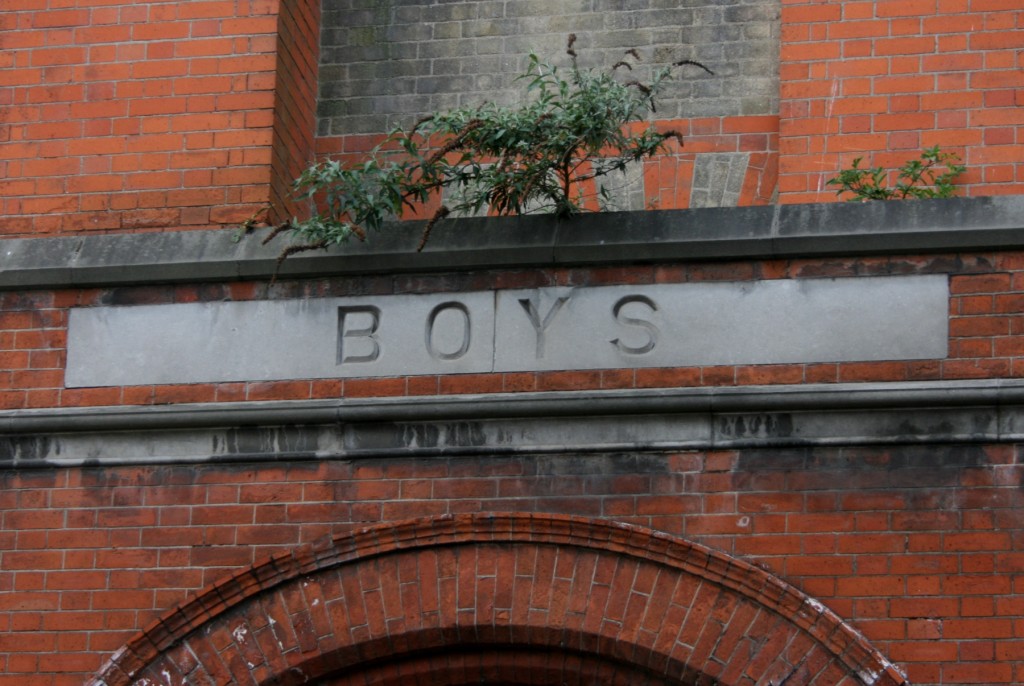
Back to the building. The segregation of the entrances has a certain charm to it (in any context), just in the sense of imposing order on a building even before you enter, and when you view the building’s form from above/in plan, the slightly u-shaped plan reflects accommodation for two adjoined schools. As well, there’s something about national schools’ convention of naming an entrance with a single word that seems like optimal signage, everyone immediately knowing where they’re going and where they should be.
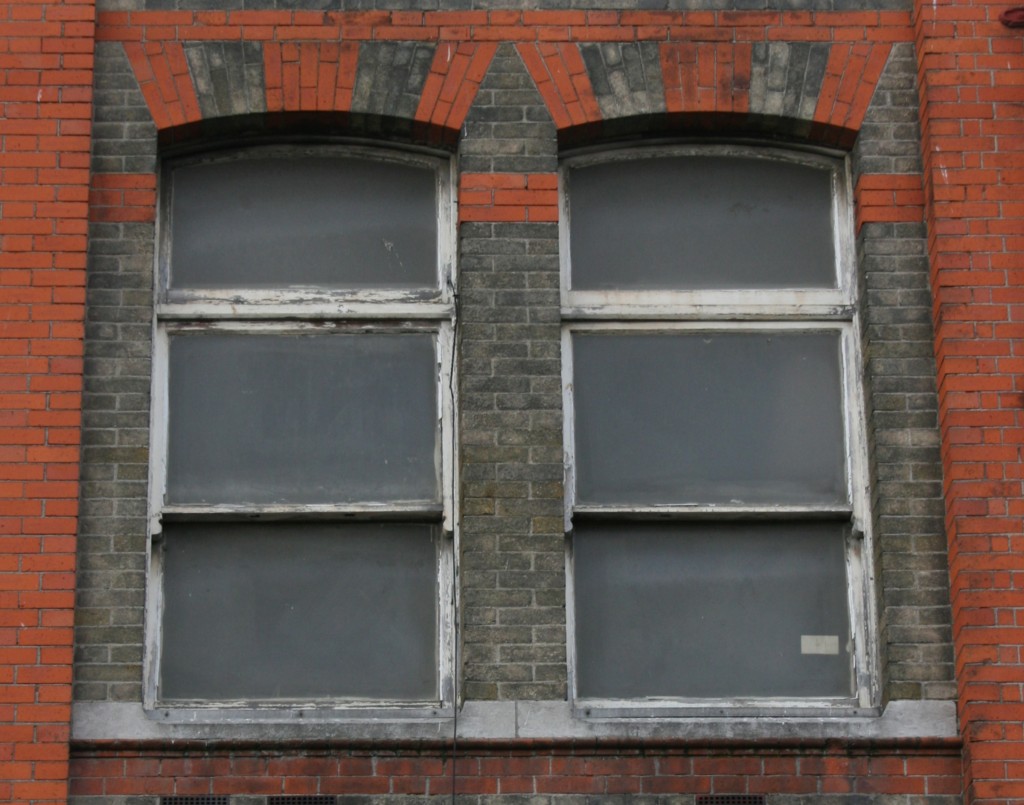
The muddy, subdued brown brick makes the red brick look extremely vibrant, particularly the fanned, sunburst sections above the windows and entrances. Especially on a brighter day, it’s almost as if one aged and weathered while the other didn’t, in spite of the stains and marks to the contrary.


