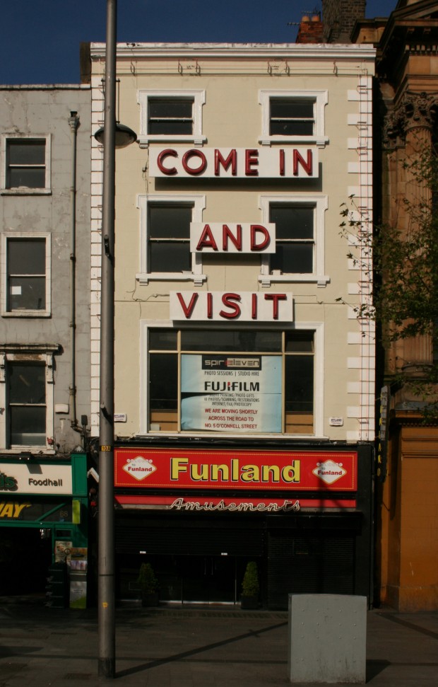
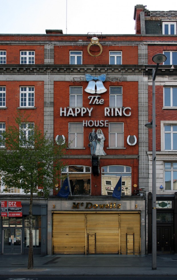
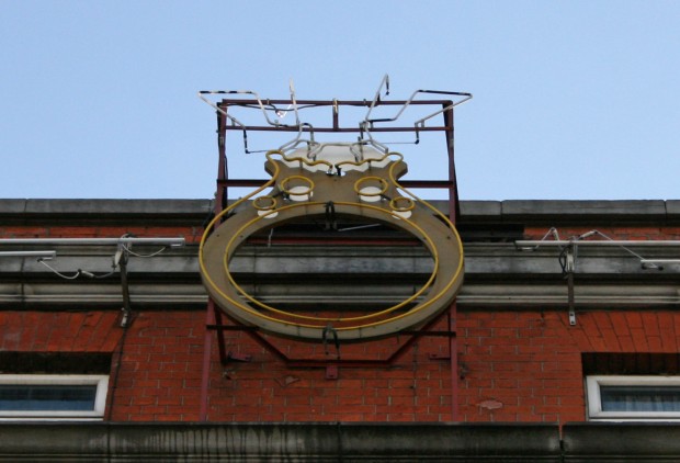
I tend to think of The Happy Ring House and Funland’s neon signage as a pair, though with the former’s sign made by Gaelite in 1952, that’s probably only a recent condition.
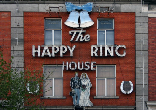
The scale of the Happy Ring House signage is great. Not only does it use the facade like a billboard (a bit like the well-known retailer), but the horseshoes are bigger that the couple’s torsos, the bells are big enough to be used as spinning teacups, and the ring has a rock big enough to be the subject of a biggest-heist-ever movie. Sure, there’s the obvious double entendre, but the size makes that run aground if you stare up long enough.
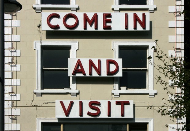
Across the road, its neighbour isn’t as careful with the facade and uses some unfortunate backing boards, but there’s something entertaining about how sweet the message is. ‘Come in and visit’ is, at heart, what most shopfronts are trying to communicate. Both signs turn decent enough buildings into decorated sheds, and like any decoration, that brings you right into arguments about taste – often, arguments about taste wrapped in value judgements. I like neon and this pair are a highlight on O’Connell Street.

