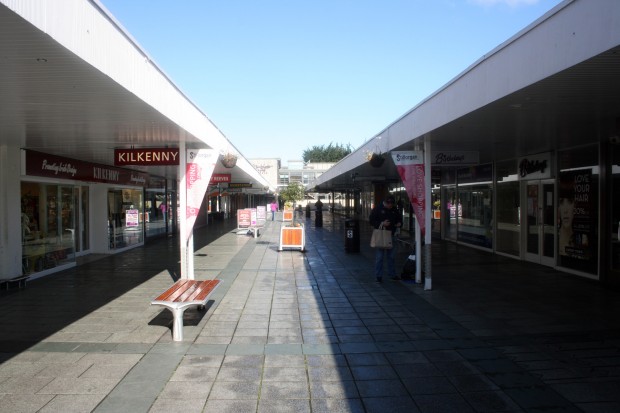
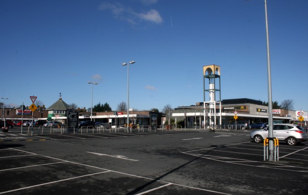
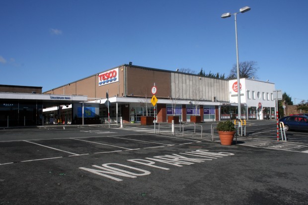
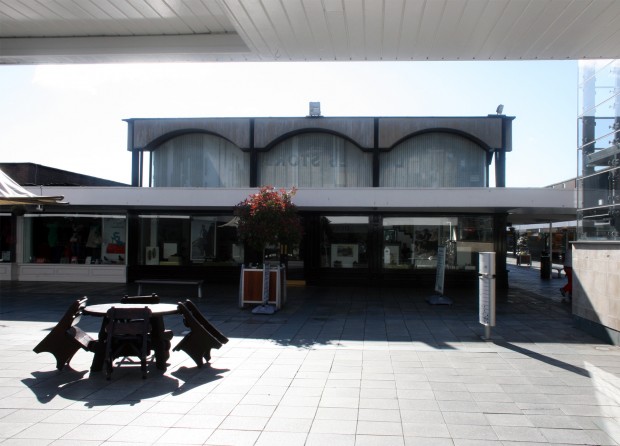
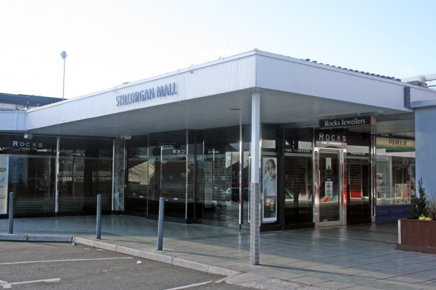
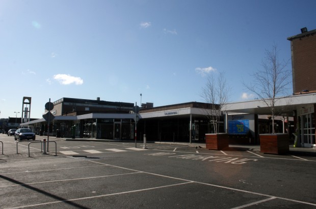
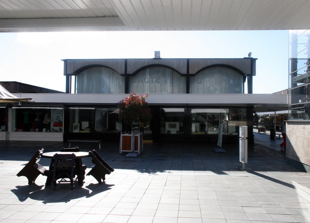
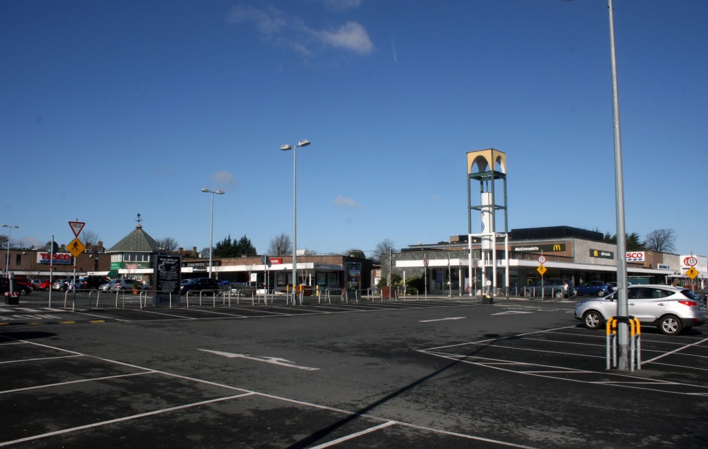
Completed in 1967 and designed by John Costello & Associates, the most striking thing about Stillorgan Shopping Centre is the open-air plan. There’s an L-shaped outer section (with an external staircase to a cafe at its elbow) sitting around a hollow rectangle of retail units facing onto paths, which you can see on Google Maps satellite view below.
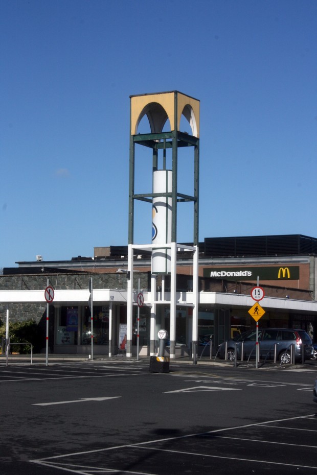
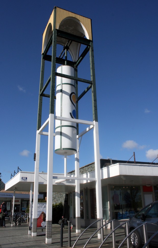
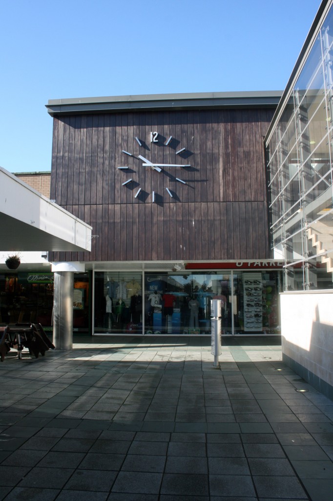
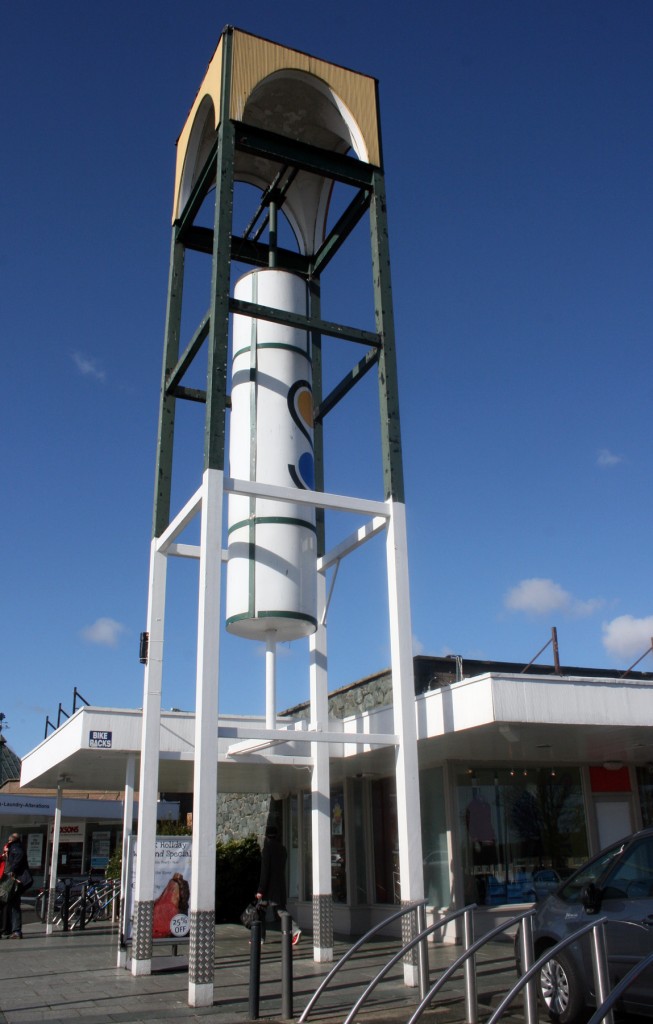
Unlike the hermetically sealed style of contemporary shopping centre design – creeping steadily towards feeling like airports, which have essentially been shopping centres for a while anyway – Stillorgan seems like it was aiming to be a retail village, a place you come to do your weekly shopping without the pressure of having to go into town. It’s the same car-led model as all shopping centres, where convenient parking is the main selling point, but it’s got a big clock, ‘streets’ with paths and planting, and you’re outside in fresh air and real weather.
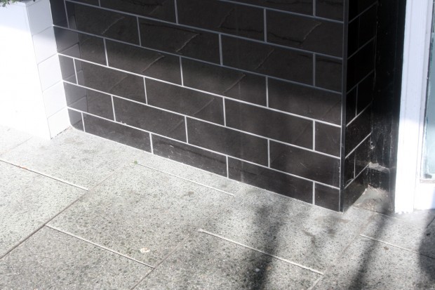
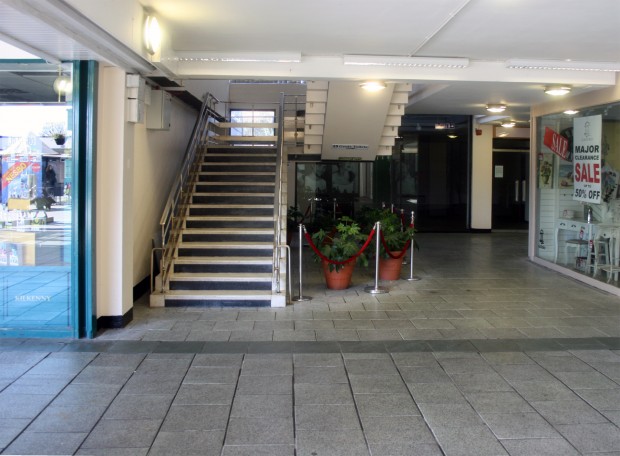
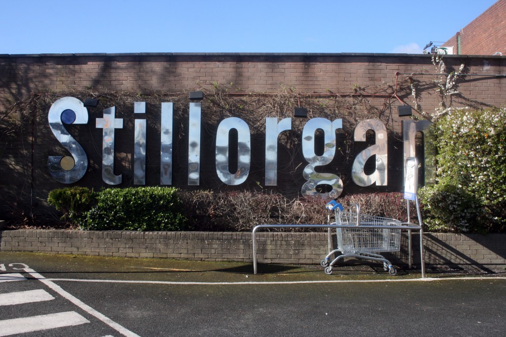
In terms of details or materials, it’s not extraordinary, but there are some nice elements. The chrome lettering on the car park end walls is quite lovely, as is the tower with the ‘S’ logo – it’s iconic and highly visible, so it’s impressive that it’s been spared from rebranding. It’s also interesting to see that some of the tenants have reclad their units, like Bank of Ireland (stone) and recent arrivals Donnybrook Fair (black tiles). The skinny columns beneath the overhang are undecorated, and take up minimal space while lightly defining the route.
Update: Thanks to Shane O’Toole for mentioning that the shopping centre logo was designed by the Kilkenny Design Workshop. Even better.


