
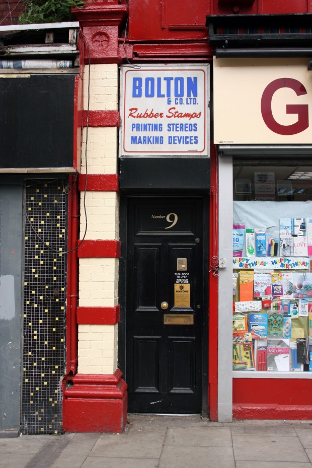
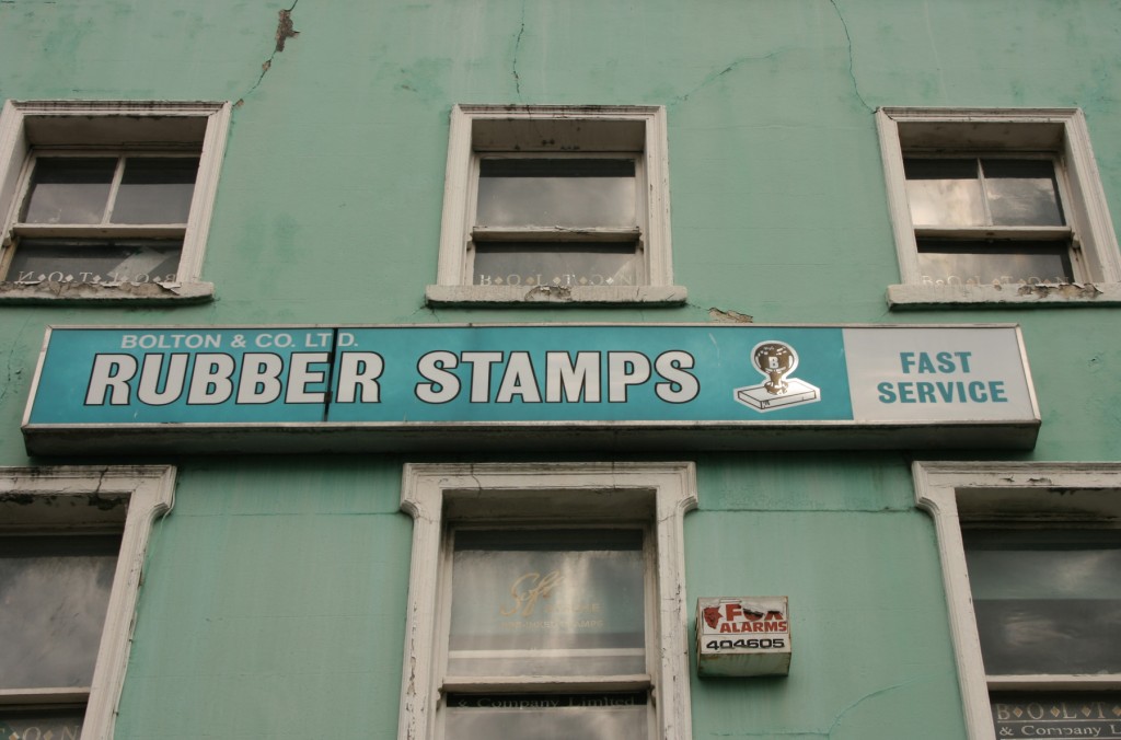
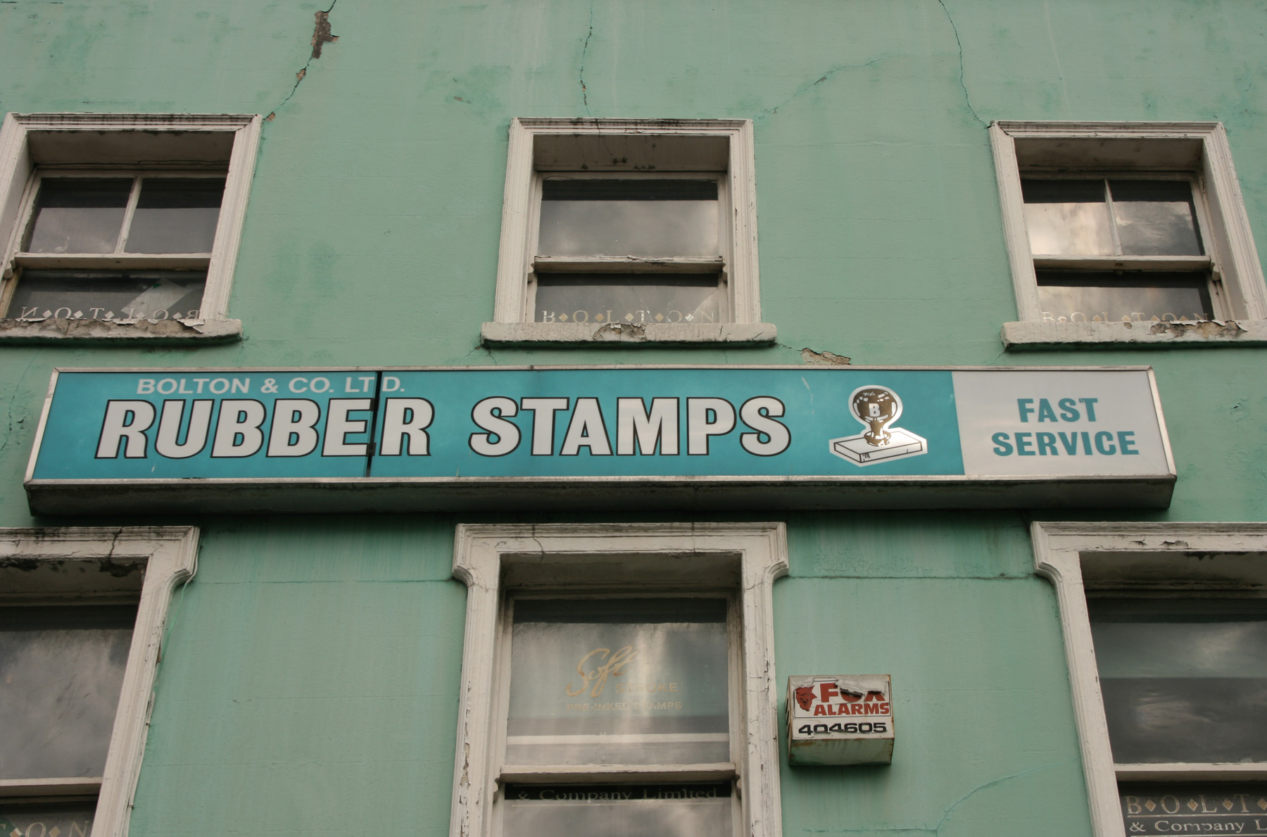
In the middle of the shopfront jumble of Lower Camden Street, Bolton & Co. has two totally separate but equally excellent signs. The first is right above the door at ground floor level: a failsafe white/red/blue combination with their signature product in red italics and the rest in neat capital letters as ordered as a rubber stamp, as if the blue was put down first and the red was added by hand. The border reinforces the stamp effect, even though it’s thinner than rubber lines. (By the by, printing stereos were originally cast metal printing plates, but it seems like there’s a reasonable chance these ones are the custom rubber variety – your own text and logo made into a rubber negative to be used in stamping.)

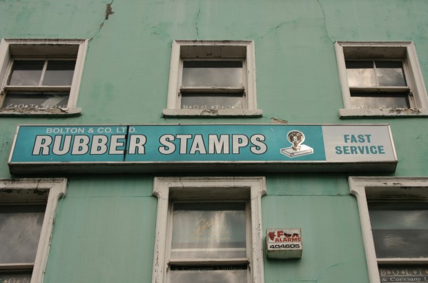
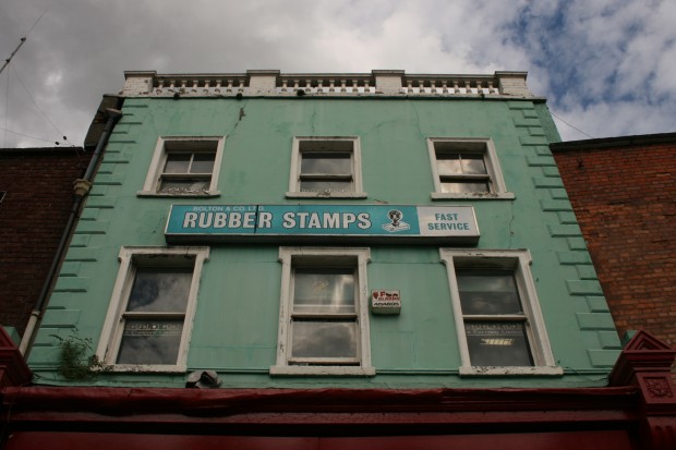
The second one benefits a great deal from the colour of the building, even though both of them look a little past their prime. ‘Fast service’ is a lovely thing to have incorporated in a sign, and there’s a singularity to this that I really enjoy. The more time you spend looking at signage in the city, the more you realise how many businesses are wiping out whatever their intended message was by swamping it with noise. Instead, rubber stamps, a rubber stamp, fast service, company name.
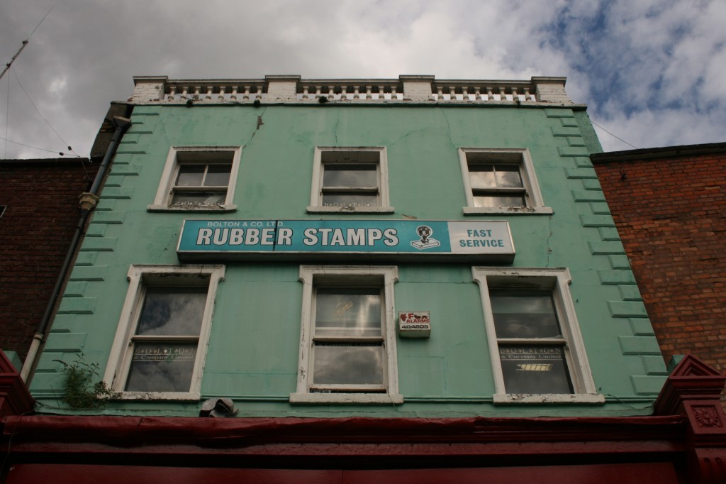
The mint green on the facade and the teal/turquoise of the sign have a lovely vibrant tension between them, set off by the red below and the red brick at each side. Bolton & Co. appear to be here since the start of the 1980s, and it looks like they’re still in action – I’d love to know the order in which the signs came along, assuming they’re of different vintages.