
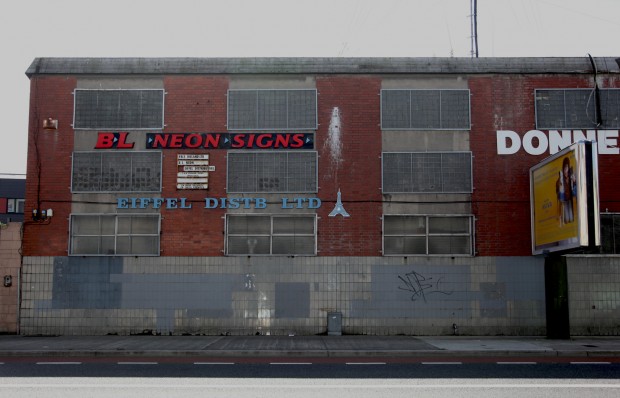
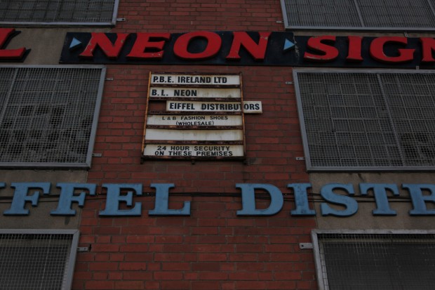
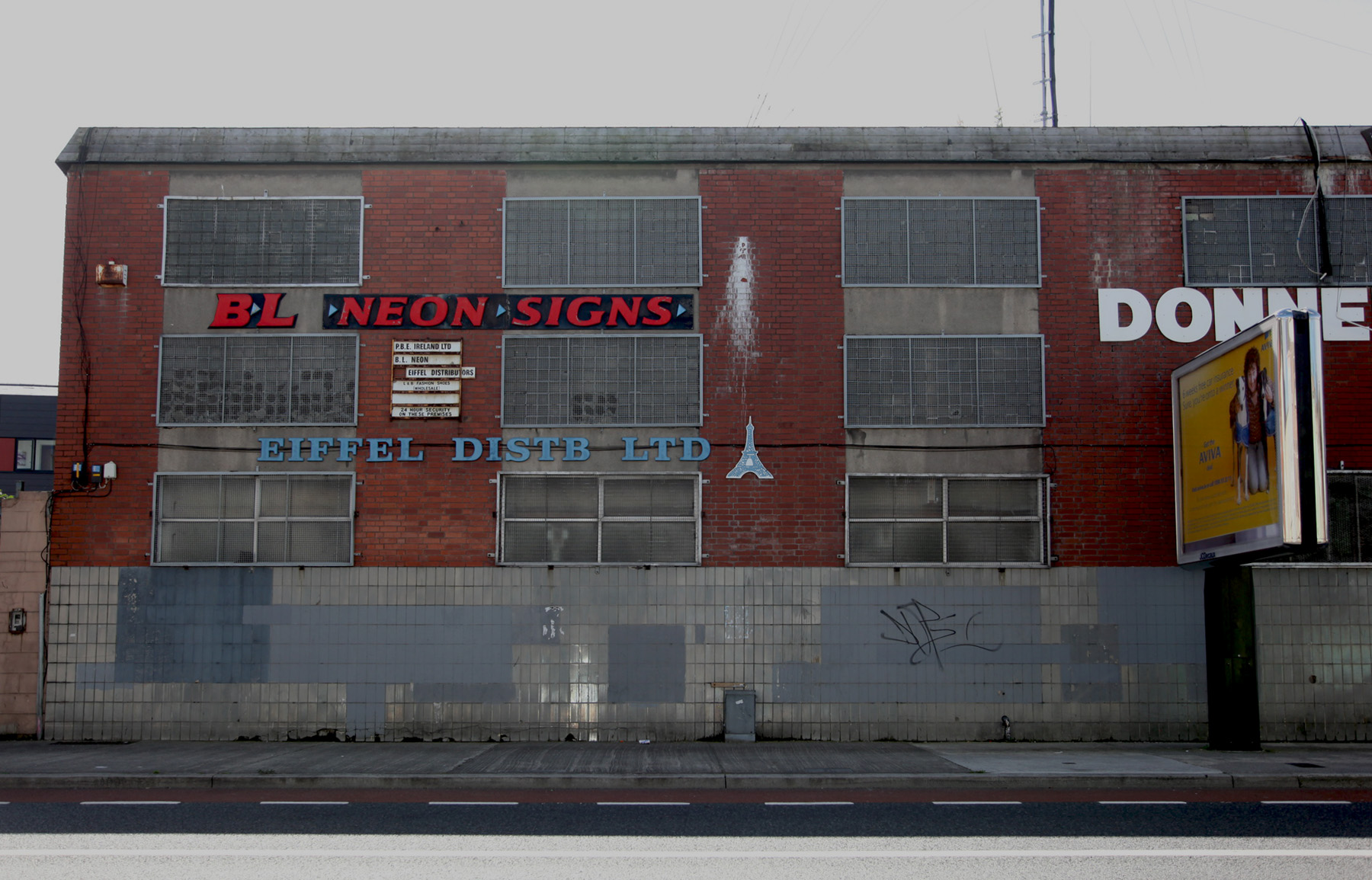
The patchwork of tiling on the Donnelly Centre was probably the first part to catch my eye, but the signs have become the landmark. In a way, there’s not much that should be distinctive, rather than just reading as generic industrial unit signs.

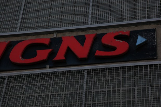
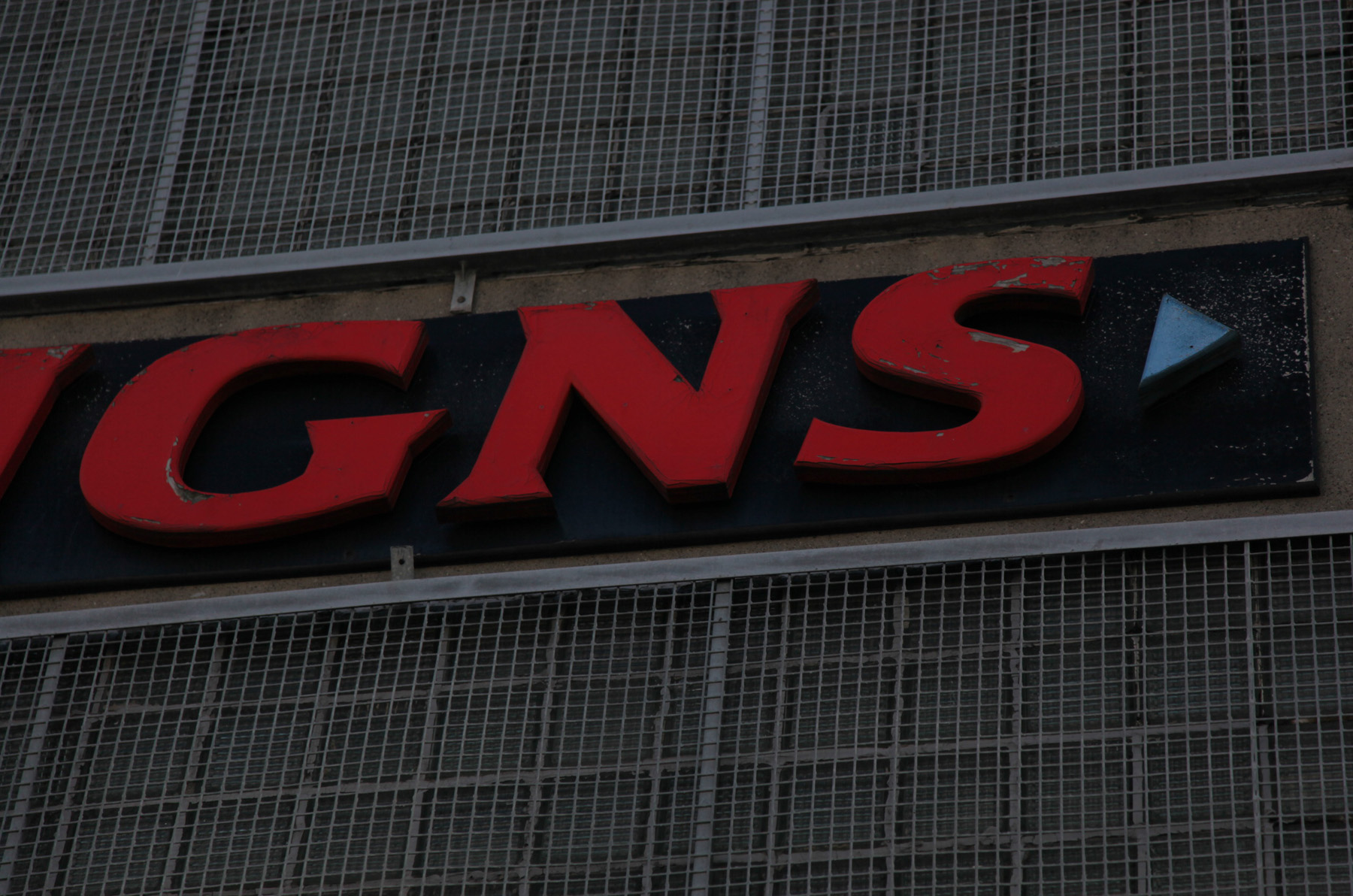
In ascending order, I think there are three enjoyable things about the signs. At the most incidental level, there’s the intensely coloured lettering on the NEON sign, with blue arrows separating the words, and not much neon going on.

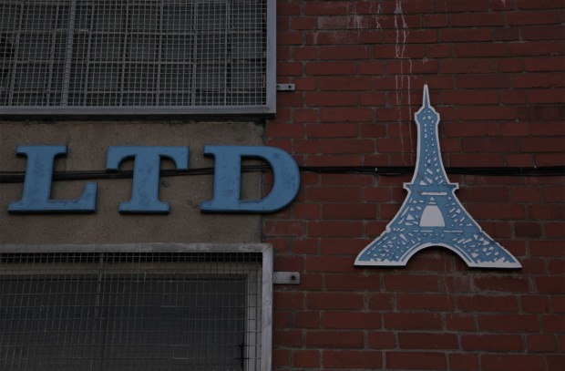
Then there’s the rather dinky Eiffel Tower for the eponymous distribution company.
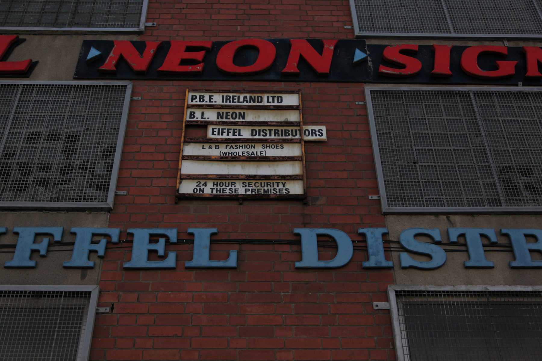
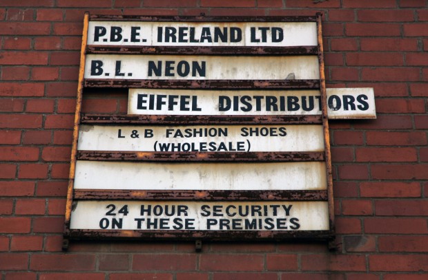
Then there’s the stack of signs – again, entirely ordinary but there’s something about the framework as a representation of the units inside, with businesses slotted in and out as a matter of course. Eiffel is halfway out, and the fifth is empty, and security is a permanent resident.

On a more basic level, there’s a coordination to it, with a similar weight to the letters in the upper sign (though the NEON one is slightly italicised and the serifs are a bit more rectangular) and the two blues matching, and the foolproof red/white/blue colour combination. There’s a harmony to it and they’re positioned with a certain symmetry within the facade. Inevitably, they’re someone else’s eyesore, but they’re a small delight for me whenever I’m on Cork Street.