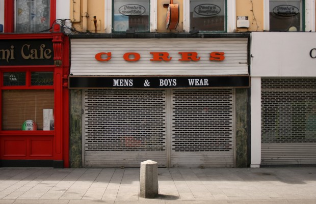
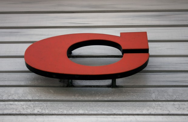
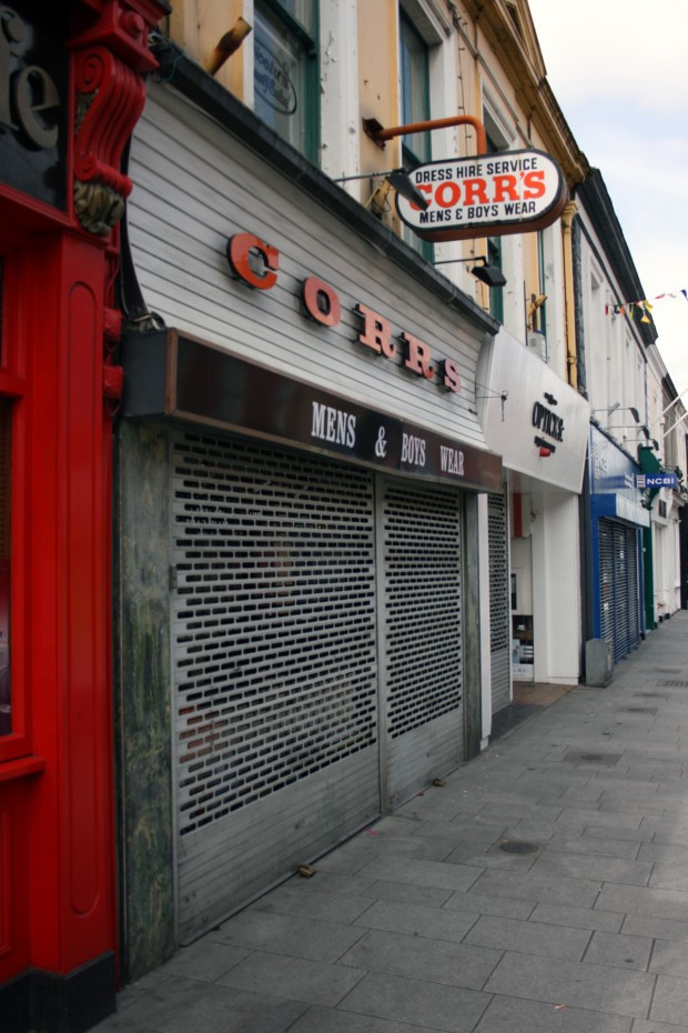
Corr’s looks like it stood still while Dun Laoghaire passed through decades of change. The signboard is concave, with horizontal white slats, giving a textured backdrop to the thick (and slightly unevenly spaced) orange letters. At the base of the curve, the projecting strip gets to business: MENS & BOYS WEAR.
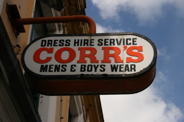
Above the shopfront, the same offering is repeated on the perpendicular sign, a gorgeous capsule shape held out from the wall by a bracket in the same orange as the sign’s edge. We’re up to three shades of orange at this point, but they all look good and might have started off closer in tone. Nobody’s going to mistake it for new, but it might just be that white boards age well, orange ages well, contrast and strong lettering age well.

