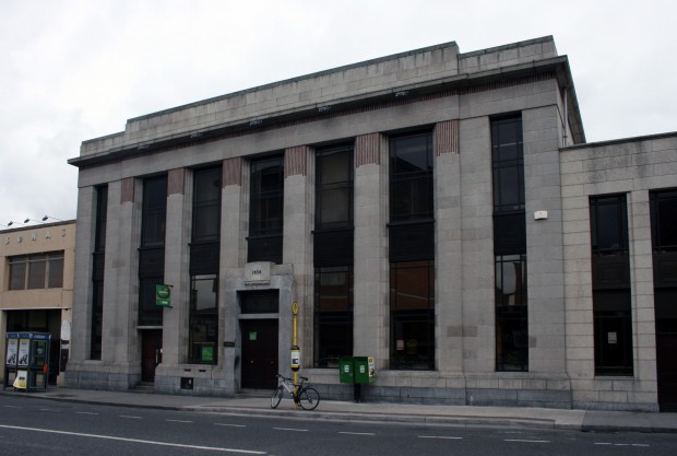
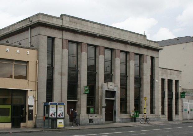
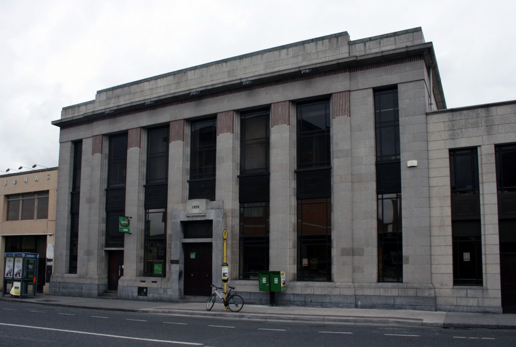
On the lower edge of Rathmines Road Upper, the post office maintains a neat, composed presence on the street. It was built in 1934, designed by Howard Cooke of the Office of Public Works, to replace the earlier OPW post office (1883, by William Howard) on Lower Rathmines Road.
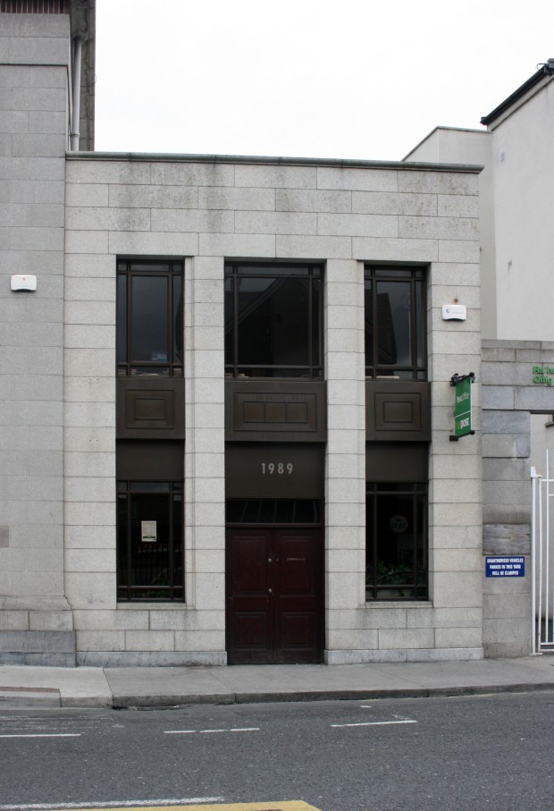
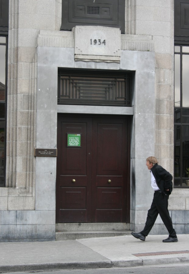
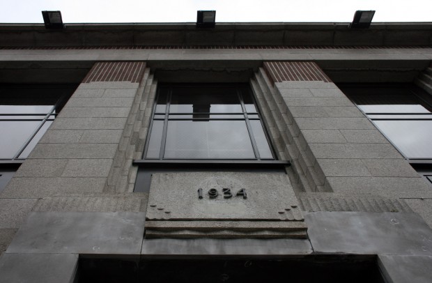
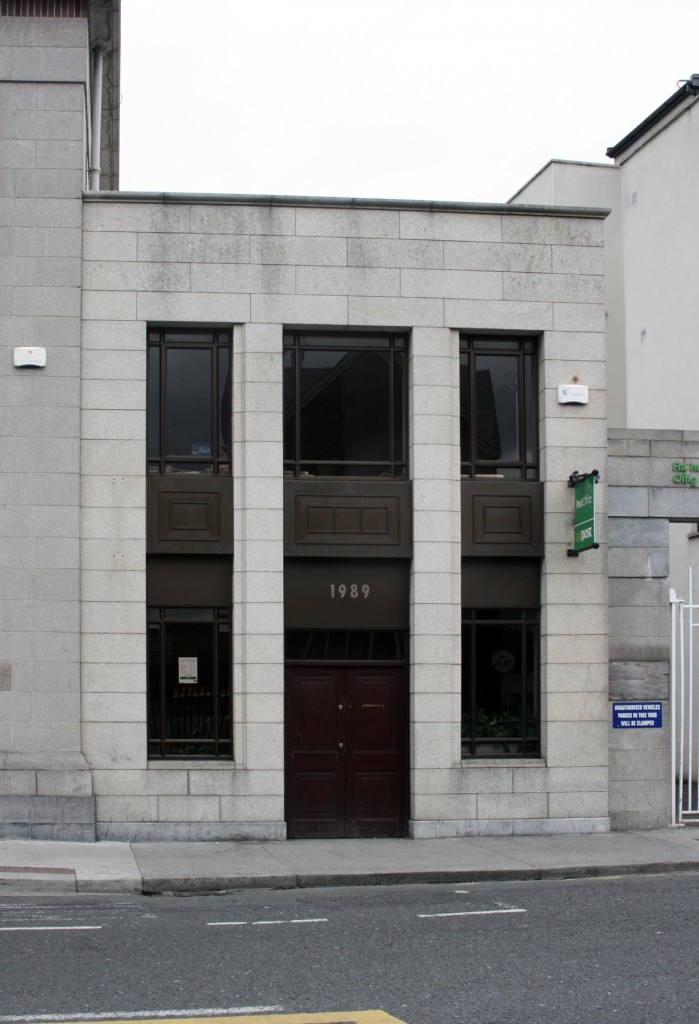
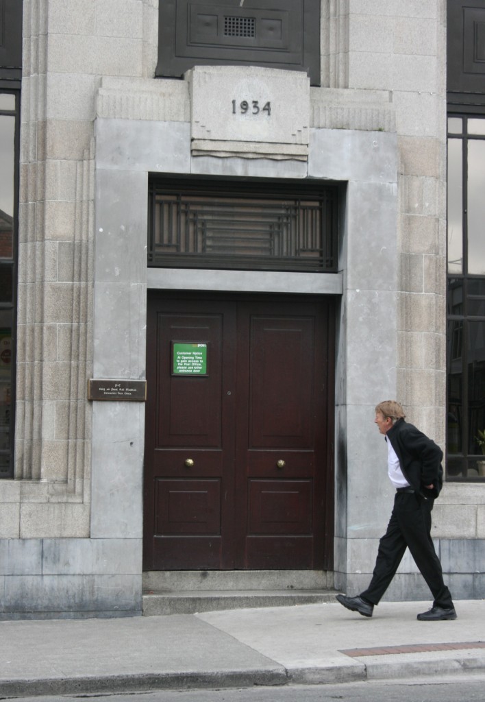
To a remarkable extent, the building today looks as it did originally. I don’t have anything terribly positive to say about the 1989 rebuilt of the last bay on the south side, constructed in a pastiche of the original. Both parts have their dates of construction above their doors, but at least the 1934 section speaks to its time with more than just a bronze date.
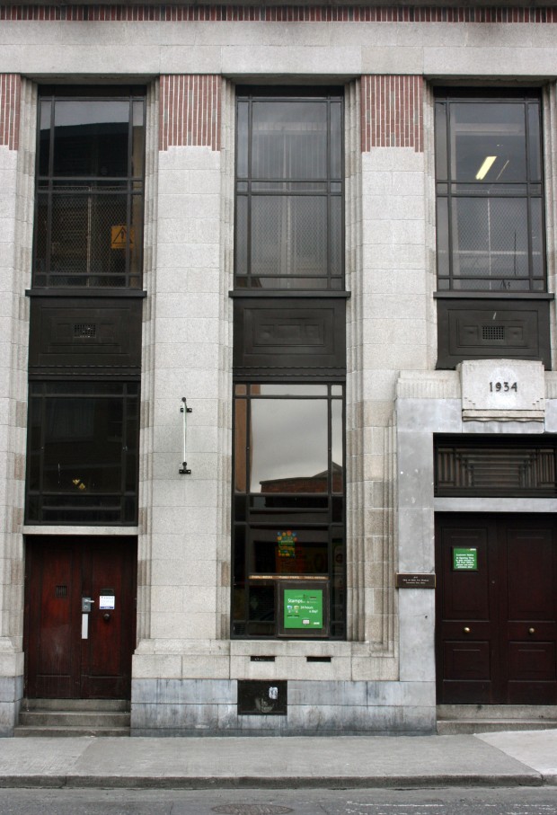
The main entrance doors are original, with the solid outer leaves seen here and the inner glazed pair too, which bear a linear timber pattern in glazing members. (The rest of the interior is mostly modernised, including the counters, but if you’re queueing for a while you might notice the chevron-like pattern on the vent covers.) Likewise, the gorgeous bronze window frames and the solid panels separating them vertically at floor levels are unchanged, and they’re still very elegant. The darkness of the bronze is contrasted by the granite facade, with limestone running along the bottom as a plinth and stepping up to frame the door – not as stark a contrast, but a fluid grounding piece that gives the building an additional richness.
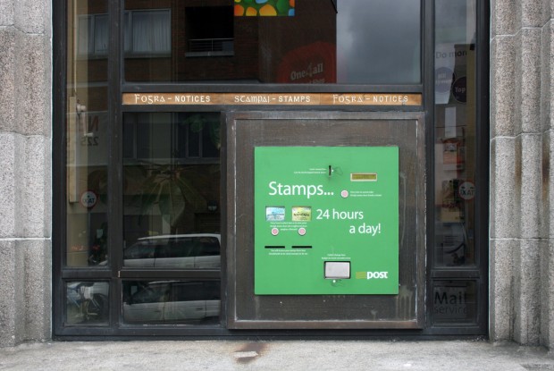
The An Post stamp dispenser is obviously more recent, though the retained ‘Fógra – Notices’ / ‘Stampaí – Stamps’ signage is a nice surprise, as are the two postboxes (no longer in use) beneath this window.
I’ve been enjoying reading Máire Crean’s MUBC (Masters in Urban and Building Conservation) thesis from 2007 on the subject, The Purpose Built Post Office Buildings of the Office of Public Works in Leinster from 1870 to 1947, which you can download as a PDF. Crean compares Rathmines to the later (1947) post office on St. Andrew Street, both as a mixture of classical and art deco, and she meticulously catalogues the typology, context, and development of the buildings as well as presenting an inventory of examples. Among the many details on Rathmines Upper, she mentions that it was built flanked by a shop on either side, with the northern shop now owned privately and the southern demolished for access to the sorting and delivery facilities.
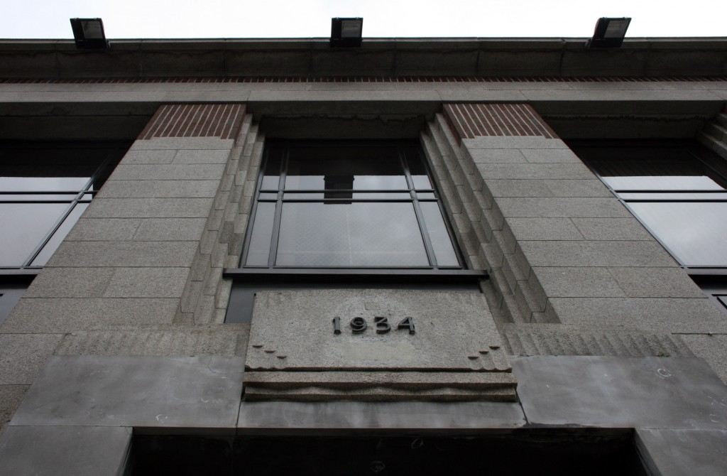
As well as the form and the composition of the facade being satisfying at a streetscape level, there are also lots of smaller details to enjoy too. The stepped stone to either side of the piers and the windows adds a greater density of vertical lines, and the layers of the doorcase introduce fluting in a similar rhythm. Beneath the parapet, there’s my favourite: a thin, vertical course of red brick that’s like a deeply modern acknowledgement of the three dimensions it’s representing, and the taller red brick at the top of each pier. They’re not columns and the red brick is not a capital, but the grandeur of the classical composition gets a nod before the facade does something else entirely.
I walk past the post office almost every day, and seeing the brick is genuinely exciting each time. It’s beautiful, it’s graphic, and it doesn’t seem to mind if you don’t spot it at all. It’s even better that it’s still in use as a post office…even if the jumble of stands and furniture in the interior feels chaotic no matter how quiet it is.

