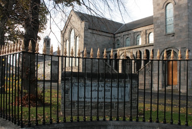
The Church of the Sacred Heart was built as a prison chapel for Arbour Hill, which was originally a military prison (and is now a medium-security prison for men, mostly serving long sentences). On the closure of Collins Barracks in 1997, it also became the Church of the Defence Forces. Authorship for the Church is a little uncertain – it has been attributed it to Joshua Jebb and Jacob Owen, but the Dictionary of Irish Architects and Christine Casey’s Dublin (both reliable and authoritative) suggest otherwise. Christine Casey’s footnote on the subject reads:
“Drawings for the prison, governor’s house and chapel 1846-7 are signed by a Lt-Col. Savage and by Richard Cuming (a Dublin based deputy surveyor). The surname Harvey also appears. A drawing for the military chapel, 1850, is signed by B.R. Baker, a draughtsman in the Dublin office of the Royal Engineers (ex. inf. Frederick O’Dwyer). This discounts a former attribution to Joshua Jebb and Jacob Owen.”
(Casey, p.246)
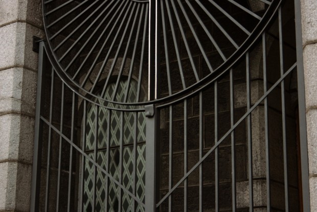
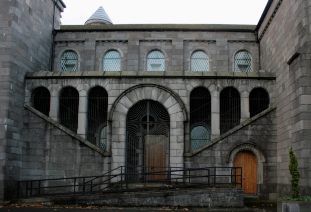
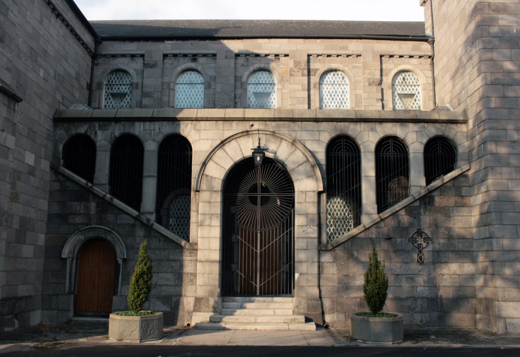
The building is cruciform in plan, with interior galleries at the transept and a pair of towers at the entrance. In between the transept and tower on each side, there’s gallery access via a pair of staircases, arcaded on either side. To the exterior, it’s an open arcade with fine screens, and to the interior, it’s glazed.
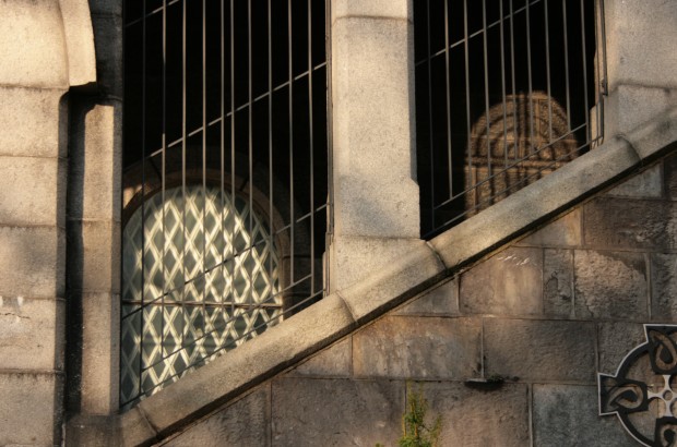
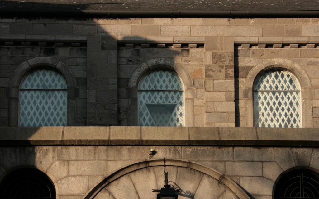
Most of the windows to the interior are lined with these heavy, diagonal, diamond bars, which look like they’ve been made heavier with repainting. The pattern is broken (nearly in-pattern) by a triangular section projecting towards the interior. Presumably, this is for an obvious functional purpose (but I can’t imagine it’s letting in much light, and it doesn’t appear to ventilate?), but it also acts as a reminder of the translucency of the panes, that these are not solid parts of the building even though they feel a bit as if they might be.
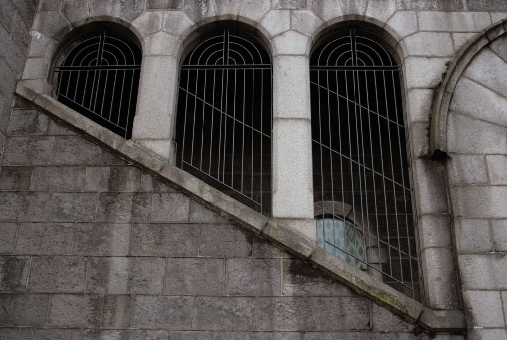
It’s in the overlay of these two screens – the window bars, and the outer arcade – that I found myself getting excited about the building, watching the lines interact. The effect doesn’t seem designed, and it’s not exactly beautiful, but the interplay across these flights of stairs is like movement as you pass around it. The difference in thickness is interesting given the building’s prison function and origin, with the inner bars feeling more like enclosure.
Meanwhile, the outer ones are far more romantic, and there are beautiful things happening with the lines in relation to the masonry and stair pitch.
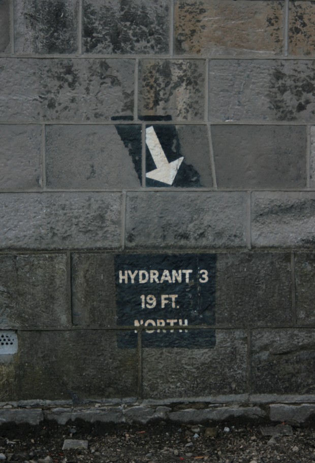
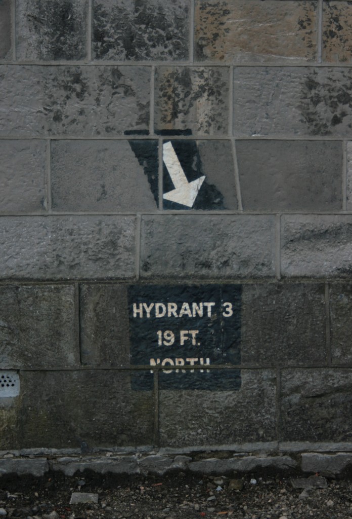
And, rewarding a wander around the building, this small, utilitarian painted sign is totally charming. The building is clad in limestone with granite dressings, and the pointing (mortar joints between the masonry) seems very unfortunate and heavy-handed. It looks like ribbon pointing (which projects from the wall) to me, though maybe it’s actually flush – I’ll go with ‘unfortunate and heavy-handed,’ either way.


