

Though the Invisible House has an address in St. Patrick’s Cottages, it’s only really visible from Tara Hill Road and Grove. The house, designed by ODOS and completed in 2008, takes the lower half of a long garden and builds a house into its wall, sinking the building half a level to allow for two levels of floor space while also staying within planning constraints. There are plenty of images here if you’re curious about the interior – having not visited, it’s hard to be sure, but the plan seems to make disappointingly little use of the curve.
I’m slightly familiar with the road but didn’t fully understand the house’s relationship with context until I’d visited again and compared the aerial view. At several points within Tara Hill, the end-of-terrace condition looks like this:

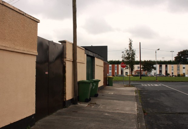
A curved wall sits in line with the footpath, while the house sits rectilinear behind its cake-slice front garden. Some of the smaller houses sit on the street directly, rectilinear but with a curved footpath that gets a little pinched for the corner. Each house has a garden, and then there’s a narrow lane providing rear access. Straightforward enough. The curved path threw me from noticing the difference when it came to this house’s site: St. Patrick’s Cottages aren’t back-to-back with anything, they have longer gardens, and Tara Hill Grove is their rear access.

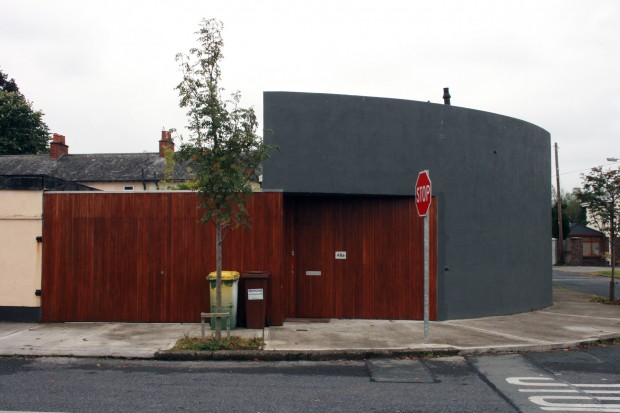
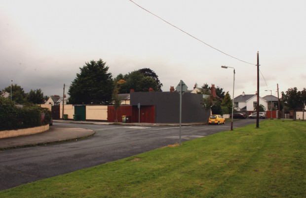
Once the rear-access context was clear, the massing and mews style from the Tara Hill Grove perspective made absolute sense. The timber surface stays flush with the wall long enough to be a garage door, then the solid rendered upper level passes over before the lower plane steps back in to create a sheltered threshold and entrance. It’s neat and looks well, and there’s a good balance between holding the street line and allowing the recessed space to give the house a presence on the corner.

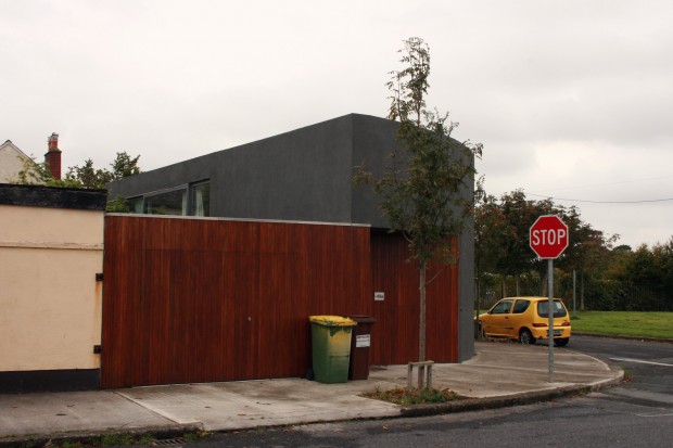
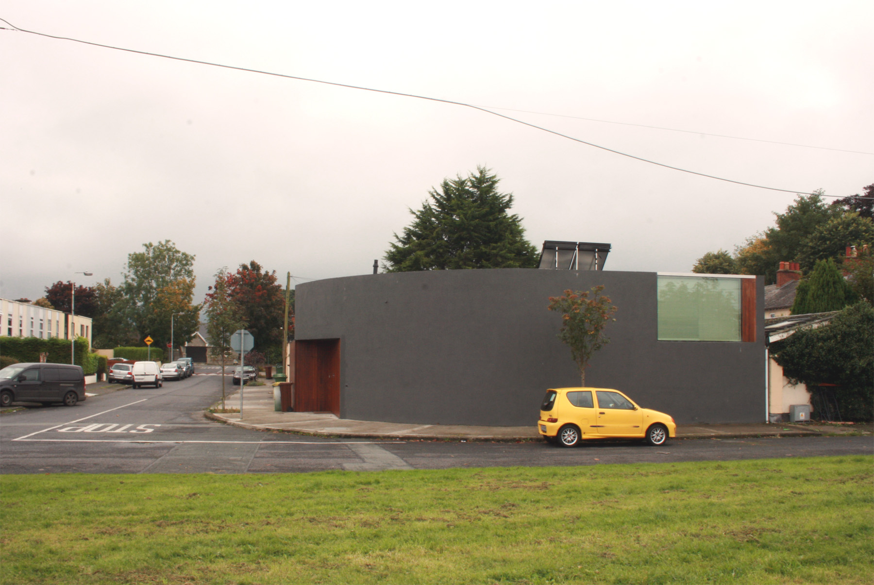
Approaching from the opposite corner, the house is much more visible, but it’s still neat and offers more interest than a blank gable end, with flush glazing giving a sign of occupation to the exterior and offering a view over the green to those inside. The dark render marks the house as contemporary by contrast to its neighbours, sitting well with the house’s other materials, but it’s also robust and unassuming.

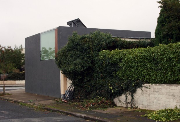
Within the site, the house is as open as the outer face is closed, glazed on both floors and presumably leading to a very bright, sunny interior with a view onto its minimal garden. I like the house’s introversion as a response to the site – elsewhere, it might be hostile, but here it’s keeping as much of the corner’s non-residential character as possible without imposing the effects on the interior living spaces.