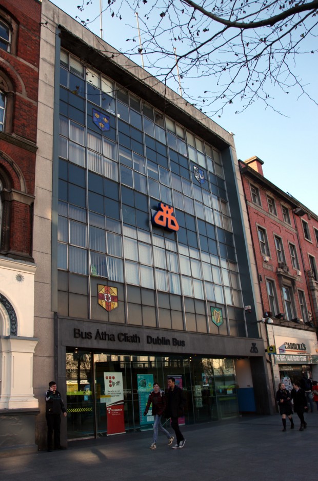
The Dublin Bus offices on Upper O’Connell Street (constructed originally for Córas Iompair Éireann) carry a certain amount of association from their line of business, for me – I’ve found them useful, but they haven’t necessarily been an exciting surprise in the city. They’re good qualities for buses.
In a building, maybe we want more, but the infill (completed in 1959, designed by Brendan Ellis) has been growing on me. The public offices on the ground floor are within a neat shopfront on the facade, and the upper storeys clearly read as offices, with a charming one-and-a-half measure to the clear glazing on the piano nobile relative in keeping with some of its neighbours.
Christine Casey (p.216) describes it as being “among the earliest pre-stressed concrete framed works in Ireland. Its front reads like an attenuated granite proscenium arch, framing four tiers of glazing with deep aprons between.” Lovely.
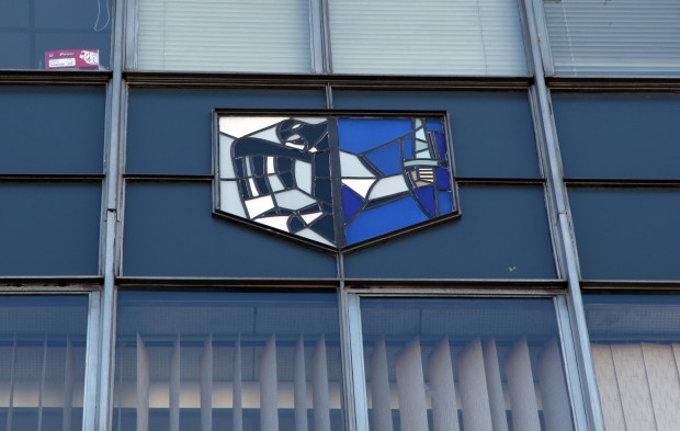
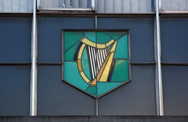
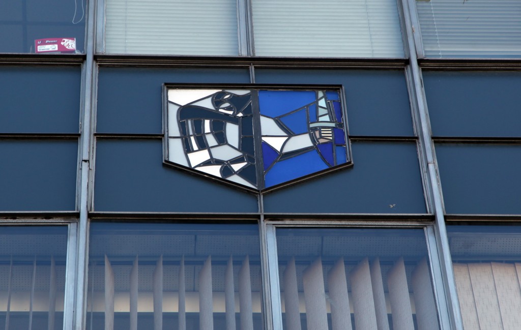
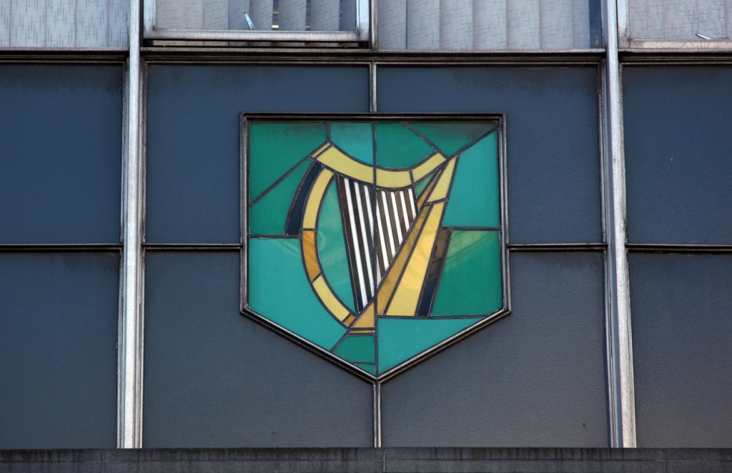
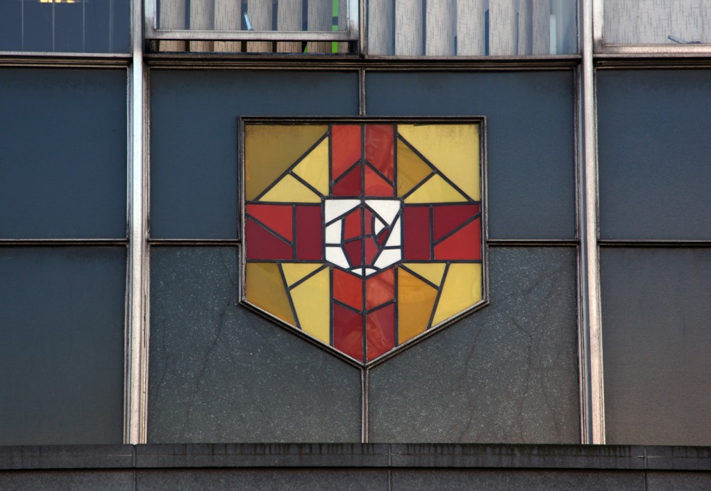
The part that’s getting under my skin is the series of stained glass crests or flags, one for each of the provinces: Ulster (red hand), Connacht (eagle/sword hand), Leinster (harp), and Munster (three crowns, representing the kingdoms of Thomond, Desmond, and Ormond). The symbols are probably more familiar to anyone with an interest in sports, but for me, they’re a hazy memory from the cover of exercise books, and they provide a short guessing game.
Putting the crests on the facade seems at once like the shamrock phenomenon – a little bit ‘our building needs decoration, what are we supposed to use?’ – and also entirely appropriate for CIE’s country-wide transportation network. It’s slightly anachronistic now that the building just serves Dublin, especially since the change into separate companies wasn’t so dramatic from a customer perspective as to be unforgettable.
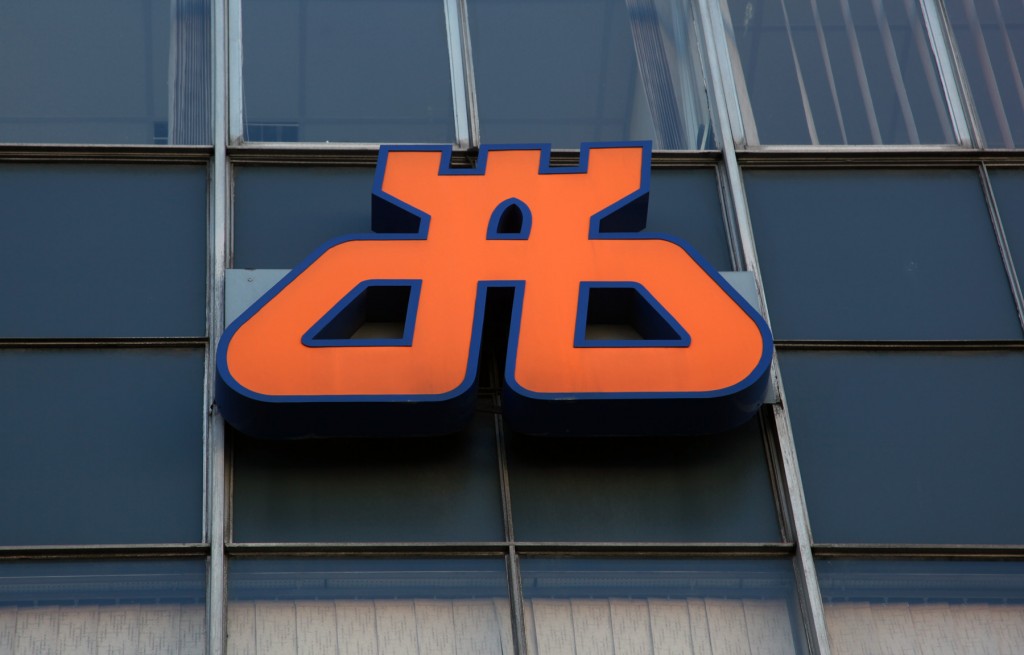
In that context, the Dublin Bus logo is quite interesting – the one on the facade is the current logo, which was a development of the initial (1987-2000) logo. I’m quite keen on the abstraction of the Dublin castles insignia into the loop of a network, one of those symbol-with-a-story cases where it’s naff and still great in spite of that. It’s a facade and and not a badge collection, but they’re very prominent on it.


