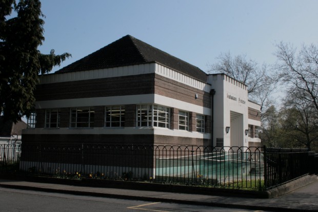
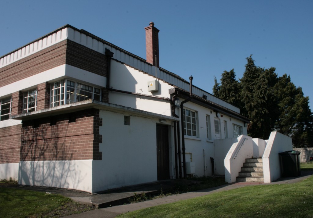
The public library in Drumcondra is a freestanding building, surrounded by a lawn and facing onto the southern end of Griffith Park. The wider area is perfectly nice, but the pairing of these two amenities makes the curved end of Millmount Avenue seem like a patch of civic paradise: handsome, full of things you can do for free, lined with big trees, and with the sound of kids playing in the background.
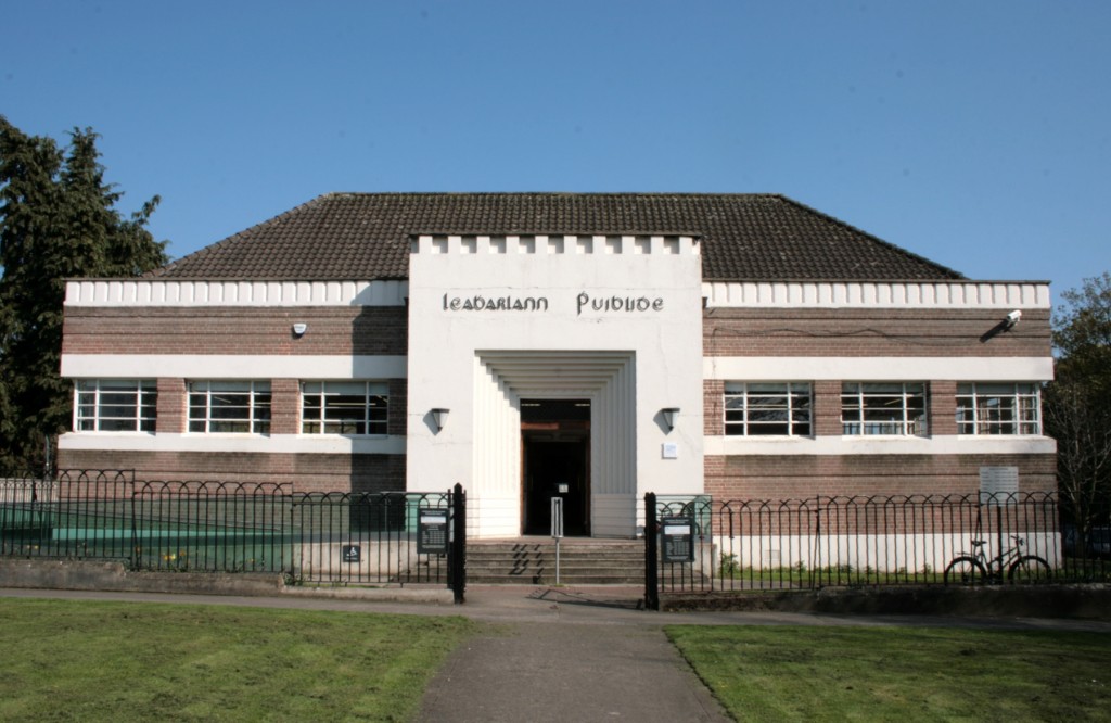
The building is attributed to Robert Sorley Lawrie, a Scottish architect working in the City Architect’s office under Horace O’Rourke. Lawrie designed the library at Inchicore, which is extremely similar to this one. The project went to tender in the middle of 1935, and was opened in February 1937. In 2009-2010, the library was closed for a period for refurbishment and extensive work on accessibility, including a new access ramp.
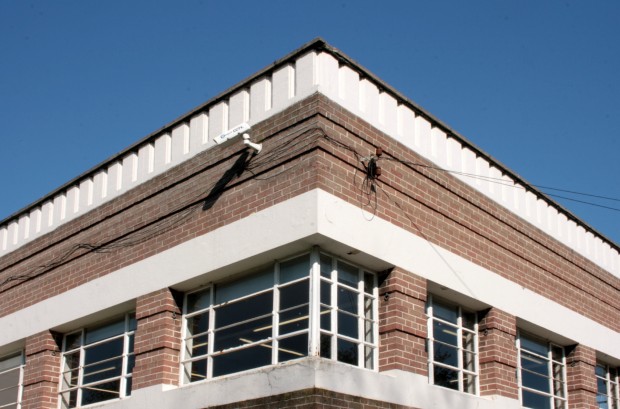
Drumcondra was one of four new branch public libraries built at the same time, all originating from the City Architects’ Office – Inchicore, Drumcondra, Ringsend, and Phibsborough. The first three are extremely similar, with the same brick and render bands, the parapet rising to make the roof appear to be set in deep, and the strongly expressed portal at the entrance.

If you were going to make a library icon to repeat around the city, it’s a pretty good one. The form is simple, and the emphasis on the entrance feels important for a civic building: if you’re going to highlight a feature, this one is the invitation for everyone to come in.
It is a strangely three-sided building, given how exposed all its elevations are. Were the bits and pieces to the rear added on? I’d love to confirm this, and when, as it’s such an odd contrast to the singular form from any other side.
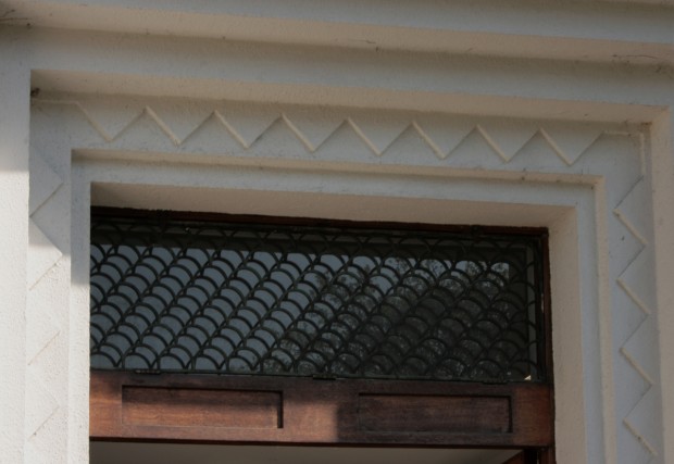
Two of my favourite aspects of the building are in lines changing planes. At the portal, the rendered plane steps back and back and back to reach the entrance, with a zig-zag pattern framing the doors.
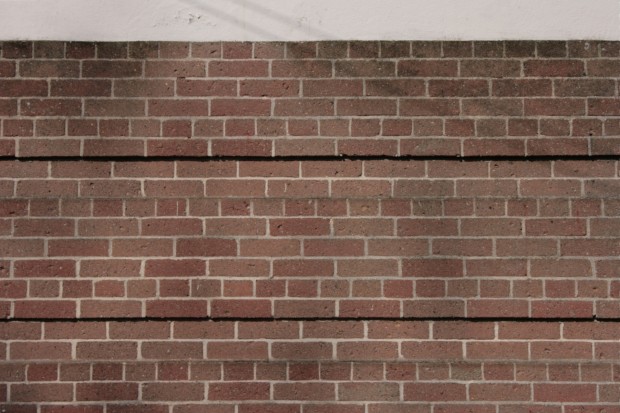
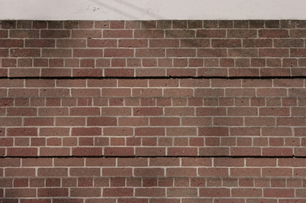
On the brick bands, there’s a repeating pattern of a pair of courses being recessed – most obvious at the corners, but otherwise mostly presenting as the shadow beneath the small overhang above. On the upper brick band, which is narrower, they’re closer together. I think it’s the texture that makes this so appealing, with the building scored and fluted and banded away from being a smooth box.
The spacing on the lower band makes it feel more solid and chunky than the upper band. It feels firmly planted right here.

