


There’s no world-weary pretension like 90s world-weary pretension, and correctly or not, that always seems like part of the cultural carbon dating of “there must be a German word for that.” Every time you say it, you’re invoking “Evian is naive spelled backwards” and the neologisms defined in the footnotes of Generation X (McJob, Dorian Graying, veal-fattening pen) – not bad things, but inextricable ones.
All the same: on derelict stretches in Dublin, I find myself simultaneously admiring elements of what’s there now, and looking forward to them being razed and replaced with part of the living city, like looking forward to a kind of net-gain nostalgia or a building-specific readiness to be heartbroken. There must be a mumble mumble mumble, right?
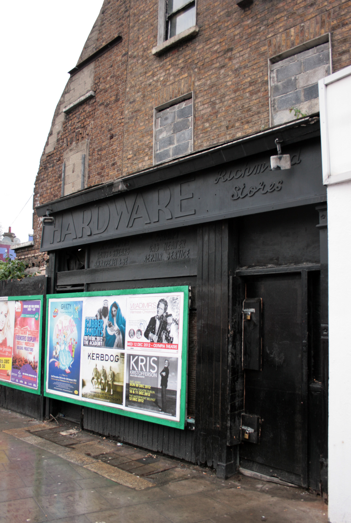
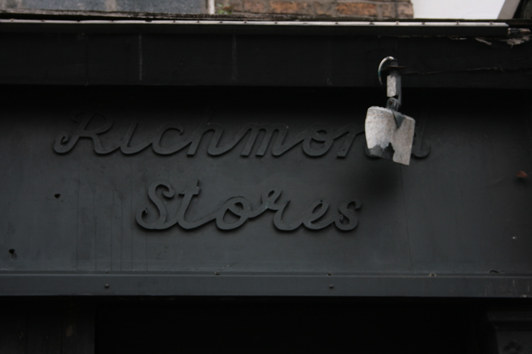
The former Richmond Stores projects out from a blocked up brick house behind, and like its active white neighbour, it’s like a shelf pulled out of the building. It’s covered in advertising hoardings, with the door kept accessible, and begins to blend into The Bernard Shaw’s adjacent stretch of colourful street art and paint-splattered pavement. Richmond Stores is blacked out and muted, while the street art beside manages to activate a blank boundary, and the contrast is interesting.

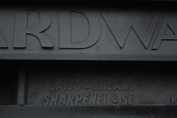
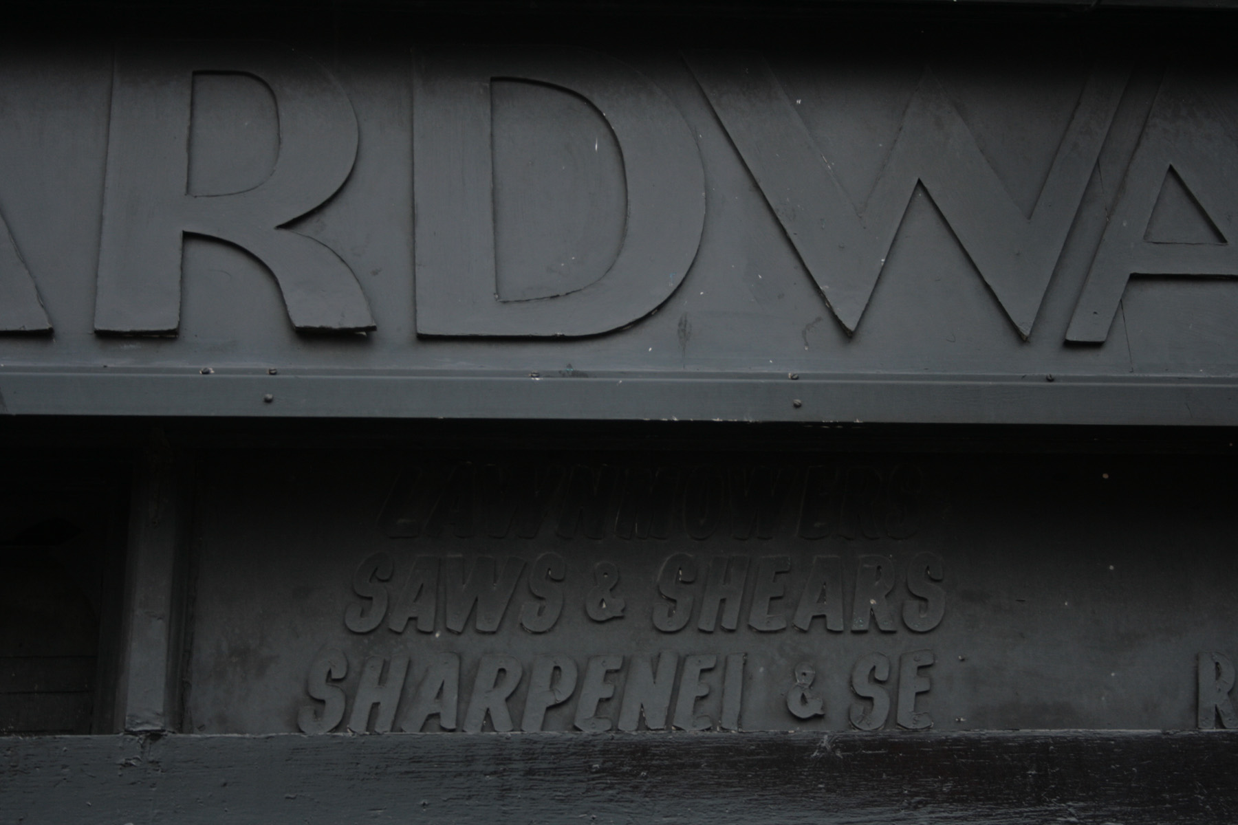
I quite like the muting, though. Painting the entire surface black and covering all the signage gives it a smart, unified look in spite of the many different types of lettering involved. The main business of the sign gets big, crisp uppercase letters, and the shop name is in a fiddly, slightly irregular cursive that’s calling out to be traced without lifting your hand, involuntarily tactile.
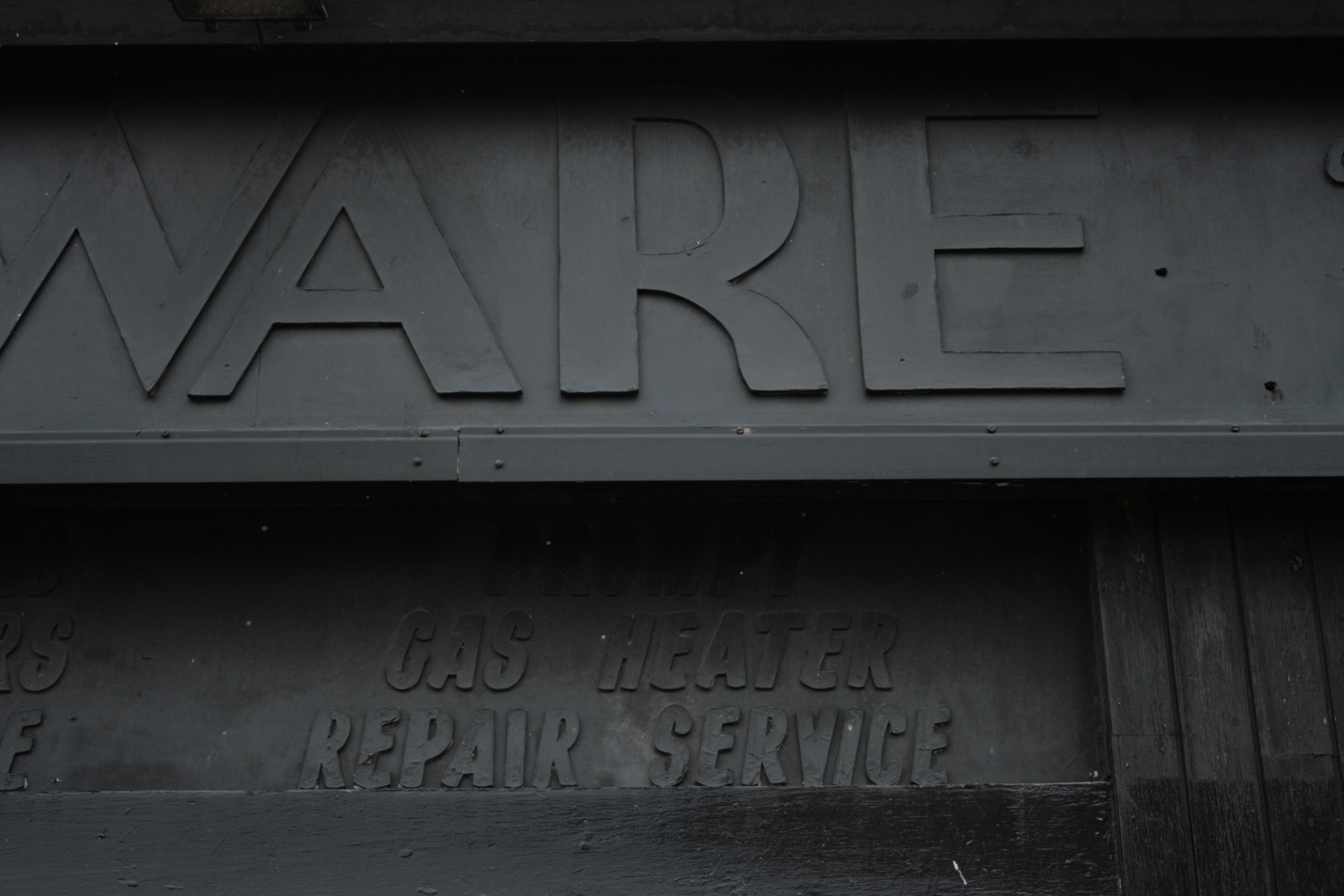
Below the board, bouncy letters with an off-the-shelf look spell out the shop’s stock and services. I can’t remember if they were red, but they seem like they should have been. They’re neatly positioned and pithy, like they know you can deduce the other stock from ‘HARDWARE’, and it reminds me of the gorgeous Pearse Hardware which manages a similar thing.

The three-dimensional aspect of the letters is obviously what makes it interesting when painted a single colour – a printed plastic sign won’t suddenly appear in relief when paint is applied – but it’s also great that it was painted without removing the letters. It’s not something I’d fight to save, but in the interim, it’s quite nice to walk past it muted rather than obliterated.