
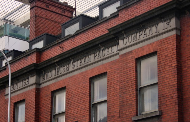


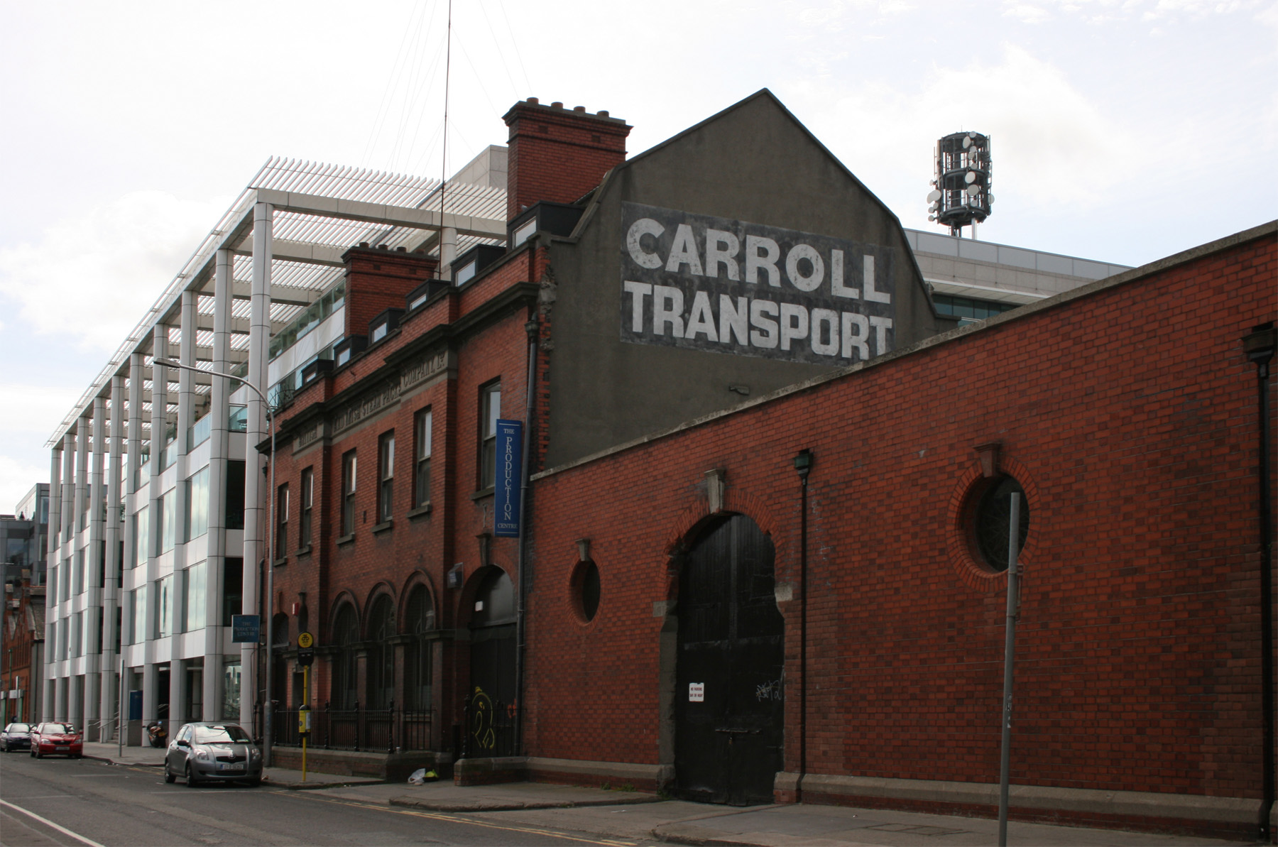
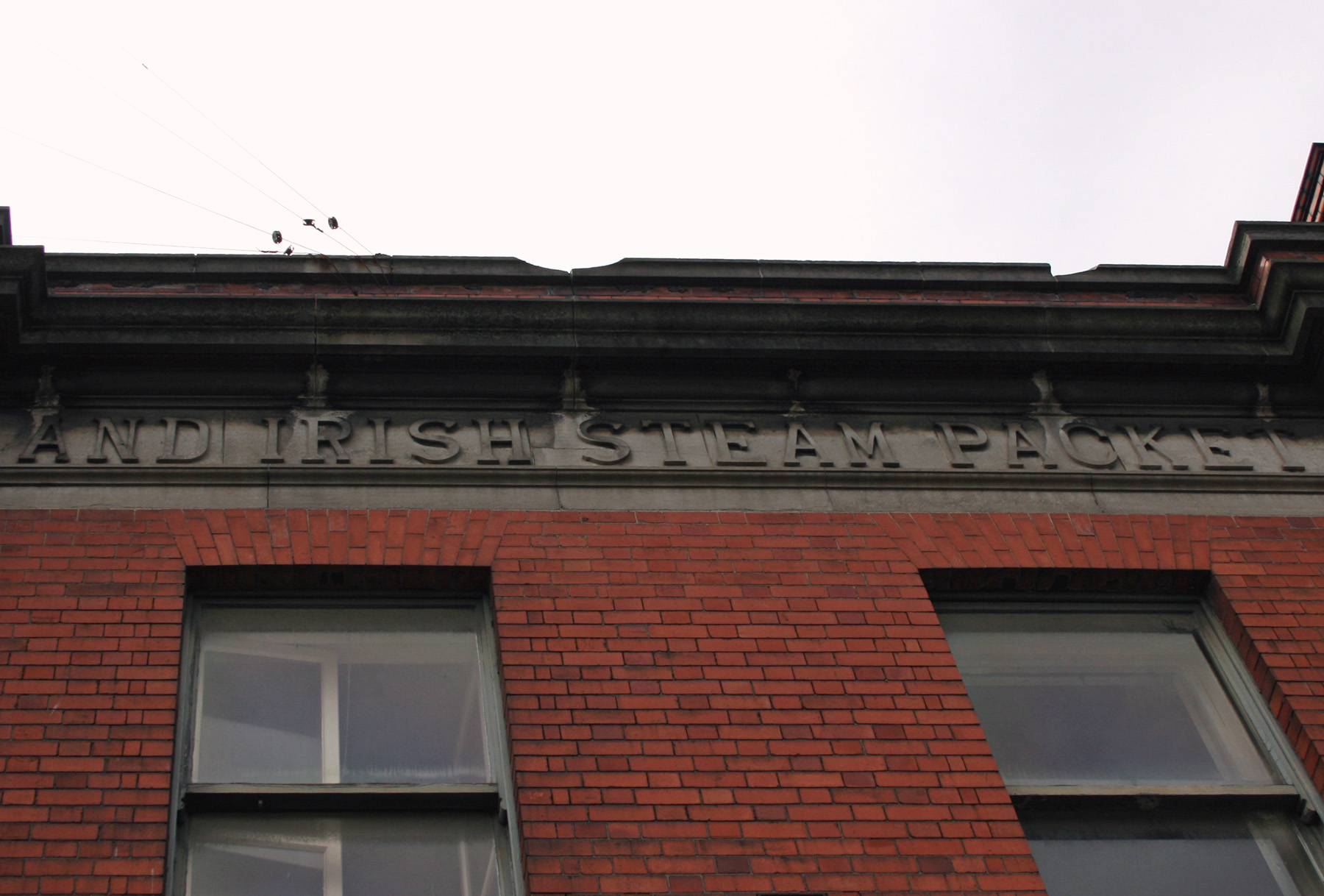
The quay-facing part of the British and Irish Steam Packet Company Building presents the building as one that’s quite tall and neat – two storeys, with an attic level in the big, wide gambrel* roof – but the satellite view shows the long stretch of warehouse space in behind. The building was designed by William Henry Byrne and Sons and completed in 1909, with the date in stone above one of the carriage arches.
Of course, the most striking part of the facade might be the name. It’s a little less romantic once you realise they became B&I Ferries and were later absorbed into Irish Ferries, but they operated in Dublin from 1836 and were taken over by the Irish government in the 1960s. Still, there’s a permanence to putting the company name in stone that seems evocative of another time, when a company and its employees might be in the same place for decades. (Maybe better or maybe worse, but definitely a different climate.) Is that a factor in signage quality now – a reaction to having to adapt, update, move? There’s undoubtedly other elements, like mass production and the shopfront or office probably not being a company’s primary visual identity or the idea of legacy or tradition being less significant in many areas, but maybe the baseline isn’t to make things permanently part of your building unless you want them to be permanently part of your building. Or, maybe maybe, maybe I have a distorted perception of permanence because the older signs still around are just the ones that lasted.
* Gambrel roofs, like mansard roofs, have two angles in the pitch on each side, a shallower upper slope and then a steeper one below. Unlike a mansard roof, the roof only slopes in two directions (rather than on all sides). There are also no Vampire Weekend songs about them.