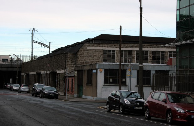
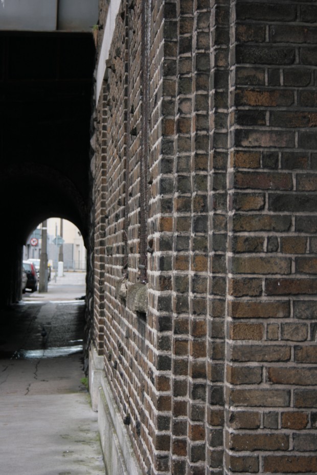
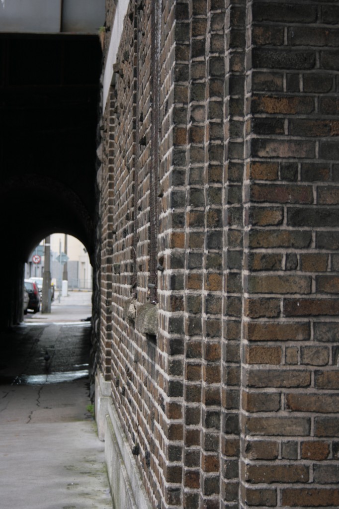
One of Dublin’s buildings with the greatest tactile appeal is tucked up against the railway bridge on Upper Sandwith Street. It’s a reasonably unassuming location, with the bridge screening it from the busier Pearse Street side and the longer view being from the odd patch of relative quiet on Fenian Street, but it’s worth the diversion.
The building was designed as a garage for the post office, credited to John Matthew Fairweather as Principal Architect of the Office of Public Works. It was completed in 1939, built on a partly vacant site, and it came amid a series of changes in how and where the post office ran in Dublin. The roof structure uses steel trusses, minimising the distribution of vertical supports to allow clear spans for parking.
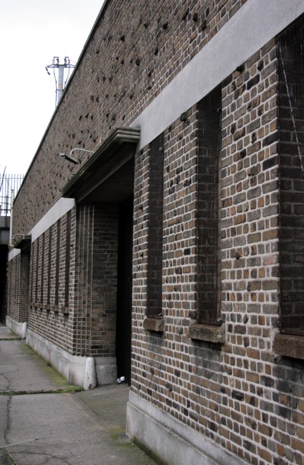
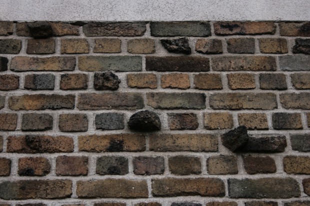
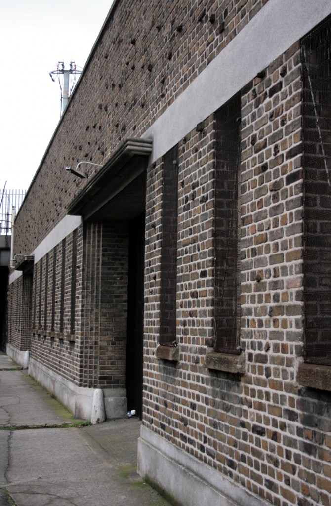
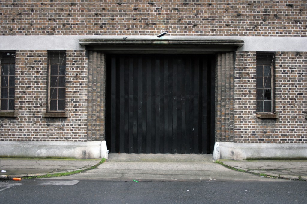
The tactile appeal comes from the brick on the facade, set off by the concrete beam. Even through colour alone, this would be pretty mesmerising: there are so many shades of brown in here that it seems to span from yellow to petrol blue, varied on a grand scale when you approach from a distance but vastly more interesting when you get up close. It’s set off by the three-dimensionality of the surface, casting small shadows across the topography. The effect is a texture like tweed – it’s ordered, neat alternating header/stretcher rows (an English bond) framed in mortar, but projects irregularly in a nubbly texture. I’m not sure how the effect was produced, but it’s one of the most genuinely delightful surfaces I’ve ever seen.
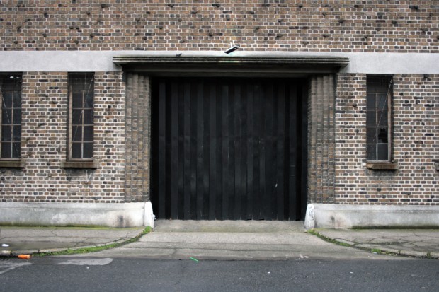
The brick is also used to a nice effect framing the entrances, with a tiering that picks up the parallel line effect visible in the lintel too. Not bad for a garage entrance, and very admirable as a kind of low-key, serviceable modernity.

