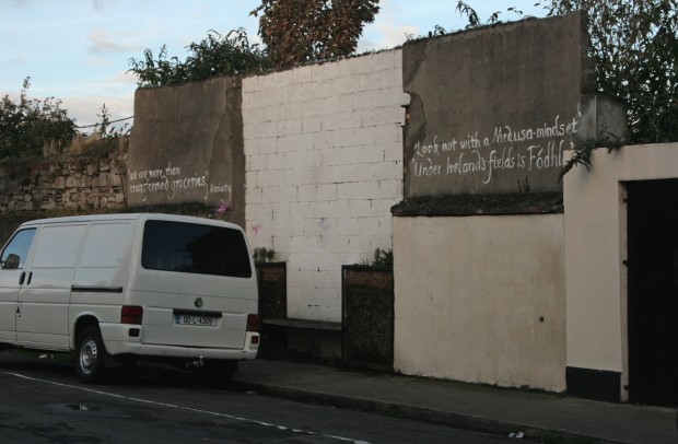
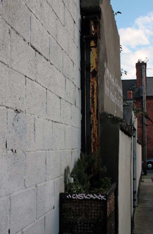
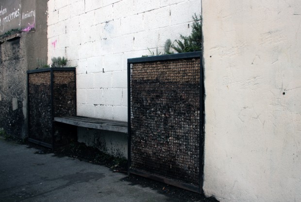
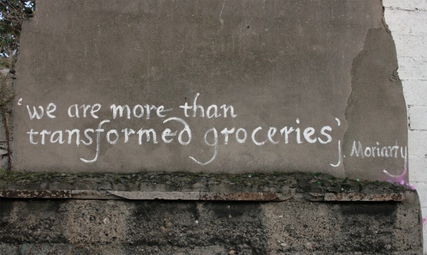
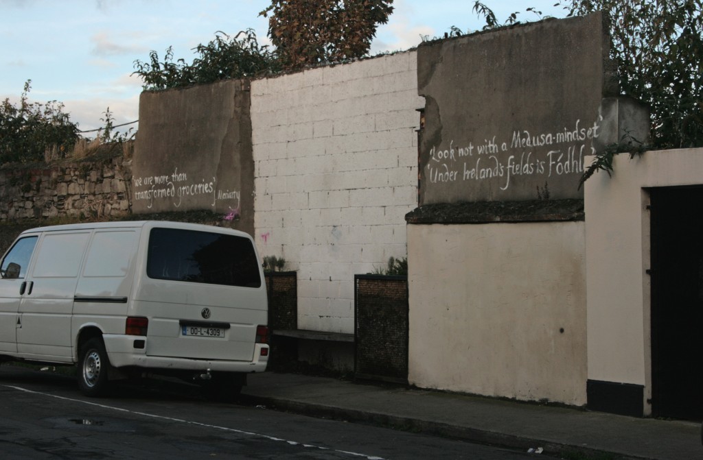
Diagonally across from the Sitric Community Garden in Stoneybatter, there’s a condition that can be seen all over the city: a patchwork of blank boundary walls meeting, forming a space without real intent. In this case, it’s a shallow alcove, and it’s been turned into a bench and small vertical garden by residents of the neighbouring streets.
The work appears to have been done in May and June 2008, based on the timestamps in this Flickr set by Kaethe Burt O’Dea (a researcher, activist and one of the driving forces behind the area’s flurry of green, community-based projects). On Flickr, the project is called 14″ x 14′ x 4′ Benchmark, helpfully quantifying the dimensions involved.
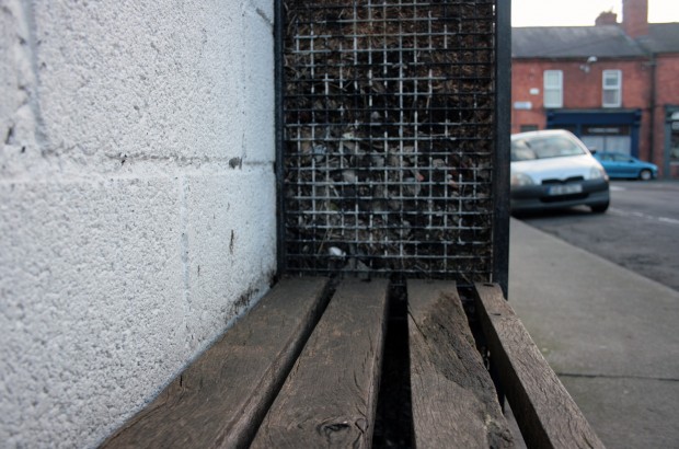
The project consists of thick timber boards bookended by two caged banks of planting material. At the time of construction, the cages supported vertical gardens, with herbs and climbing fruit plants growing beside the bench – my photographs are from the end of October, which is a cruel time to visit most gardens, so it’s hard to say whether the bare vertical surfaces are just seasonal or maybe recording a collective learning experience.
I’m inclined to be a bit cautious about urban interventions that are part of a trend, especially those with radical intent but a strategy and appearance that’s replicating another project (or worse, things branded as design which offer little to the actual underlying urban issue and a lot in publicity to the designer). A piece by Mimi Zeiger from earlier this year resonated a lot for me, and there was a certain deja-vu in feeling bad after reading the comments. DIY is great, as is seeing people directly engaged and passionate about where they live, and when the very best – the most site-specific, inventive, and often the most anonymous and wordless – of these interventions work, they’re really magnificent. There’s just not much substance for me in an annual day of turning a few parking spaces into parks, or the 8000th tree in the world getting a jumper put on it, but it’s hard to find the right line in trying to approach it with a critical eye without fighting a worthwhile impulse towards problem-solving.
Benchmark is great, though, and the kind of project I can celebrate without reservations. It’s the right thing in the right place at the right size, highlighting the human-depth scale of the recessed wall and engaging with its very specific site. It’s also a very subtle intervention, using the simplest forms to do the job and looking like skilful make-and-do rather than making an object with a distinctive aesthetic. The bench is a nice place to sit and adds a feature without cluttering the street with furniture, and it’s another gathering-place in a neighbourhood that’s proving to be very good at really using them.

