
In strictly good-taste design terms, a good shopfront is going to be one that works with the building as a whole and the broader context, setting up a relationship between outside and inside, and conveying the nature of the business inside. Maybe it’s beautiful, too. The traditional Irish pub and shop front – with a timber surround in a colour matching the door and mullions, a sign board above (with or without timber letters) painted with the name – is attractive because it was a neat answer to all of these criteria, robust enough to take variations in quality and still look well enough.
Good taste is a bit constricting, though. You miss out on the neon, the tasteful but added-on, the things that shouldn’t work but do. You couldn’t design it that way without it being unbearably twee, but there’s a visually overloaded charm in streets jumbled with shopfronts, unrelated first-floor businesses, and a building beyond.

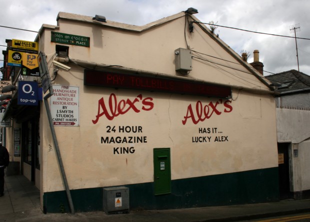
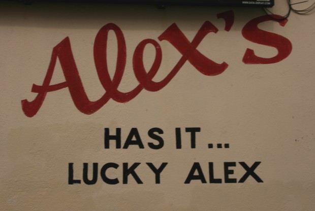
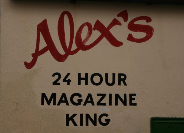
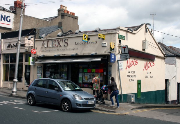
Alex’s is a bit of a missed opportunity, with something magnificent hidden on the side and not brought around to the front.

The lettering’s nice, but the slogans are phenomenal. “24 hour magazine king” is grandiose and sounds exhausting, and the weird combination of melancholy and lottery sales (the front of the shop advertises ‘lucky lotto’) in “Alex’s has it…lucky Alex” is in Weaver D’s territory. On the front, though, it’s generic chrome-finish letters, sober and dotted all around with signs for services. It’s a pity, Alex.
