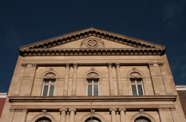
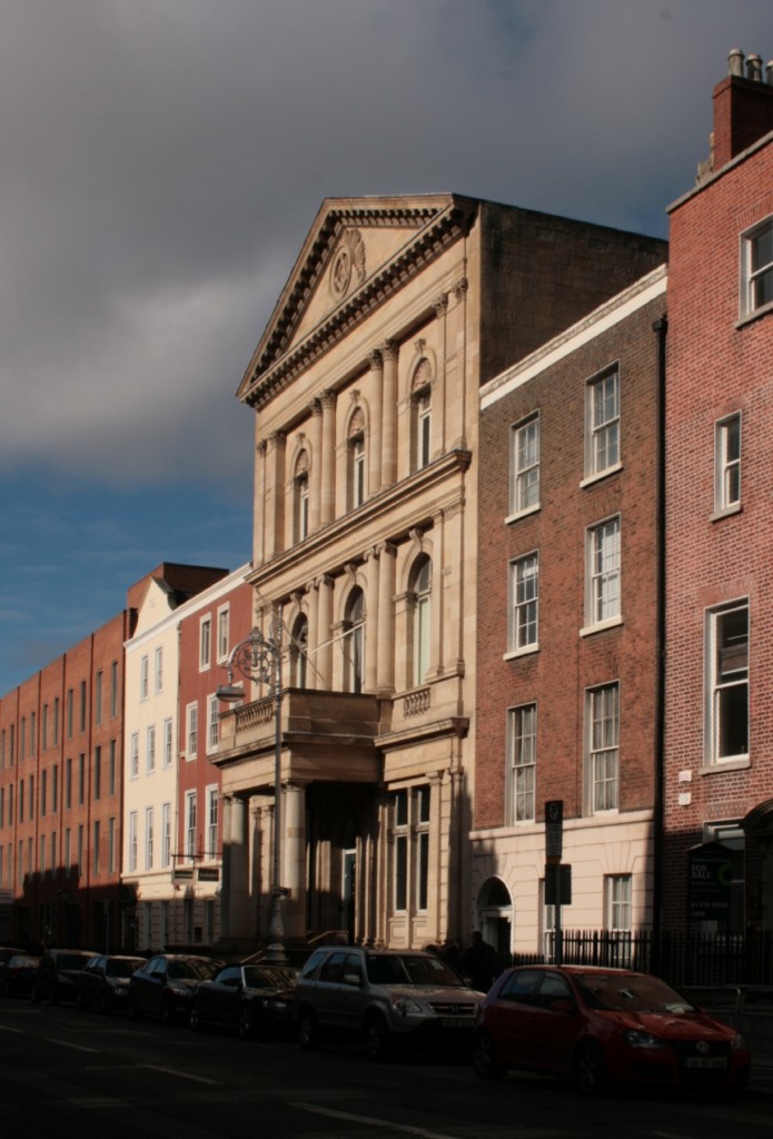
Though the Grand Lodge of Ireland dates from 1725 or earlier, work on their present building in Dublin began in 1866. The design competition for the Freemasons’ Hall on Molesworth Street was won by Edward Holmes. It’s a three-storey building clad in sandstone, with a set of steps leading to a porch at the centre.
The general air of mystery surrounding Freemasonry makes the hall a subject of fascination, but it’s pretty easy to gain access to the interior. As well as frequent events such as book fairs, Weight Watchers meetings, and Culture Night, the Freemasons provide tours for public groups and are more than happy to tell you about the organisation, emphasising their diversity and their charitable works.
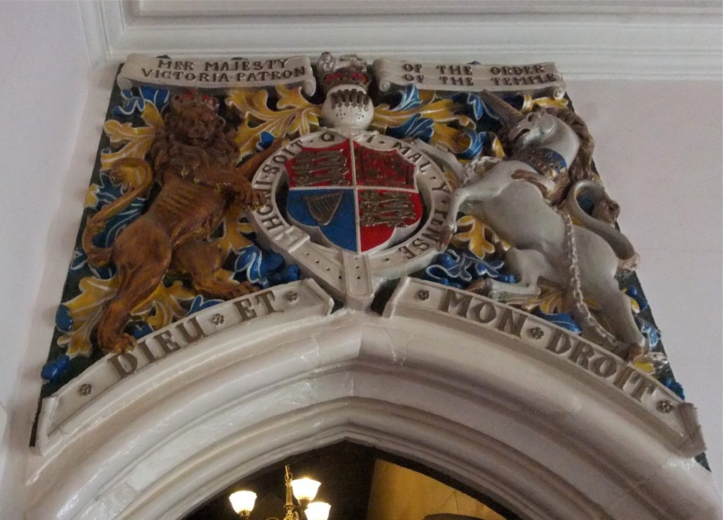
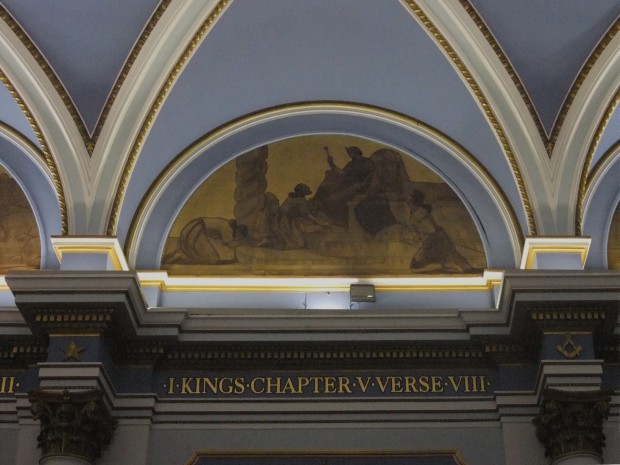
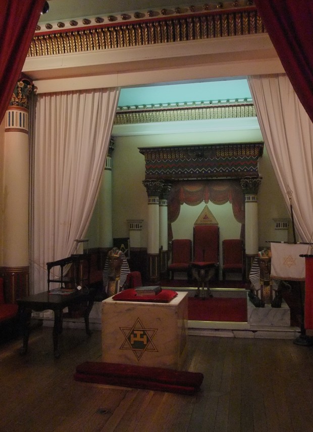
Each of the main rooms is designed for a particular Masonic ceremonial purpose, corresponding to the different degrees and using different decorative themes. On the first floor the Grand Lodge Room is located to the rear, decorated in the Corinthian Order.
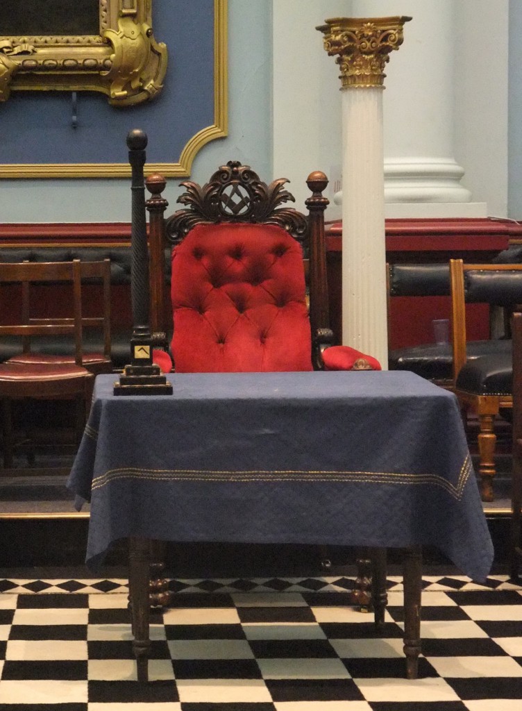
There’s a certain (usually religious) use of architecture as symbolism to represent models for good living or fundamental human truths. The Freemasons seem to go in for it in a big way, and architectural elements are approached like texts to be deciphered. For me, it’s a deeply unappealing approach and very far from how I relate to architecture, but since I don’t think we’ve many too many common sensibilities anyway, maybe this is by design. It does make me curious about whether anyone in contemporary architecture is a member and how they square those two parts of their lives, all compass jokes aside.

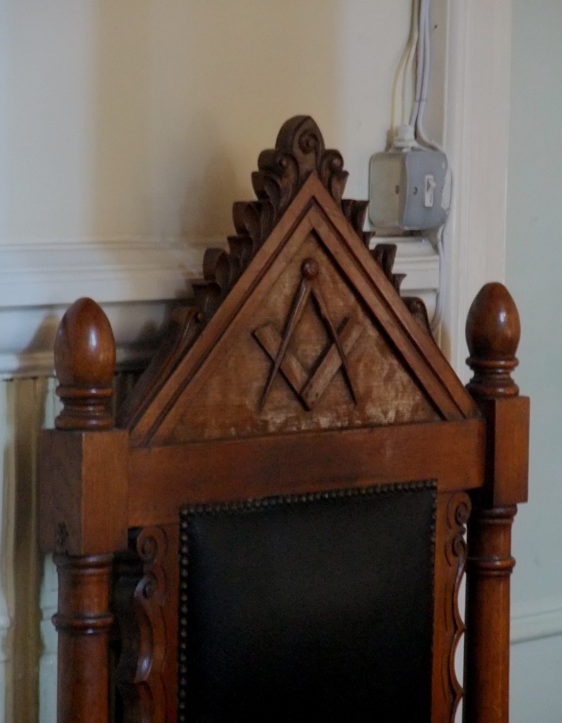
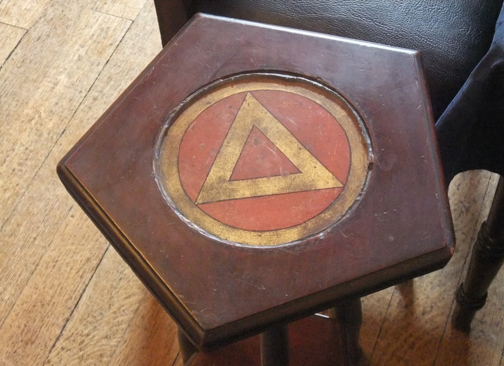
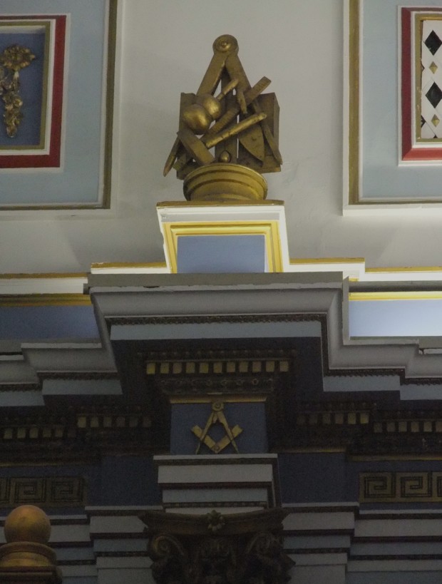
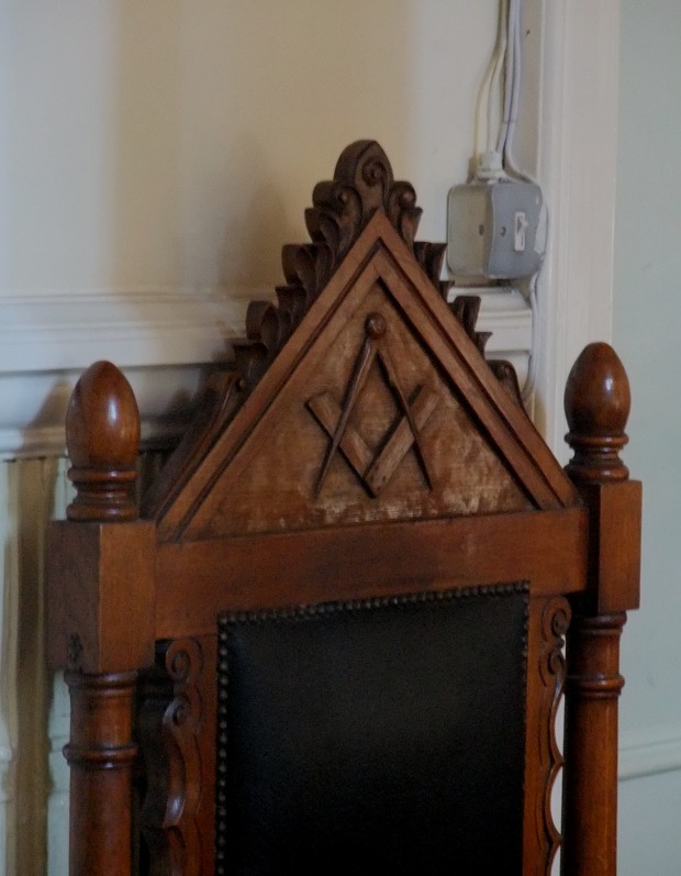
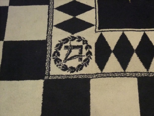
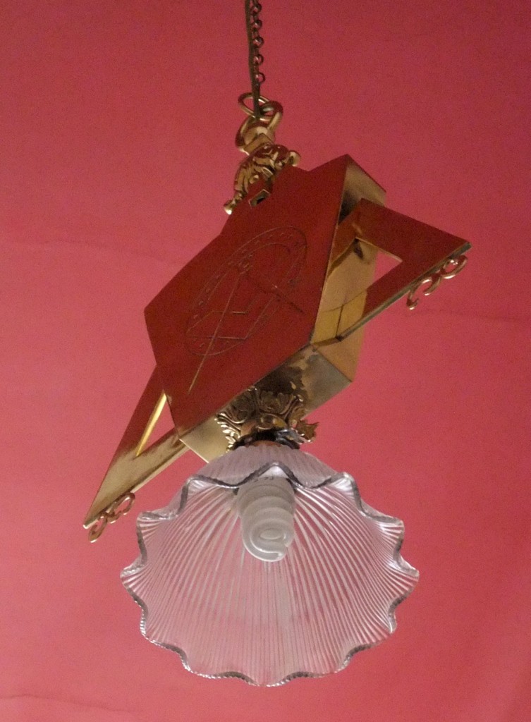
In the Grand Lodge Room, there are free-standing columns situated at points in the central space for use in the degree, and elsewhere you’ll see elements like keystones incorporated into lighting, furniture and tools. The square and compass appear on carpets, lamps and many other elements, and geometric shapes appear throughout. It began to seem, as our tour progressed, that every single object in every room was chosen for a symbolic purpose, including standard-looking items like carpets. (Our guide seemed thoroughly pleasant and sincere, but someone more wicked could probably have had fun with this.)
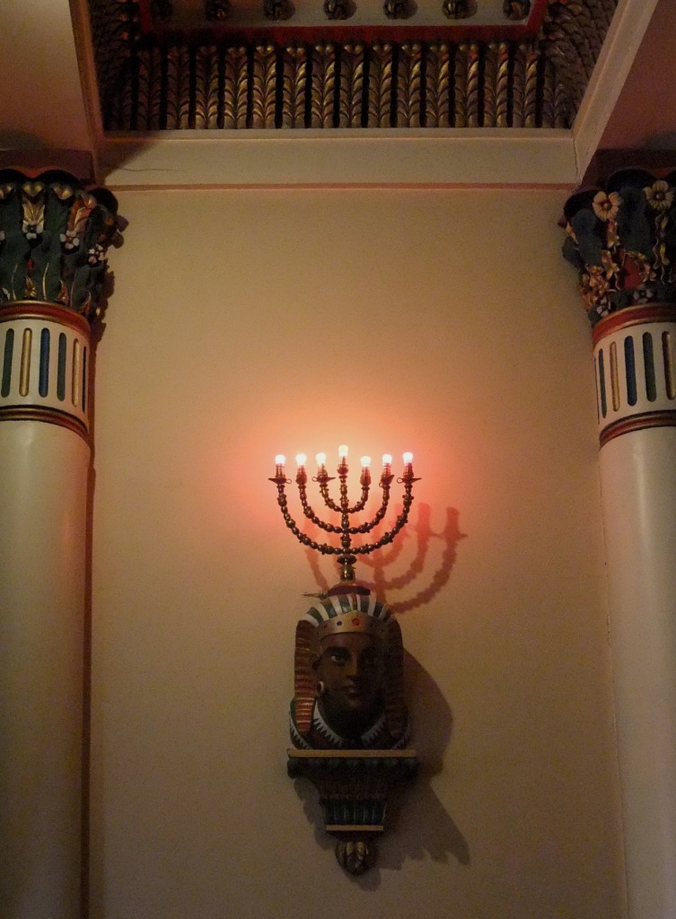
On the same floor a room is decorated with an ancient Egyptian motif with lighting elements incorporating Egyptian heads and foliated capitals and cornices. A third room is more plainly decorated, though heavy on the keystones and triangles.
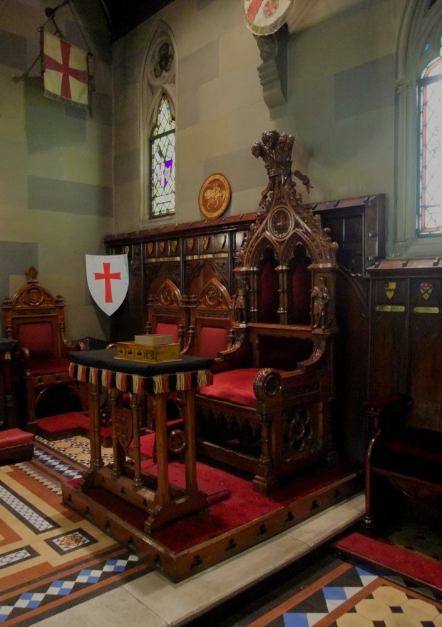
On the upper floor, things get Gothic. Here, there’s the Knight’s Templar Chapel and the Prince Masons’ Room. At the end of the Chapel, we became particularly aware of the ceiling and interior windows being constructed for effect, as it was like seeing the back of a stage set. I mean, every interior sets a scene and creates an effect, but the high drama and total commitment of the Freemasons is really quite something.

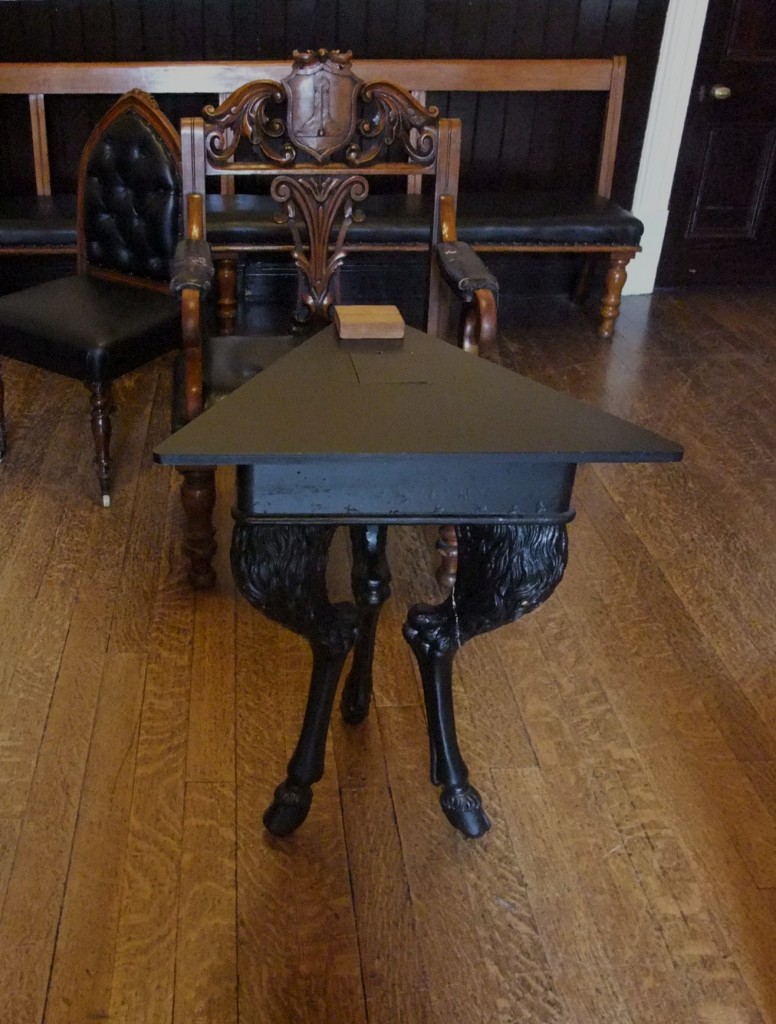
I had the pleasure of visiting with a group, almost all women, that probably shared my scepticism and curiosity. Our guide was very amiable and obliging as we asked questions, but one detail on the first floor point that seemed to alienate the most was also one he didn’t wish to expand on: the three-legged tables with their strange haunches.
Though, pieces like these made me think how much of the furniture and fittings was bespoke, and wonder who worked on it.
After visiting, I spoke to a friend who had seen the building on Culture Night. He was very excited to meet someone who’d been and wanted to discuss the toilets. Apparently the men’s toilet is extremely ornate and gilded, like being in a private throne-room. In contrast, the women’s bathroom looked like the standard fit-out for, say, an office park: totally plain and unremarkable.
More than any space in any building I’ve ever visited, the contrast in this interior communicated “this is not for you.” As interesting as it was to visit once, the feeling is definitely mutual.
