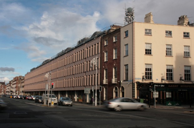
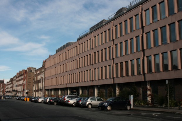
It’s difficult to separate a building from a controversial genesis, and maybe rightly so. For the ESB Headquarters on the east side of Fitzwilliam Street Lower, its architectural merits have always been overshadowed by what came before: the demolition of 16 Georgian houses in the centre of what had been Dublin’s longest Georgian streetscape. The Georgian terrace was the subject of a popular preservation campaign, and the permission for the new building was granted in full by Neil Blaney, Minister for Local Government, the day before the introduction of the new 1964 Planning Act. Not an auspicious start. At the same time, there were voices in support of redevelopment – Frank McDonald’s The Destruction of Dublin (p.21) describes a group of architecture students attending the public meeting in the Mansion House with “‘Don’t make Dublin a museum’ [as] one of their catch-all cries.”
(There were, and still are, strong feelings on each side of the argument, but there’s a bizarre moment involving clashing opinions from two British architectural historian OBEs brought in on the matter – Sir Albert Richardson for the Georgian team, and Sir John Summerson for the ESB, who described the houses as “a sloppy, uneven sequence” and said (again, via The Destruction of Dublin, p.20) “It has no special architectural coherence. It is not a planned facade, nor an architectural entity. It is merely one damned house after another. […]”
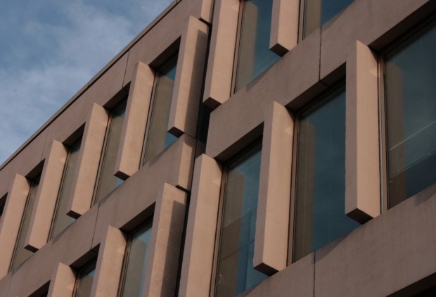
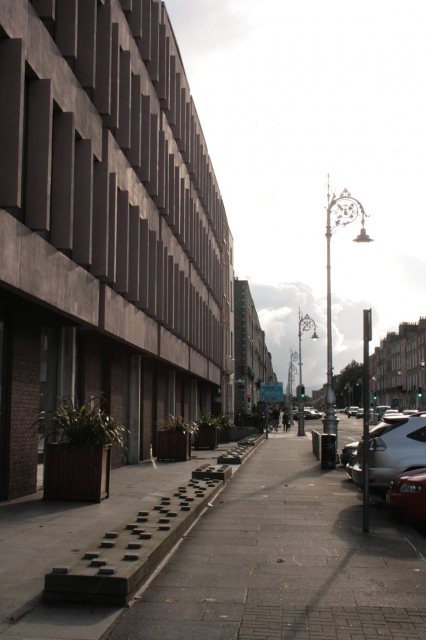
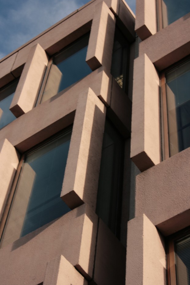
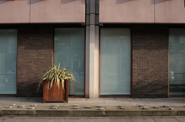
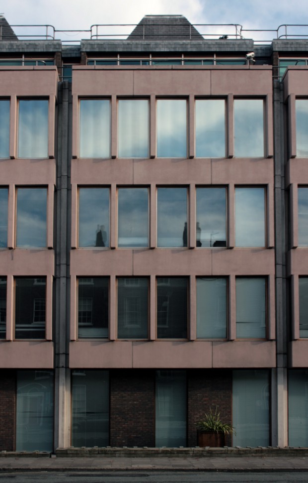
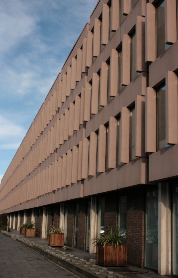
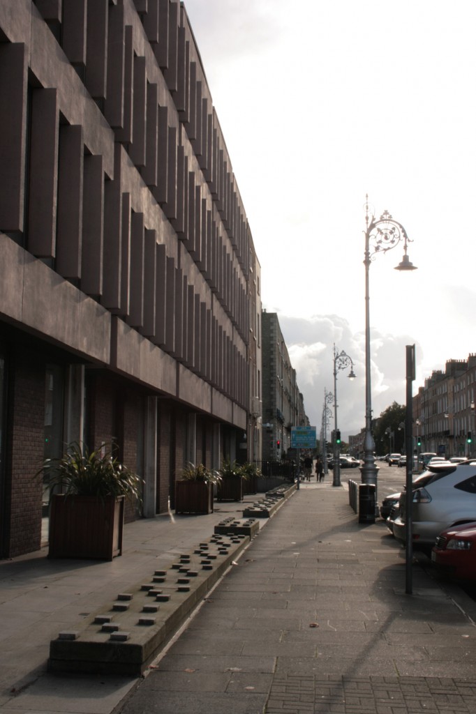
In the middle of all this, there’s a building. Stephenson Gibney & Associates won a design competition announced at the end of 1961 to provide a new block of offices to house the Electricity Supply Board’s headquarters and load distribution office. The Georgian terrace was demolished in 1965, and the new building was completed in 1978. At the time of the competition, a positive view on the design was published in The Irish Times by ‘our architectural correspondent’ (answers on a postcard, please!), noting that the regular bays had nearly the same spacing as the houses’ party walls (keeping the grain), and that the windows “have a vertical emphasis similar to their older neighbours. The total effect when viewed obliquely – and this is the aspect that matters from the townspace point of view, will echo closely the accent of the street vista as a whole – crisp white verticals alternating with the flash and sparkle of dozens of separate windows. The brownish tint of the concrete work and the hand-made facing brick on the ground floor will also serve to diminish the ‘sore-thumb’ effect which was feared by so many critics.” (The Irish Times, 10 November 1962, p.10)
The writer also offers the opinion that “it seems to me that, granted the need to rebuild and to preserve the vista unbroken (an arguable point, since the corridor street is dying, and the modern buildings increasingly present their flank rather than their front to the passer-by), this winning scheme is a fine one, and will add to the beauty of Dublin instead of helping to destroy it.” (ibid.) In the accompanying drawing from Stephenson Gibney, the competition entry’s facade looks nearly identical to what was built.
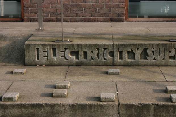
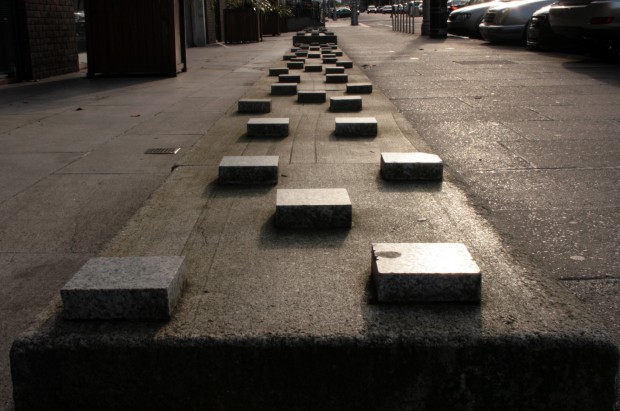
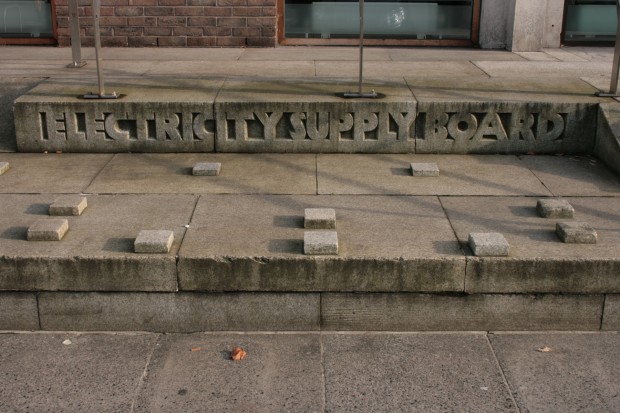
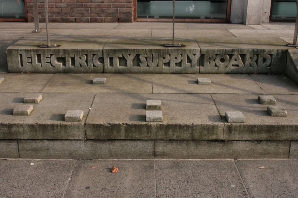
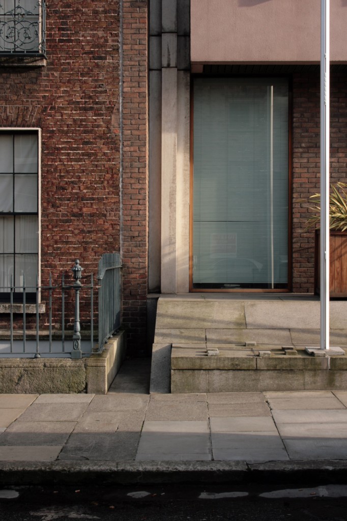
I’m quite fond of the facade, and every time it’s been on my daily route, I’ve looked forward to passing the building. There’s a soothing regularity to the rhythm of the window verticals, broken often enough by the bays and the gorgeous full-height columns in between to avoid monotony, and there’s a beauty to their block abstraction when you see them against the sky. The low walls (with the stupid anti-skateboarding blocks on them, even less usably than their Baggot Street neighbours) step and break to further reinforce this, and towards the entrance end, the planting looks great against the brick. At the entrance, the carved stone lettering on the rise of a step is a spectacular moment in semi-state branding, and it’s weathered well.
In the coverage of the winning entry for the building’s replacement, designed by O’Mahony Pike and Grafton Architects, Yvonne Farrell (Grafton) describes the building killing off the street – the statement is followed here in The Irish Times (Thursday, October 17th 2013) by either Farrell or Frank McDonald (it’s not totally clear) attributing this to the lack of steps, basement, railings, and having “just one entrance.” To me, the street level is quite pleasant and calm – the planting, again, is pretty and well-maintained, and there’s an openness extending the path as far as the building’s shallow overhang, keeping the built line and handing over the basement zone.
That said, Grafton Architects’ extension for the Department of Finance on Merrion Row takes on the context of basements and recessed entrances with great success, with a formal, contemporary acknowledgement at the entrance. Their work manages to be world-class contemporary architecture and, where appropriate, to also understand sensitive, historical contexts – one of very few Irish practices whose work appears to be entirely successful, beautiful, and exhibiting good judgement. Right now, I’ve only seen renderings and I’m cautious about how a ‘loosely Georgian contemporary streetscape’ will actually work, but Grafton’s involvement is reassuring.
In The Irish Times today, architectural historian Deirdre Conroy takes on the idea of reinstating a Georgian facade, rejecting it as a historian as a fake and a face, which I’ll get back to in a moment, and also writes that “Thankfully there is sufficient testament to the work of Stephenson Gibney elsewhere in Dublin to allow its replacement.”
I’m not sure Conroy is right, and I’m not sure there’s enough value placed on Stephenson Gibney’s work (together or individually) to ensure that much of it will be kept, except maybe the buildings like the IMI and the Currency Centre that benefit from being off the public track. They’re not helped by the series of dubious planning and demolition issues attached to many of the buildings – in a way, a time capsule of a certain aspect of Irish public life – but the buildings are bold statements of their time, coherent and startling compositions, and it’s a huge shame that there’s a tendency to dismiss them as ‘ugly’.
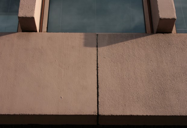
Fitzwilliam Street isn’t the best of these, though. The recent addition of pink paint to the facade’s concrete does nothing for contextual harmony and is more like a sort of architectural minstrelsy – Conroy describes it as “an affront to its historical surroundings,” but I’d extend that to being an affront to absolutely everybody. More importantly, the interior is described as being inadequate for the ESB, with a BER rating of ‘F’ and an internal configuration that’s awkward and wasting space. It’s a bloody big building, and like so many of its contemporaries on a similar scale, it’s not a surprise that such a large area might not adapt as well to changing needs in workspaces and environmental measures. Could this be handled without demolition? Probably. Will it be? Almost certainly not.
It seems bizarre that the idea of a skin-deep Georgian replica could be considered ‘reinstating’ or ‘repairing’ the street – less surprising from the Councillors (given that most do not have architectural or planning training), but incomprehensible from those who love and value Dublin’s Georgian heritage. From a distant enough view, perhaps it might pass as a single streetscape, but it’s ghoulish to me in the sense of a family photograph with someone reanimated in the centre, Pet Sematary style, upsetting and actively insulting to Georgian Dublin and Dublin as a whole. At the same time, the argument is presumably coming from a sincere and thoughtful perspective, even if it’s one that’s utterly alien to me, and it’s one of those debates which risks taking on an internecine quality. The proposed new scheme appears to recognise that.

