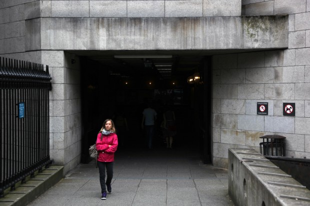
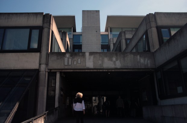
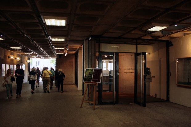
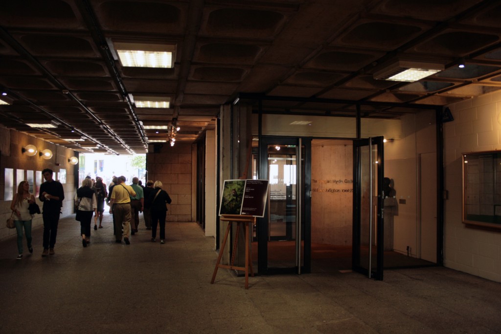
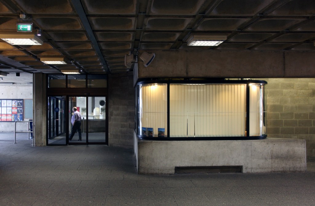
The passageway from Nassau Street into Fellows’ Square in Trinity College is part of the Arts and Social Sciences building, designed by Ahrends, Burton and Koralek (after their Berkeley Library project) and completed in 1978. As well as being one of the busiest routes into the campus, the passageway also contains several entrances, including those for the wonderful Douglas Hyde Gallery and the Arts & Social Sciences block itself.
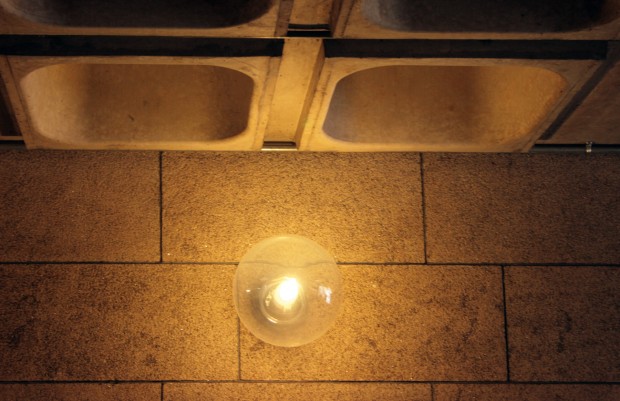
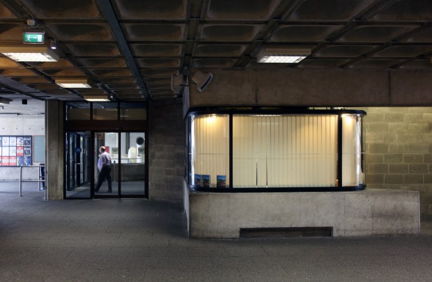
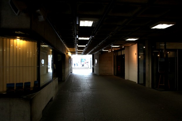
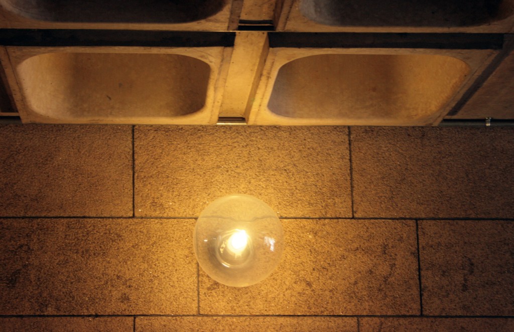
The surfaces within the passage mediate between the granite-clad Nassau Street elevation – coming about halfway in, as far as the Douglas Hyde glazing extends – and the use of concrete on the square, with bare block walls and beams continuing the route. The paving carries through, as does the ceiling surface, a grid of precast concrete units with round-cornered squares recessed in each one.
Paul Koralek, quoted in a piece by Frank McDonald on the practice’s 40th anniversary, indicated the urban significance of this new entrance: “The single most important thing we did in Trinity was to knock a hole in the railings on Nassau Street. […] Nothing else we’ll ever do will compare to that, because it suddenly made the place accessible by creating a route through it.” (The Irish Times, April 25 2002, p.A16)
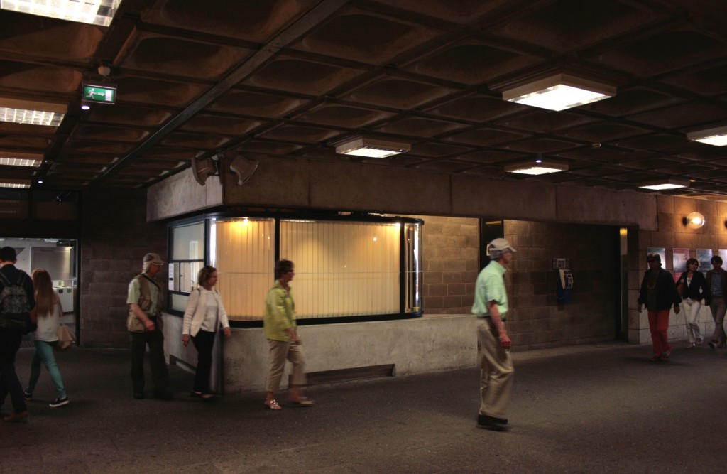
You can kind of see that any time you pass through during the day – it’s a place you’ll rarely experience alone, with a chaos in the criss-crossing paths of students, ordinary pedestrians, and the tightly bonded huddles of tour groups.
At the same time, it’s quite composed and elegant, and it’s a soothing experience if you’re in the right frame of mind. It’s not a bright space, and if you come in from sunlight, it’s a quick demonstration of how our eyes adapt to light levels, slower to adjust on the way in from light to dark than the reverse. The same thing happens with sound, and as I realised in a conversation this week, it’s not just muting the street and college to either side, but also introducing its own quality and elements of sound too. Even when the pedestrian flow is heavy enough to be as treacherous as the junction outside, the brief change in the sensory environment feels restful to me.
Not to short-change the space on objectification, though – the guards’ booth has a gorgeous form, with the curved glass box held between the span of the beam above and a similar depth in a counter below, raised on short, wide legs. It’s wonderful to see such a necessary part of the entrance brief made like a neat piece of concrete furniture, the curve mimicking the flow of movement through the space as well as allowing a line of sight through the corners.


