Designed by Keane Murphy Duff, the ILAC Centre opened in 1981, bringing a suburban shopping experience into the centre of the city. At the time, the ILAC Centre was Ireland’s largest purpose-built shopping centre, with key features including air conditioning and “American-style bubble lifts.” (‘ILAC Centre milestone’, The Irish Times, March 6 1981, p22) The building’s plan is cruciform, and it’s wide and low, stretching out between the bounding streets. More recently, it’s been given a superficial makeover (focusing on the interior and the Henry Street facade) to “[transform it] into a bright and airy shopping venue all on one floor” (ILAC).
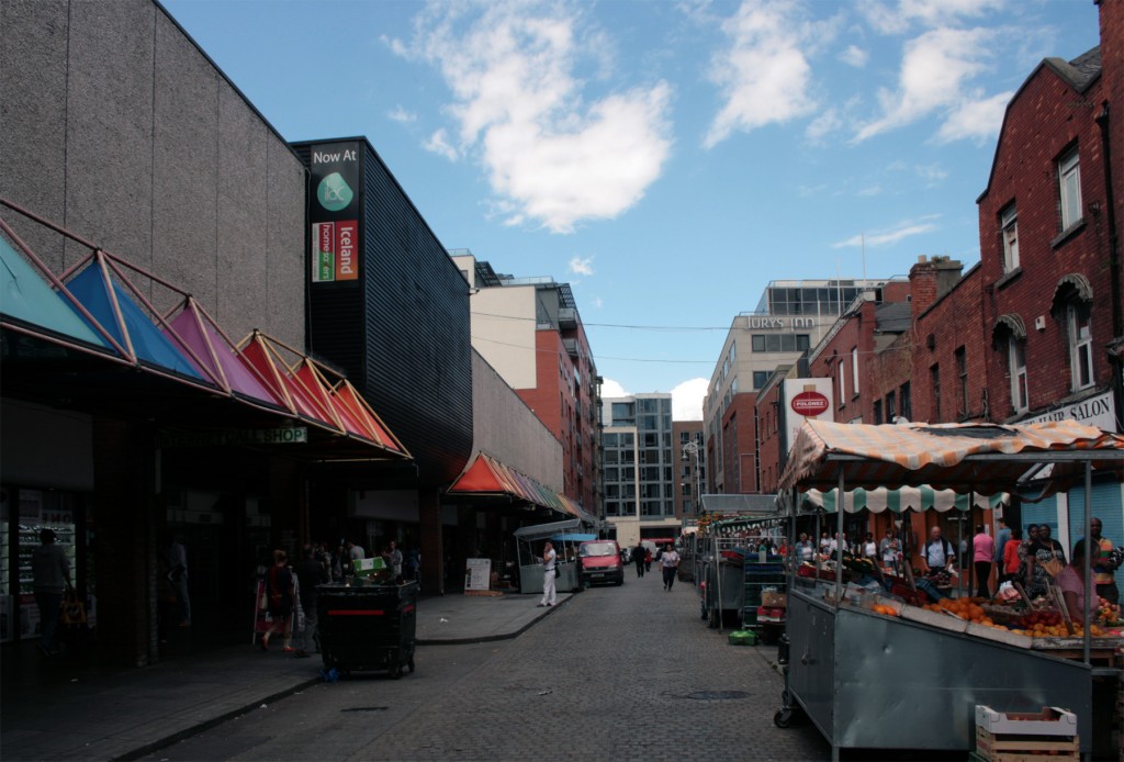
On the Moore Street side, the main recent change has been the disappearance of the old logo from the curved black section marking the entrance. I quite liked the scale and colour, and having a lowercase sign ‘ilac’ for a name that’s an abbreviation of the owners’ name (Irish Life Assurance Company) has a certain appealing mismatch to it. Here’s a photo from 2007:
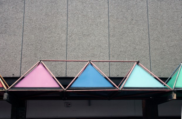
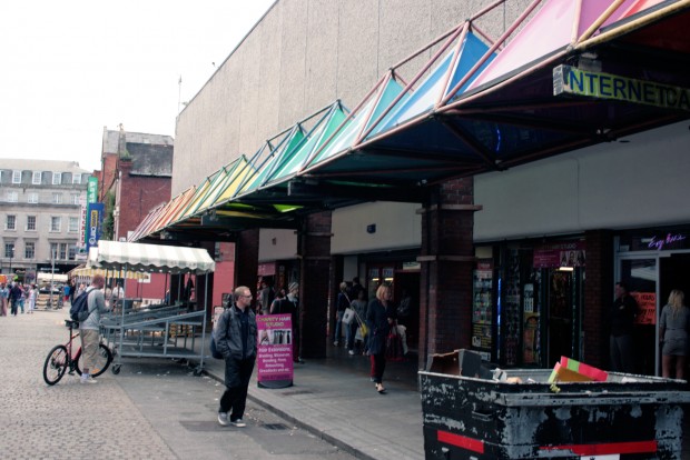
I’m relieved that the coloured canopy has been spared so far. The ILAC isn’t likely to make anyone’s list of aesthetic highlights in the city, and yet the canopy genuinely is one for me, even if it’s a bit of stuck-on 80s shopping centre ornamentation. It’s like a heavy-handed nod to the market stalls that make Moore Street, with these big blocky pyramids sitting in a row a backdrop for the palettes and frames and awnings, chunks of colours playing second fiddle to the brighter, natural arrays of food.
Passing under the pyramids, it’s a bit of a word unto itself, as if it was sheltered from Dublin’s transformation since the original centre was built. That’s not strictly true: the stalls on Parnell Street (RIP Peggy Keogh) are long gone, and the actual shops underneath match the rest of the street’s multi-ethnic-and-phone-shops mix. You’re still nearly guaranteed to pass multiple people offering to sell you cartons of cigarettes.
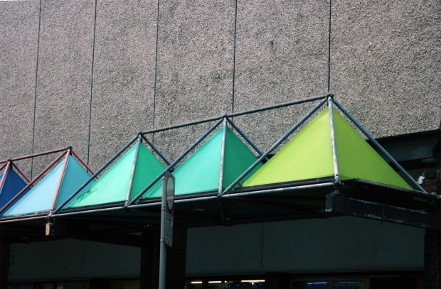
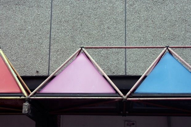
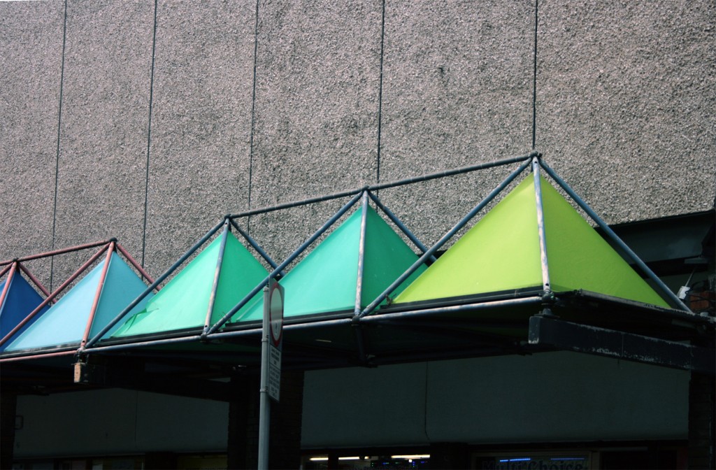
There are two reasons I really like the canopy, and they’re both extremely basic. First, the geometry of the pyramids and how clearly the structure is put together, like pipe or scaffolding, and that’s quite pleasing if a bit strange hovering in mid-air.
The mid-air aspect comes into the second reason, though: the colours are really beautiful against the concrete. They’re remarkably unfaded, like fresh bunting, and there’s something about having multiple oranges, yellows and blue-greens that surprises me – you could have done this with a ROYGBIV and called it a day, but someone felt like my man red-orange needed to be in there.

