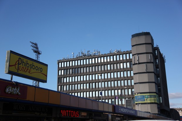
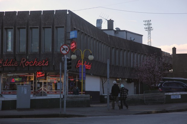
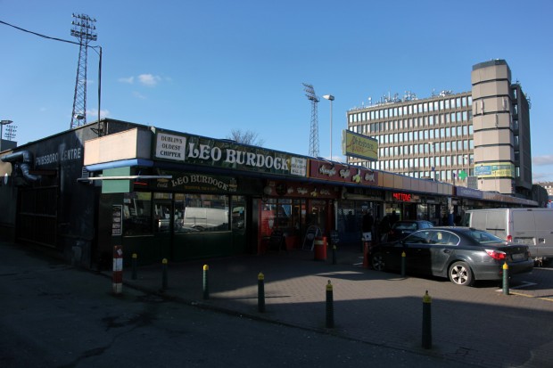
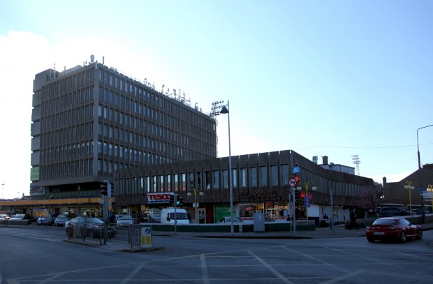
Reading coverage of the objections to Phibsboro Shopping Centre, the reasons seem surprising from now: local traders objected because they wanted the site to be used for parking. They noted that they didn’t mind the design, or a shopping centre in the right place, or even the increased traffic, just that it wasn’t a car park. The story stretched from the site’s purchase in 1962 until construction was completed in 1968, funded by Commercial Developments Ltd. as an office block over a shopping centre, and it looks at least part car park from a 2013 perspective.
From this perspective, using an urban or inner suburban site as car parking is abhorrent – it’s a major part of the city’s decline into and through the 80s, and it’s a big contrast between images of the city then and now, not least in Temple Bar. Phibsboro’s scale as a shopping centre makes it even stranger, because while the suburban edge centres are going to get shoppers only if they can get there by car (as the constipated traffic around Dundrum demonstrates so often), Phibsboro’s surrounded by housing and a short walk from the centre of town. Maybe that’s not part of the shopping centre dream, though.
As I mentioned the last time we saw a project by David Keane and Partners, it’s remarkable how many of the practice’s projects come up in lists of the city’s uglier buildings – for me, that’s not the same thing as bad architecture, it’s just a description, but I know that’s rarely the intended meaning. In its current condition, there are aspects of the building I think are beautiful, and aspects that are problematic, but I’m quite fond of it.
As constructed, the accommodation was “32,280 sq. ft office building, supermarket, department stores, 12 shops, 5 service shops” (The Irish Times, 28 May 1969, p.a10), with over half of it let within months of completion. Right behind the centre (on the best-named land in Dublin, the former Pisser Dignam’s Field), there’s Bohs‘ grounds, Dalymount Park. The mid-2000s scheme for the site, in limbo, addressed the adjacency of the two sites and viewed it as a selling point, as well as developing a new stand.
The new centre was described as a neat combination, and the estate agents considered it an example of urban renewal, replacing a row of “single-storeyed and sad and depressing” (November 1 1969) cottages in need of modernisation with this bright new hope.
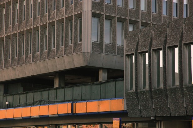
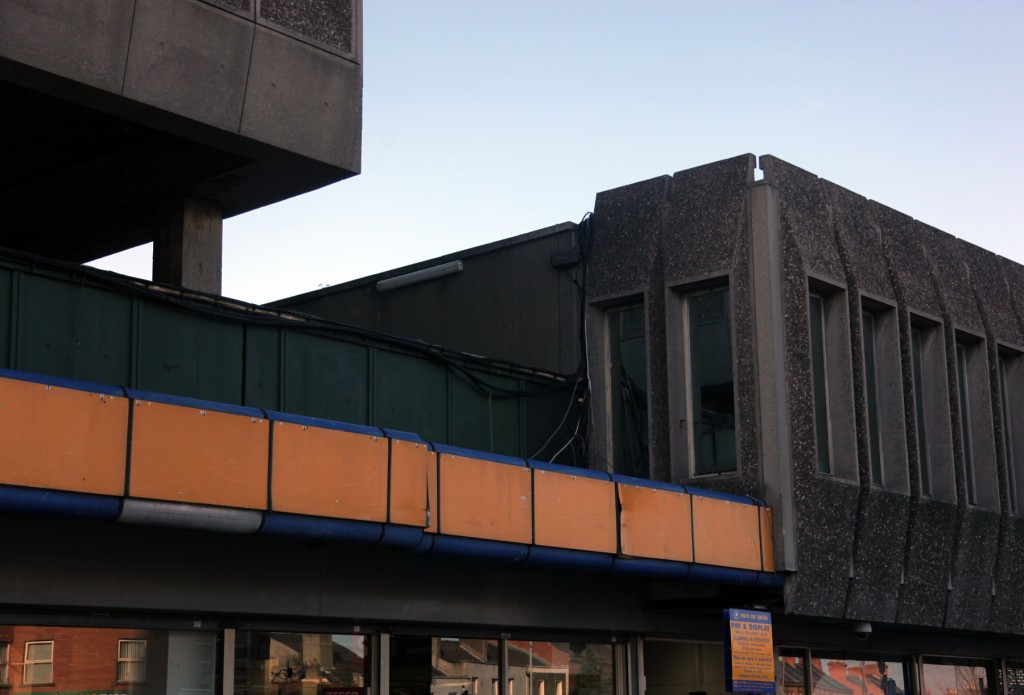
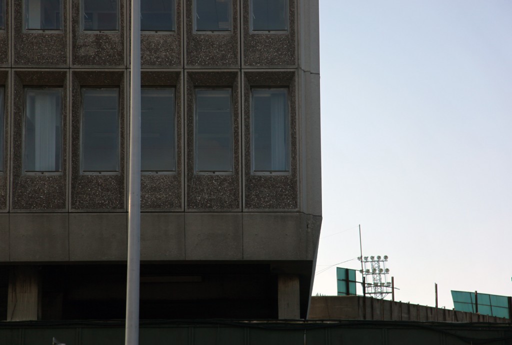
The draw for me is the precast concrete, these alien articulated forms fitting together on the upper storeys to frame the windows and create the facade grid. On the corner with Connaught Street, the panels taper back and sit as if clipped in a band around the corner, with a kick in and then out again along the side.
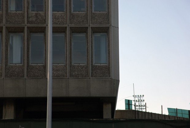
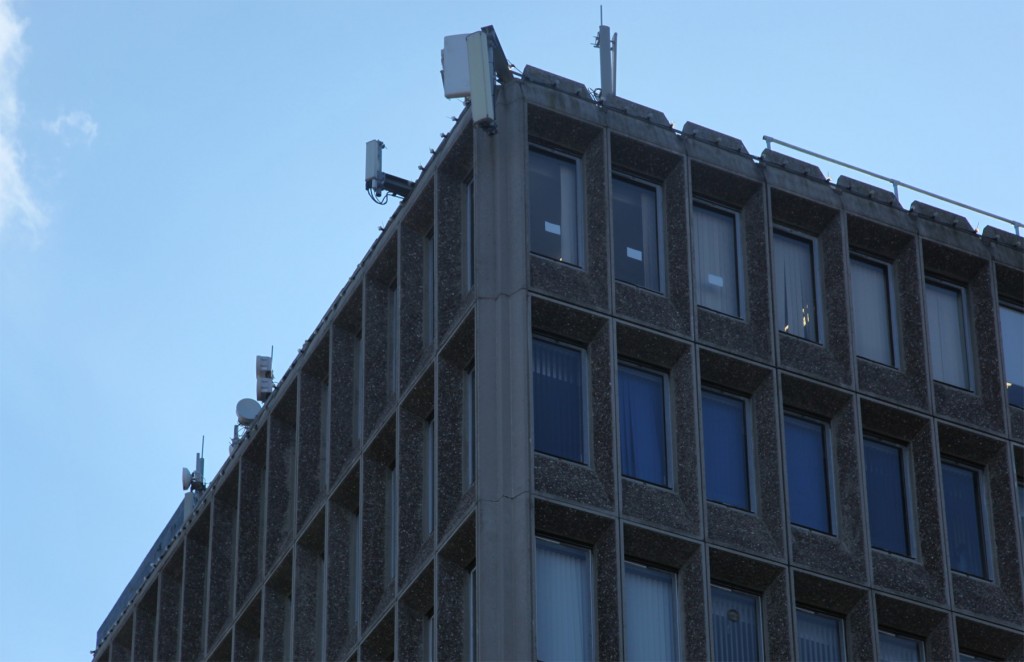
The office tower panels are almost the negative of this, which is gorgeous. Panes of glass are recessed and the concrete angles back to frame them, with a sharp line around the outer panel edge. The contrast between the exposed aggregate and the clean, smooth edge here works well for me, and likewise with the fluted effect on the negative corners.
That said, the lower storey meets its concrete neighbours in a bit of a mess, not helped by a jumble of signage and wires, and the silhouette of the complex is almost an essay in scrappy aerials and add-ons.
It’s undoubtedly a building that inspires strong feelings, and somehow, mine are mostly excitement. (Even after having it as my local shop for a few years!) The glittering sea of cars revealed on the roof when you pass on the upper storey of a bus looks almost pretty, and then the concrete. More than anything, though, I’d love to see what David Keane saw, and to figure out what gets lost in popular translation.


