
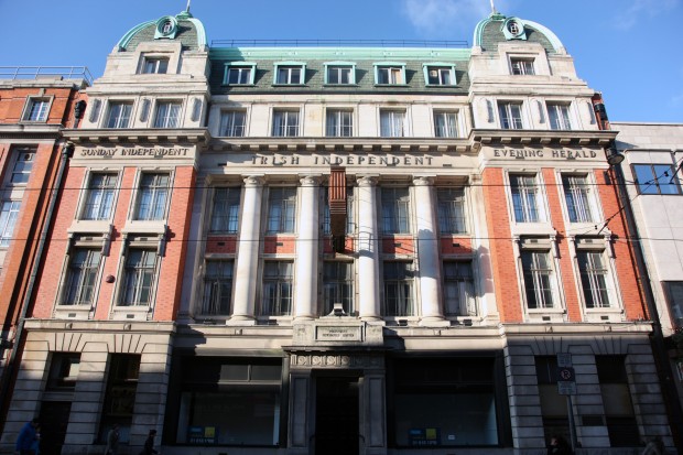
While the clock on Independent House is in great condition, the building’s postboxes have weathered more dramatically. They’re to the right of the original building (a 1936 extension sits to the left), recessed to the depth of the windows.
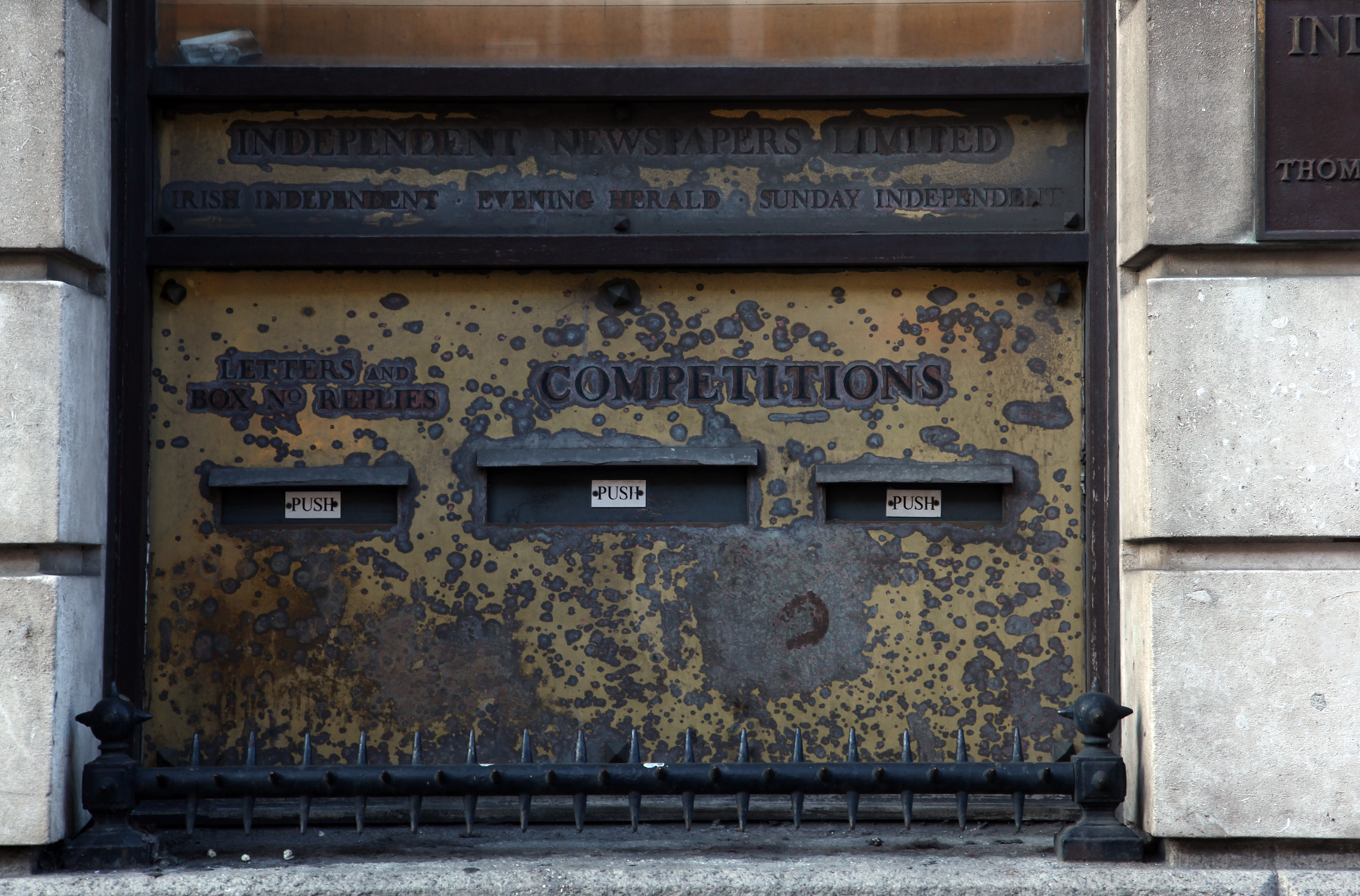
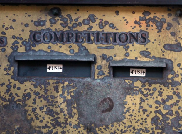
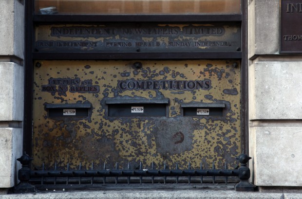
Aside from the patterns of how the brass plate has worn away to give a bubble letter effect, there are a few other lovely things here. There’s the composition, balancing the small-large-small of the boxes and their little hoods with the single-double span of the labels above. Then, there’s ‘Competitions’. It’s big enough to need two letterboxes (were there entries larger than a postcard?), even though I am assuming ‘box number replies’ was for classified ads and that ‘letters’ remained busy enough most days. Even the letters are twice the size of the other label, and bigger than the company and newspaper names above.
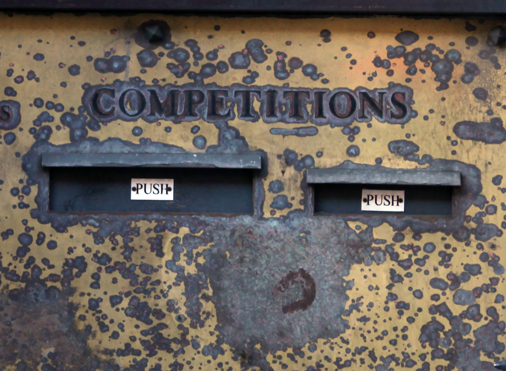
It’s interesting as part of the newspapers’ public face. There’s the landmark building (sadly no Tribune Tower, “the most beautiful and distinctive office building in the world”) giving it visibility and status within the city, and the clock and its Dunsink connection, engaging the public with the building as a useful part of their day-to-day. Not just news, but time too! The competitions box is even better, though: a mysterious opening allowing us to pass something inside the building, an inexpensive chance at making something good happen. No wonder it got the biggest lettering.
