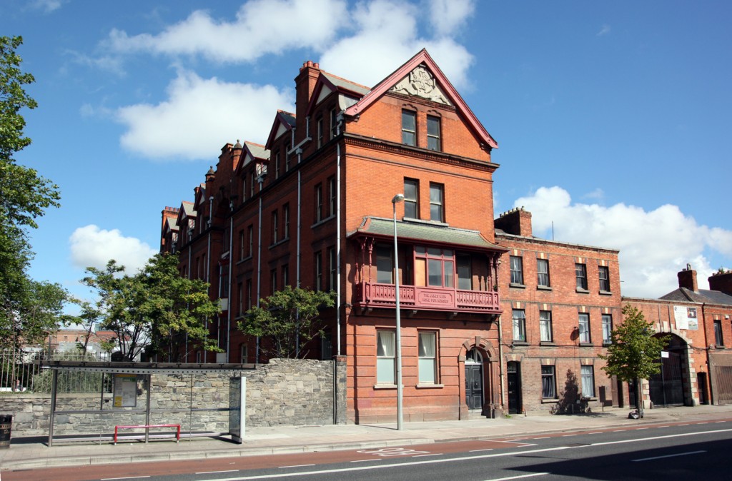
The James Weir Home for Nurses is oriented perpendicular to Cork Street – the street front gets the gable end, while the entrance is on private grounds, screened by trees. It’s an interesting effect, making the building appear less imposing than it might otherwise be, and creating a private, calm aspect to the approach, though the greatest benefit is probably that the two long facades get their daylight from approximately east and west.
The Home was built in 1903, designed by William Mansfield Mitchell and Sons, to provide accommodation for up to 50 fever nurses working at the Cork Street Fever Hospital (House of Recovery) across the road. James Weir was a grocer, wine and whiskey merchant from Scotland but running a business in Ireland for about sixty years, and on his death, he left a large sum of money to fund hospital works. In the 1950s, Cherry Orchard (Ballyfermot) Fever Hospital opened, and Cork Street Fever Hospital became Brú Chaoimhín, a community nursing unit that remained in use until 2011. The Weir Home provided accommodation for nurses until the late 1970s, and from the early 1980s, the Home housed male psychiatric patients as a ward St. Brendan’s Hospital.
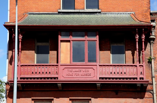
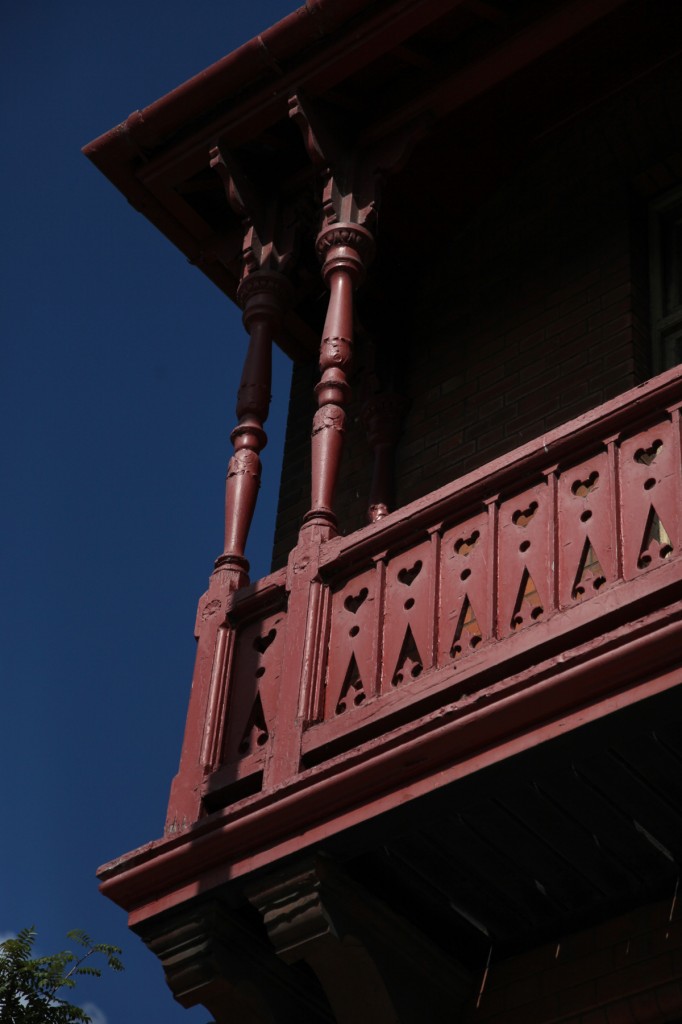
It’s an interesting sidenote, having the building’s occupants change from, presumably, being almost entirely female and working in healthcare to being all male and in receipt of healthcare. On the gable end facing Cork Street, there’s this sort of loggia at first-floor level, a timber thing with a slightly concave pitched roof above, bracketed below and by the slim paired columns at either end. It’s much less solid-looking than the rest of the building, but for me at least, it’s the part that leaves the greatest imprint.
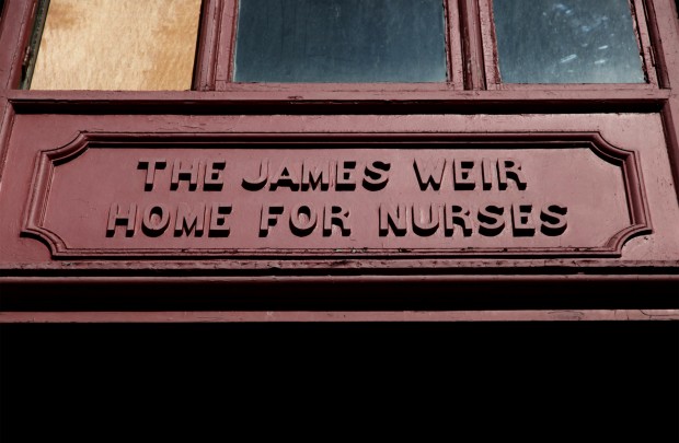
There’s Weir’s name and the building’s function, written in timber at the centre below the window. At either side, there’s a handrail with the lower part screened in, with cutouts looking like a repeat pattern of hearts, elongated and inverted and morphing into a fleur-de-lis, with a neat dot for definition in between. It looks as if these spaces are currently inaccessible and just sitting in front of windows, though it would be interesting to see how they related to the original use of the room(s) behind. Either way, it’s a domestic effect, an arts-and-crafts feel to the timber shapes, and it (along with the string course between the third and fourth storeys) breaks up the building into a smaller scale. The loggia effect reads like a human waist-height, human standing-height, and though this may never have been an intended effect, it’s particularly interesting to consider this kind of human-scale cue in relation to its more recent use as a residential facility. It’s pushing out onto the street, even if nobody could ever use it.

